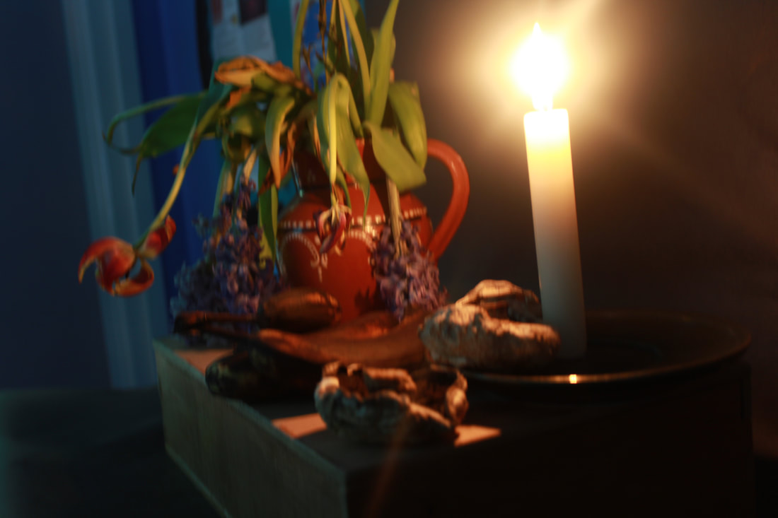
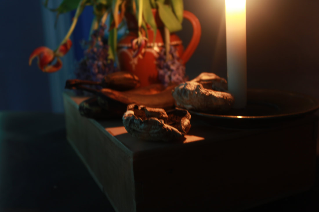
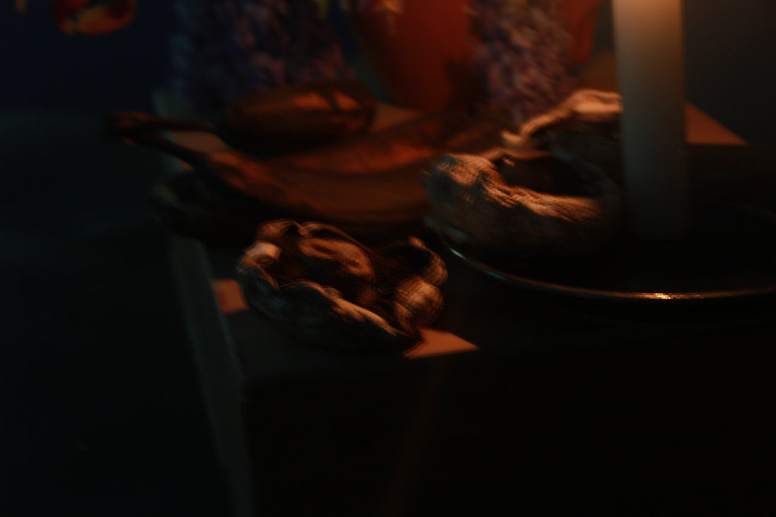
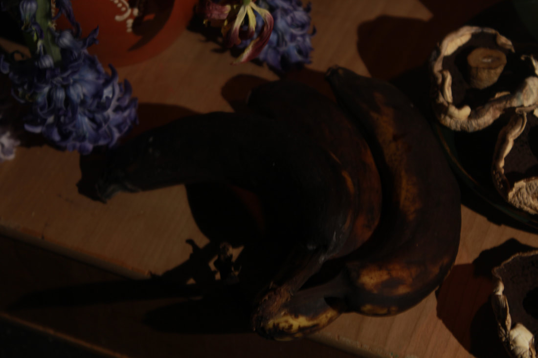
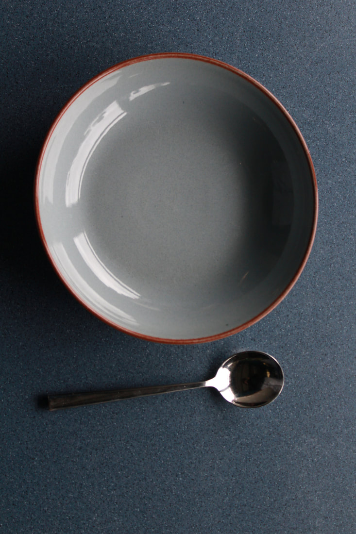
Texture
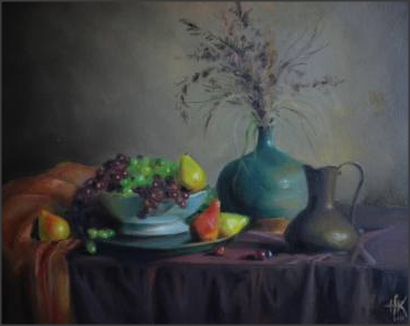
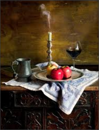
Mood board
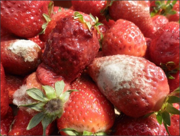
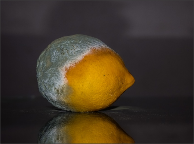
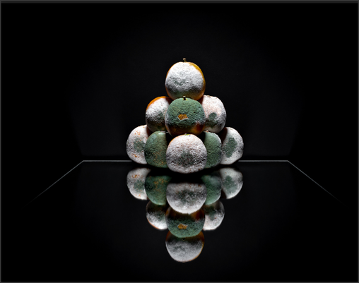
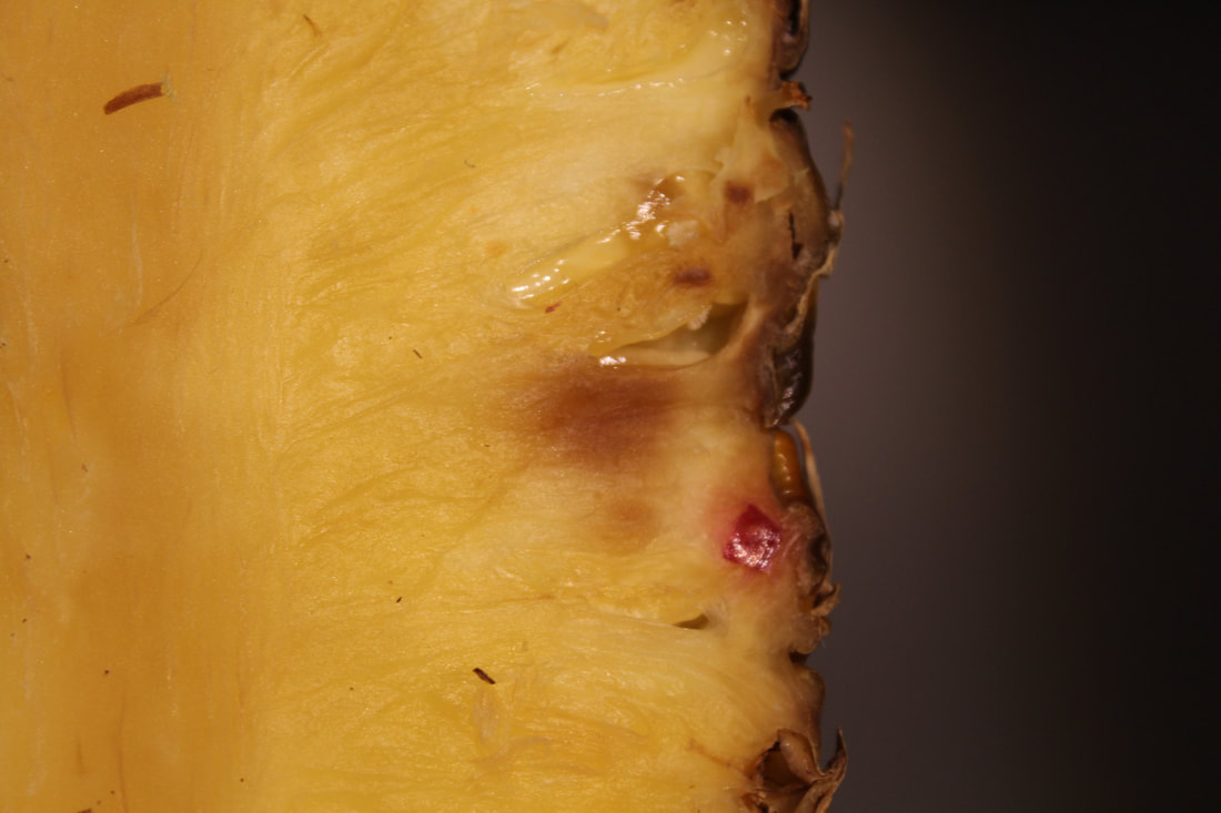
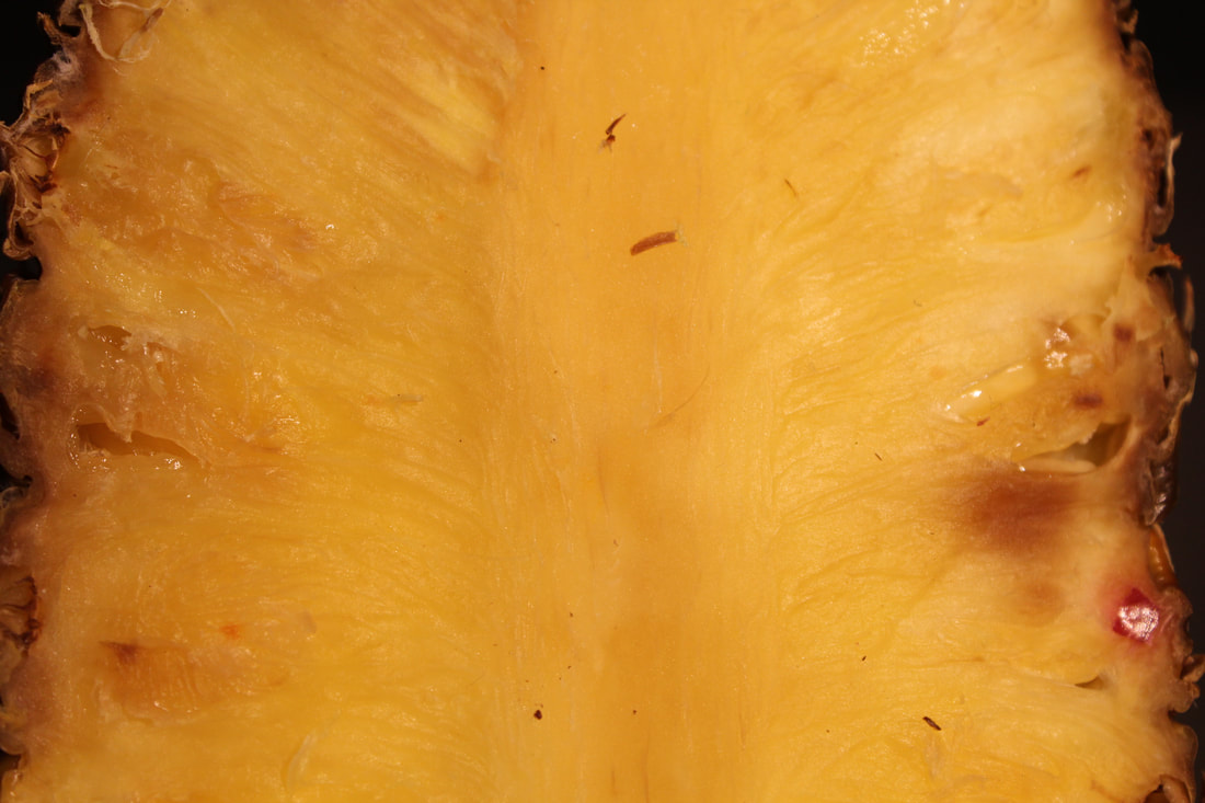
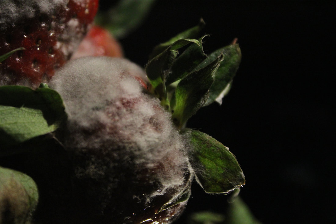
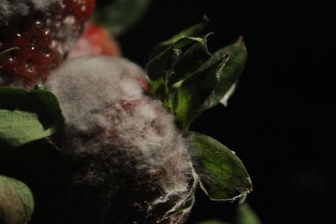
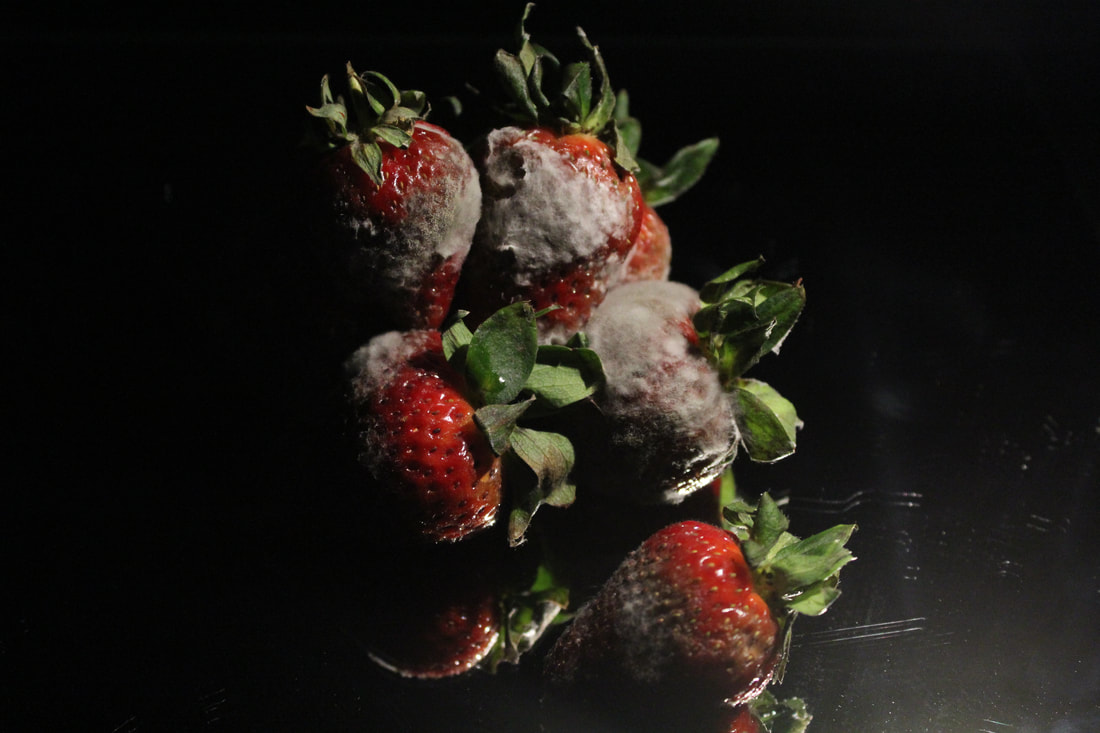
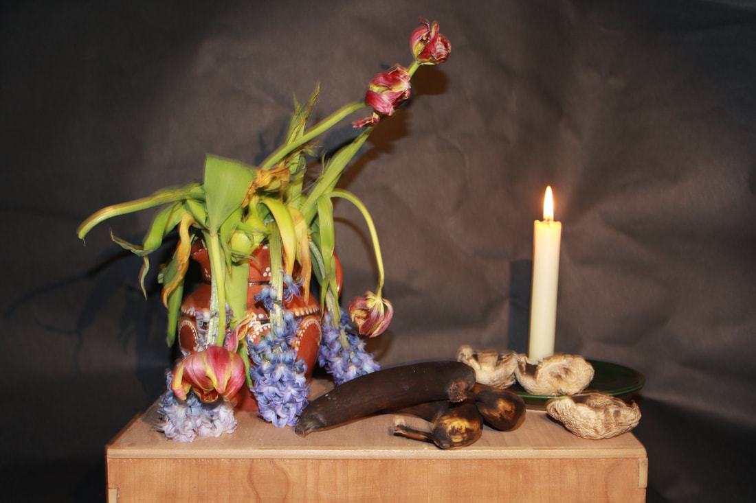
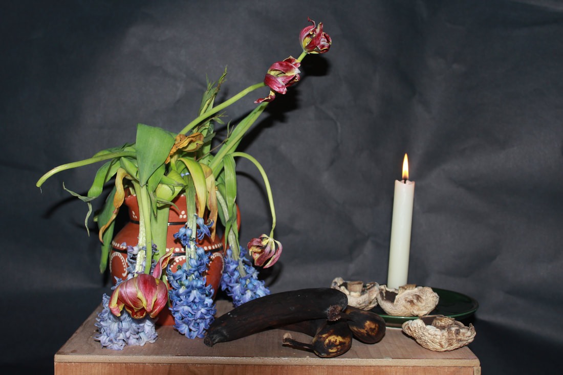
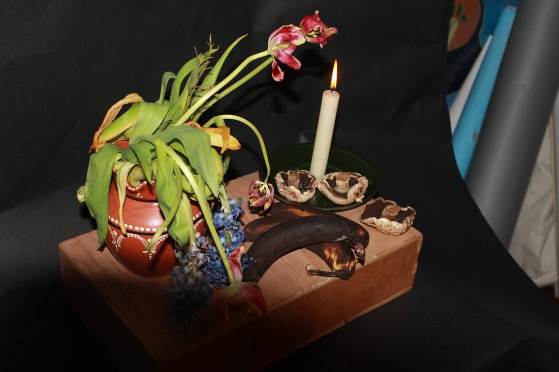
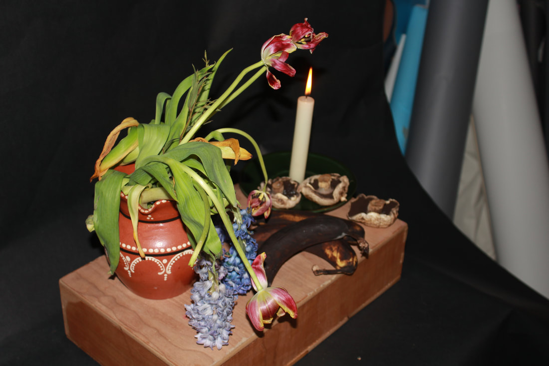
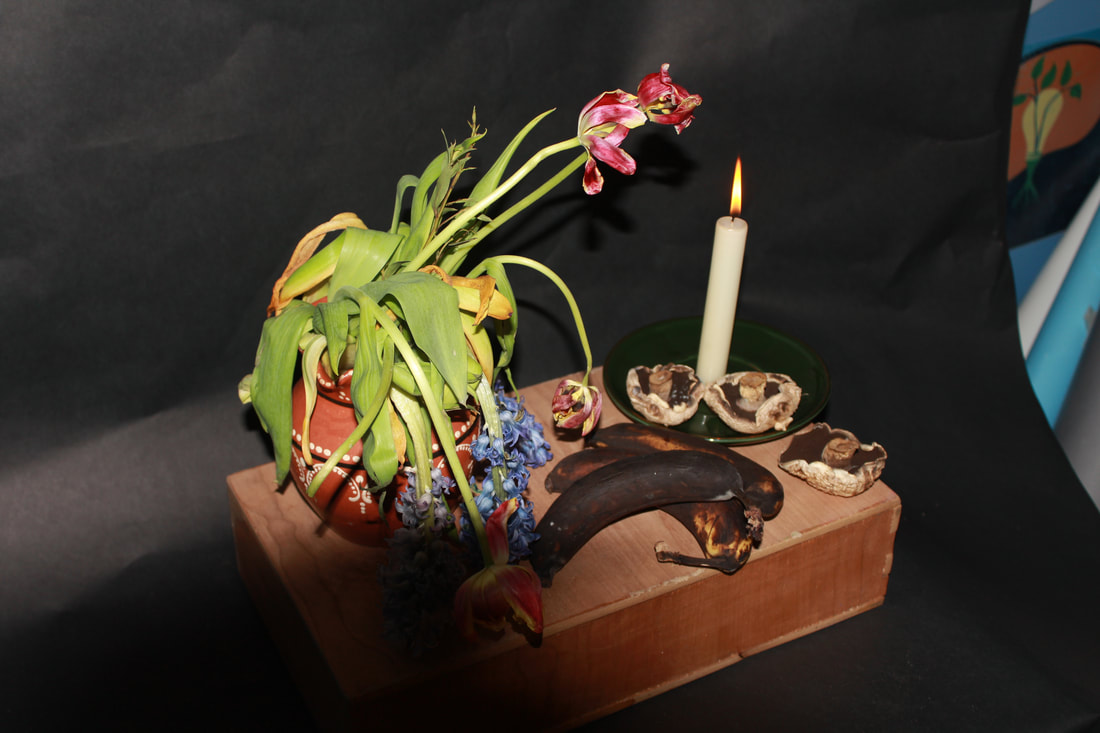
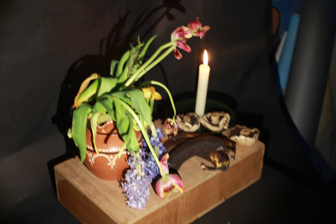
Decaying fruit

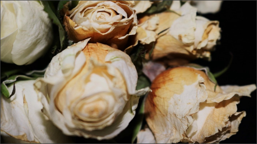
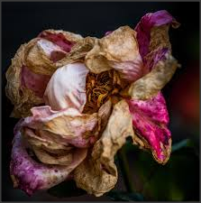
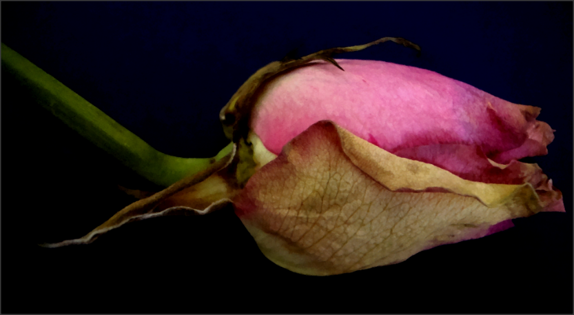
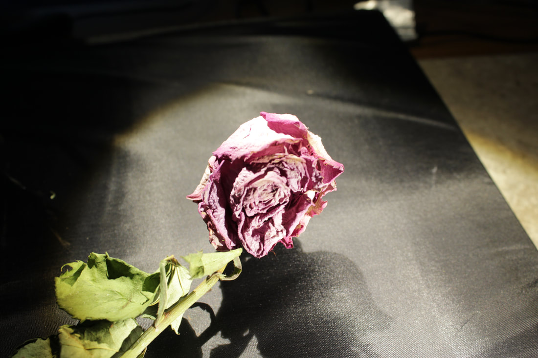
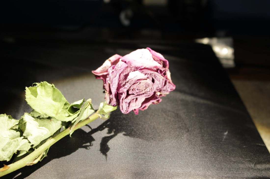
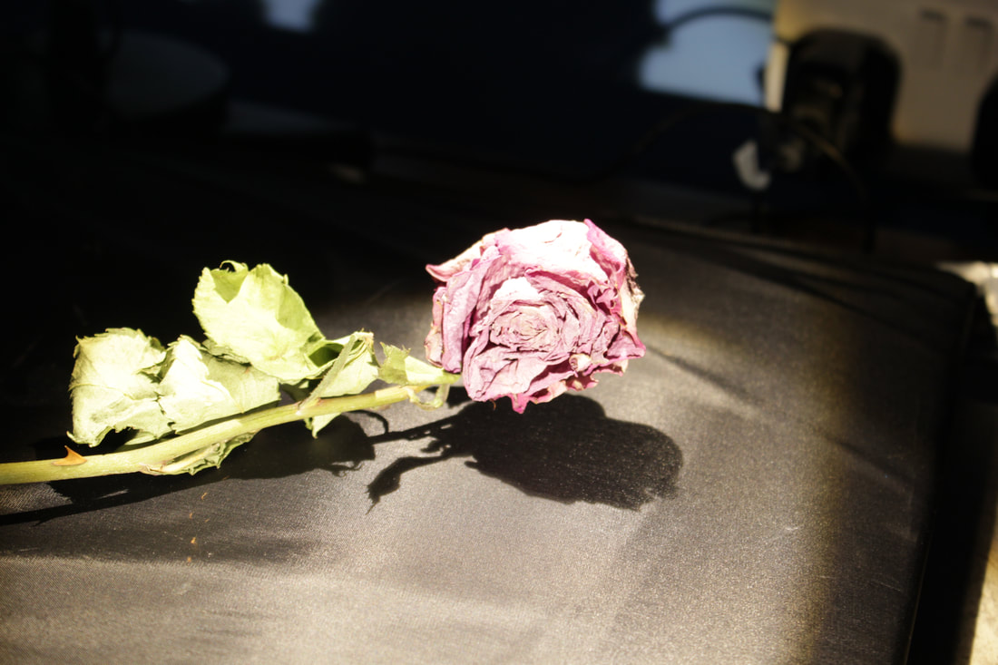
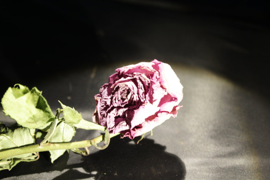
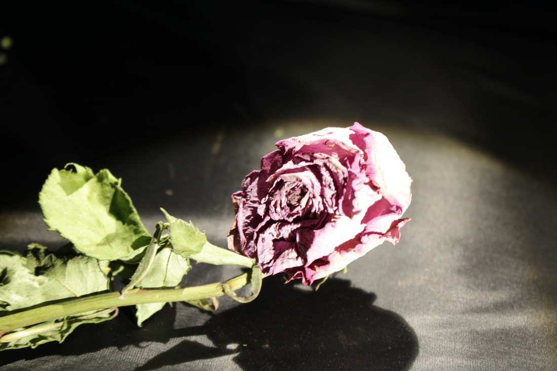
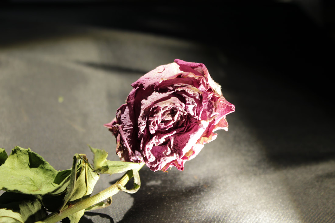
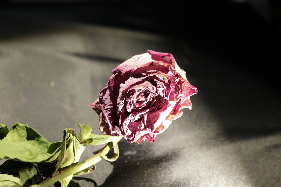
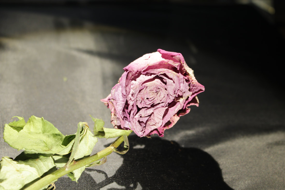
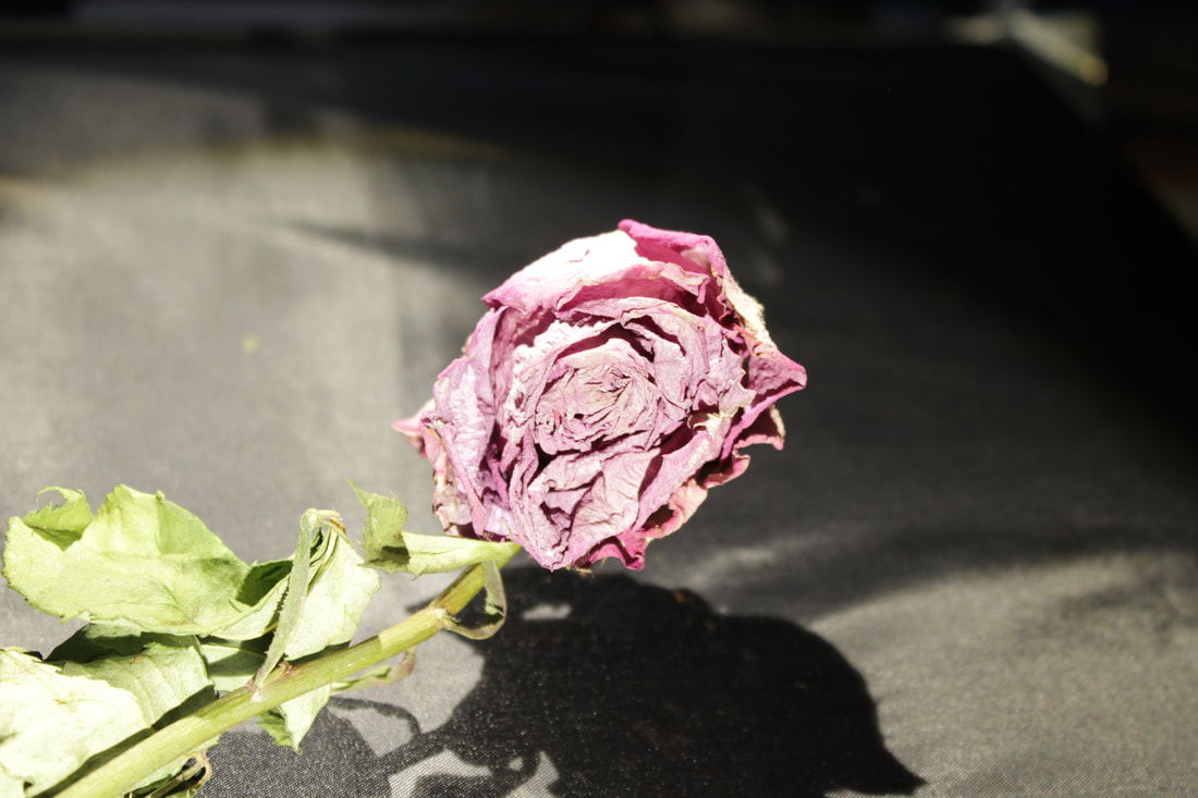
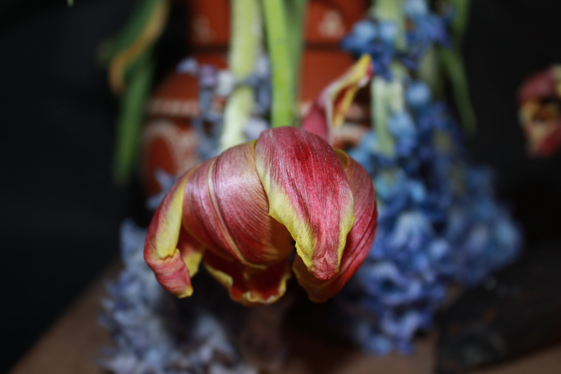
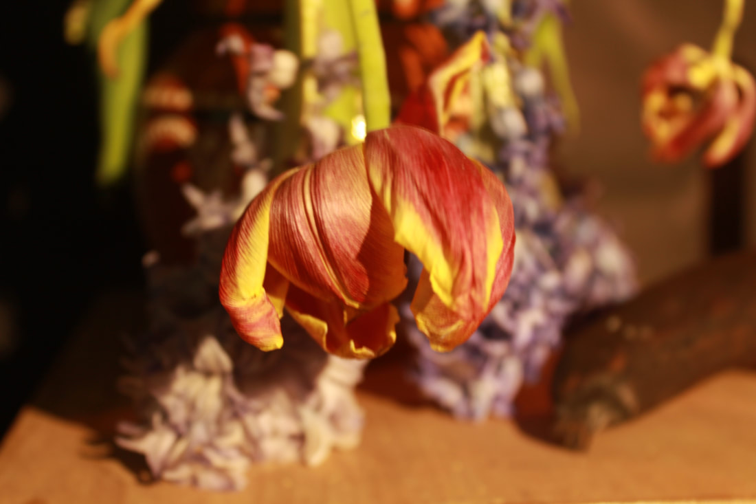
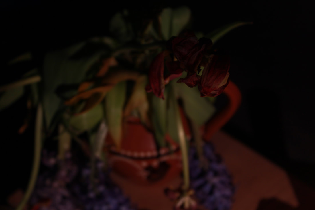
Flowers
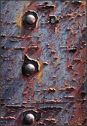
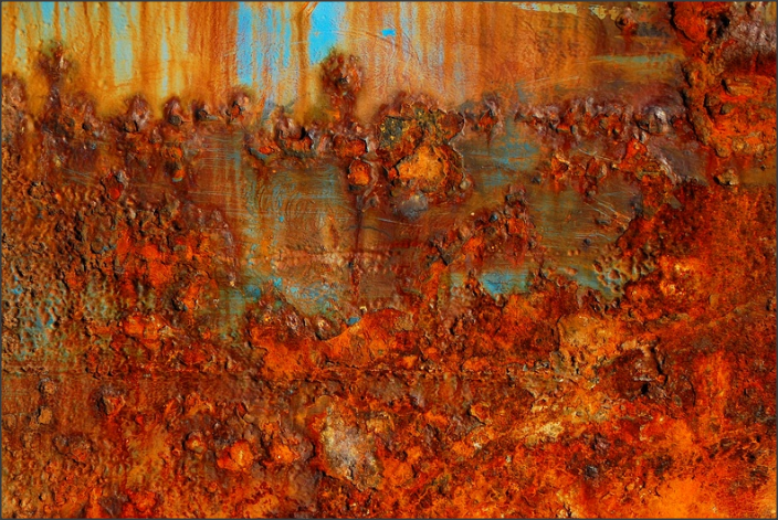
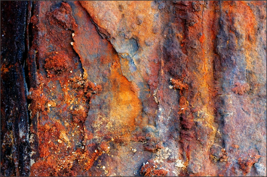
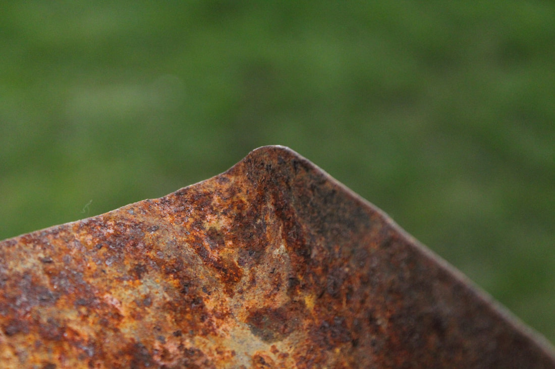
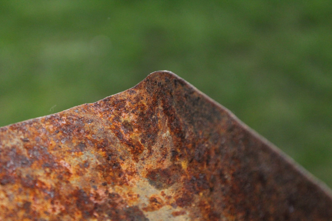
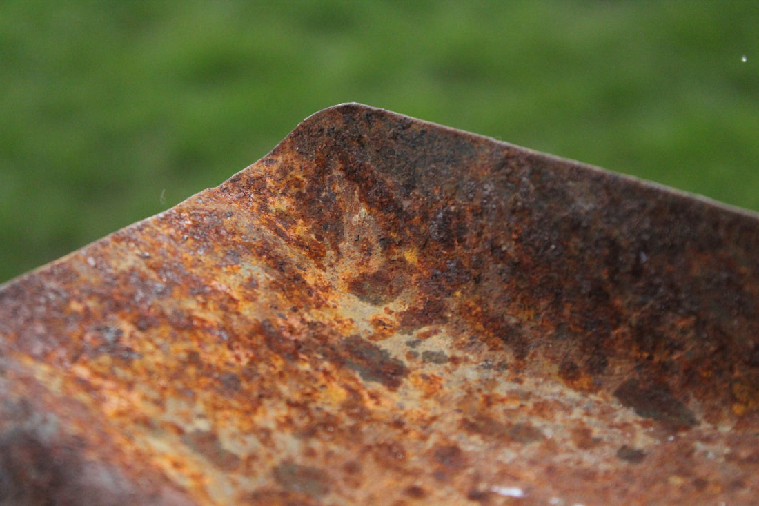
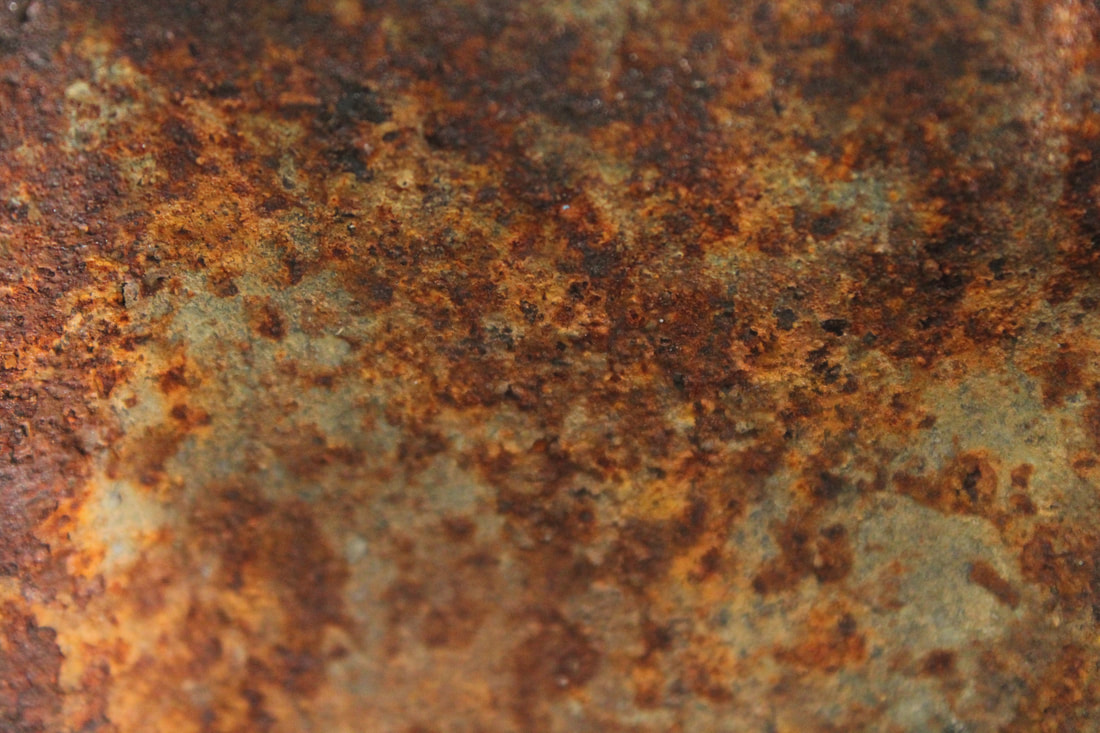
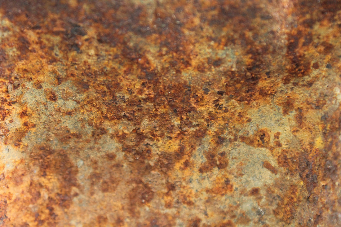
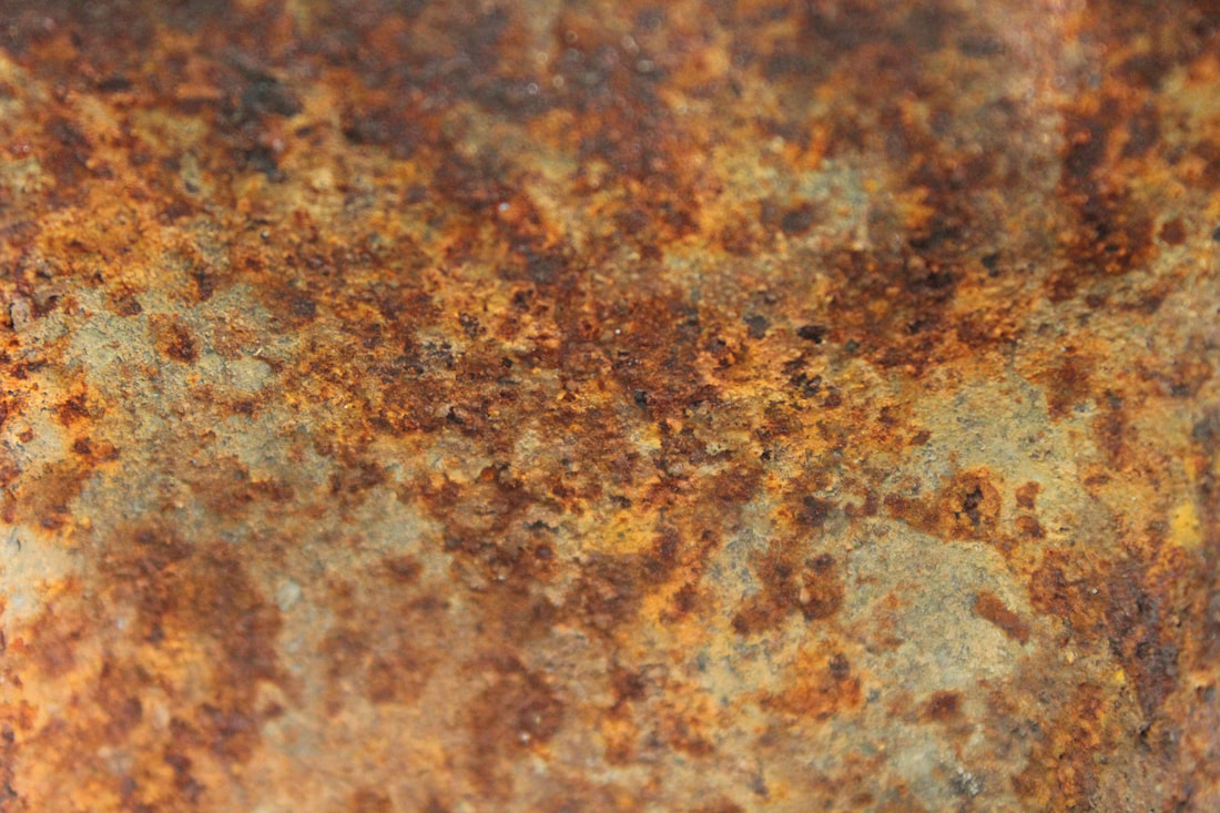
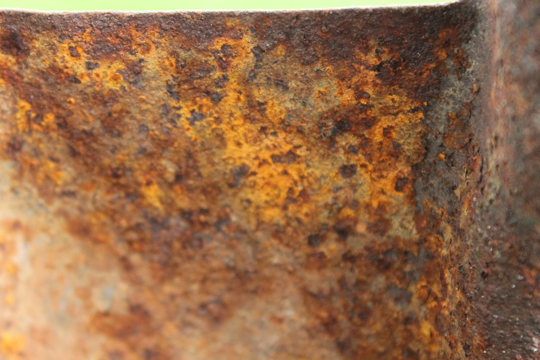
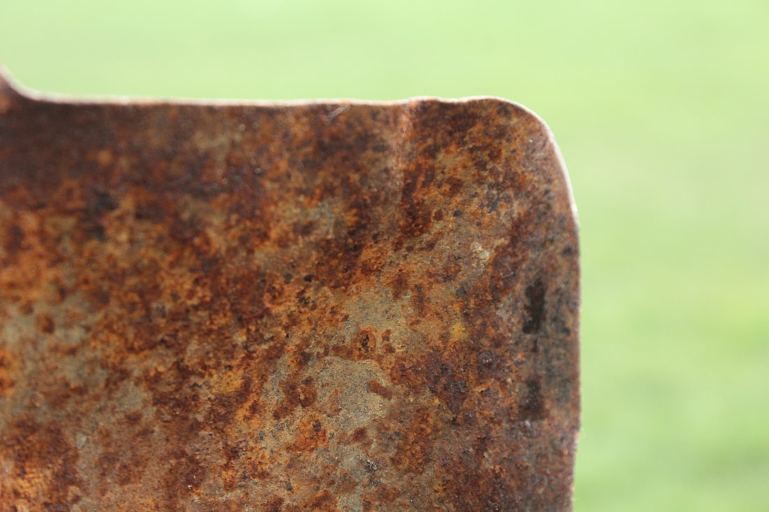
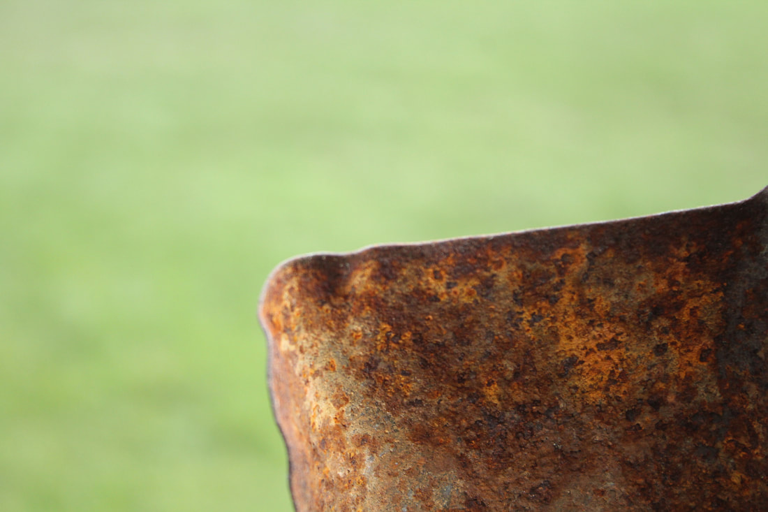
Rust

Two Photographers I Picked
Klaus Pichler |
Bill Mangold |
|
|
5 C's
Context
I have researched my photographer using the internet and this is the information I found:
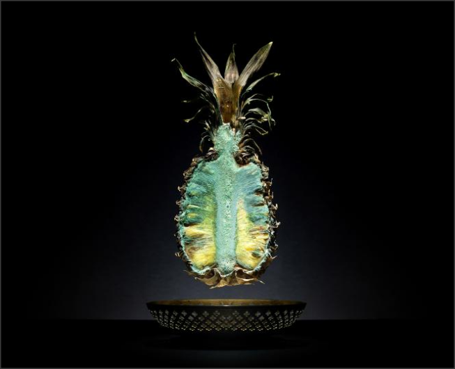
"Klaus Pitchler was born 1977, he lives and works in Vienna, Austria. Since 2005 he has become a Freelance Photographer, working for international clients and creating free projects. He has won many awards for his work and has taken part in numerous group and solo exhibitions.
Over a period of nine months, fine art photographer Klaus Pichler turned the bathroom of his studio apartment into a curated collection of plastic containers, each containing food items available to the average citizen of industrialized Europe.
He created the images to show visually the about of food that gets wasted. He did a survey and found that over one-third of food produced for human consumption goes to waste, due to factors such as consumer decisions and lack of distribution channels, while over nine hundred million people are starving.Because of these findings Pichler decided to create images that look nice and advertising at first glance but shock the audience when they realise it is rotten fruit. His message is to show how much waste is being created even though there are so many staving people in the world."
Content/Composition
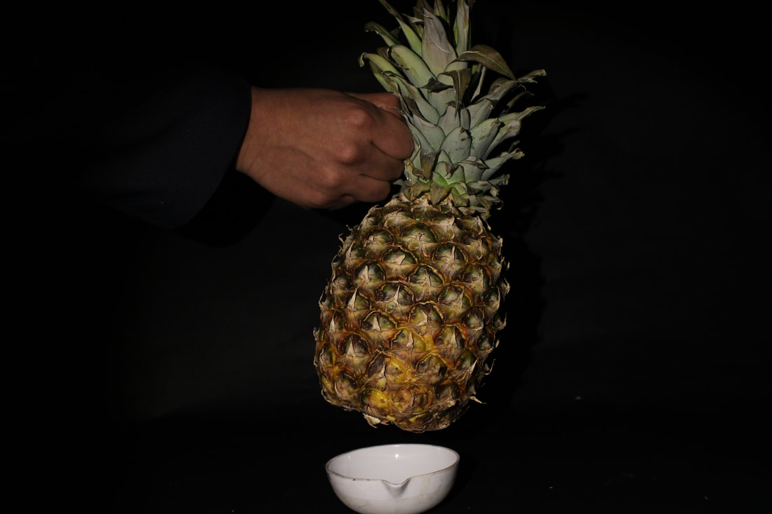
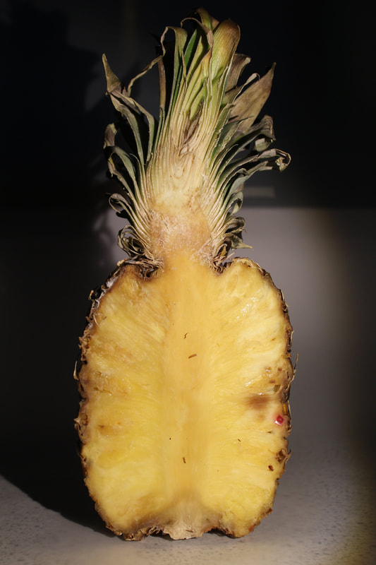
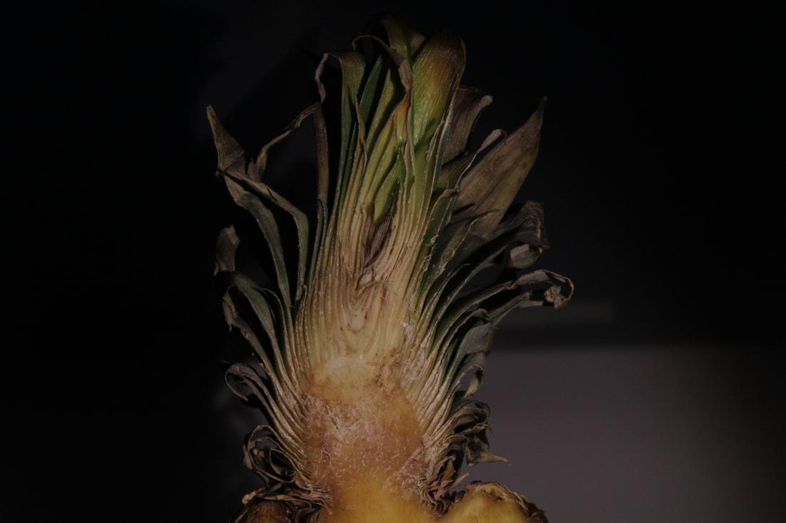
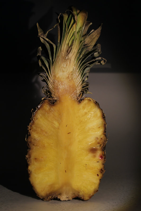
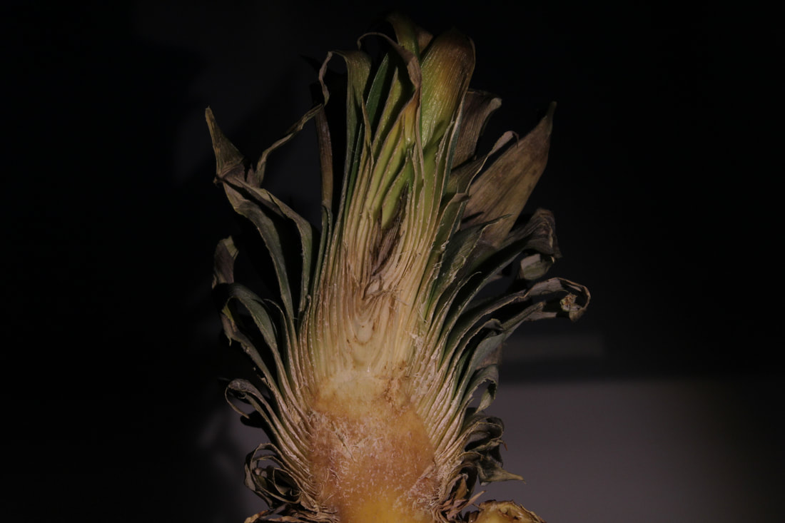
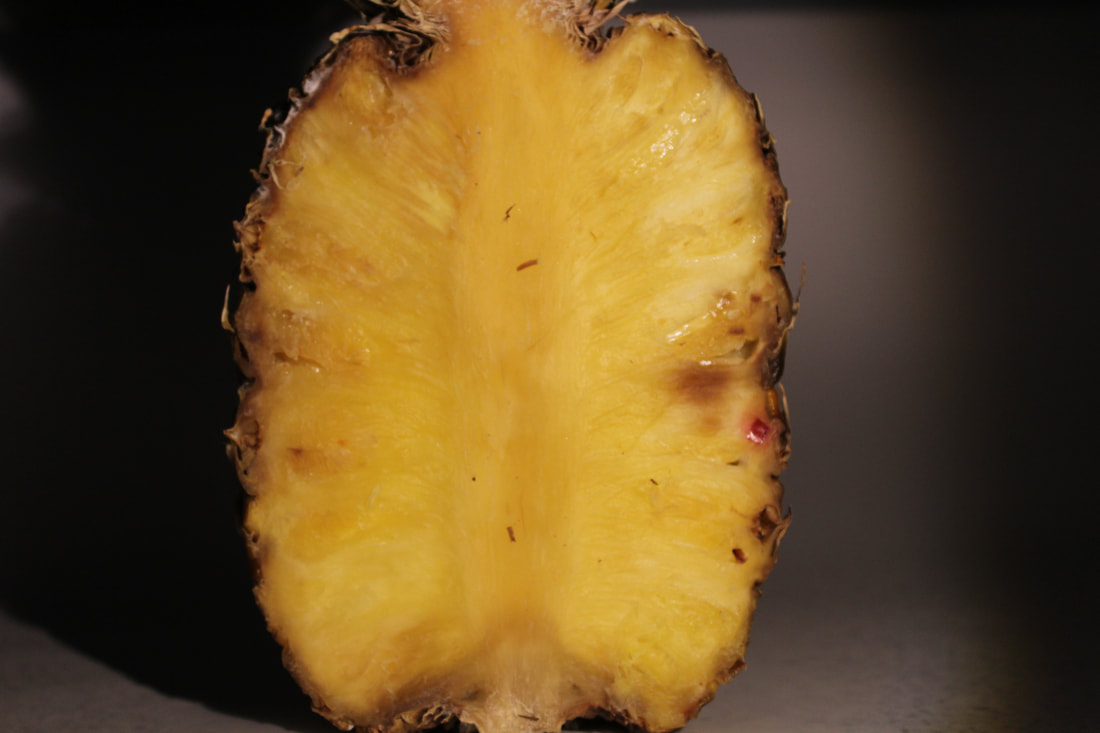
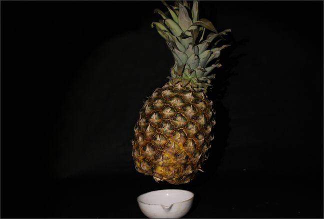
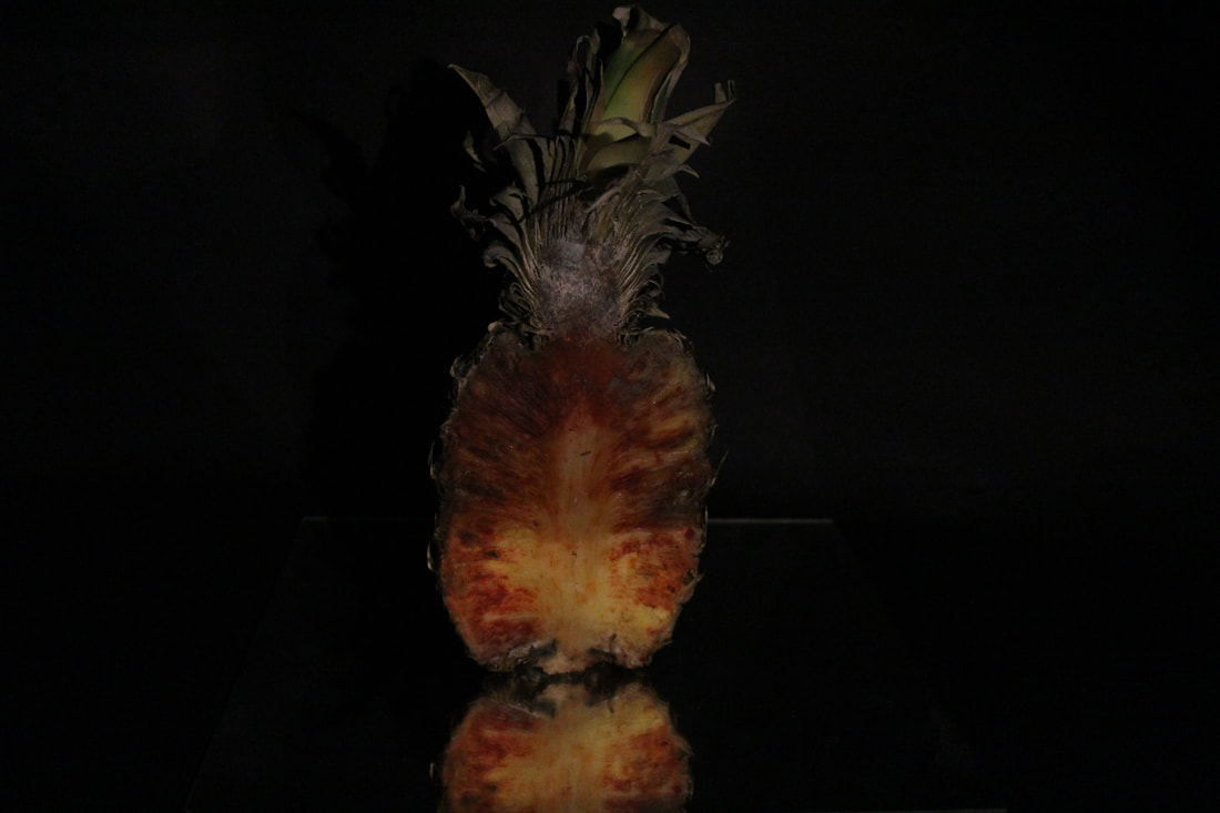
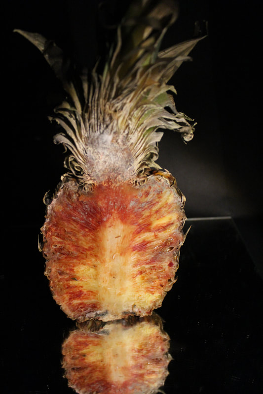
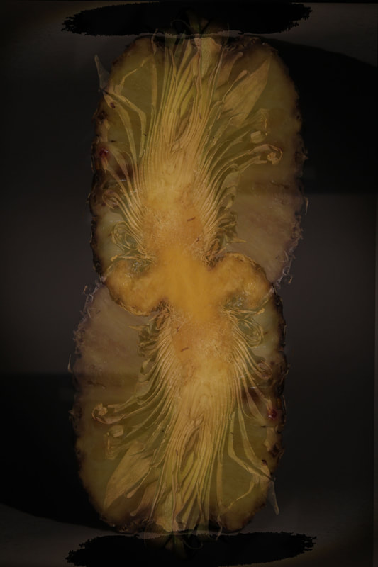
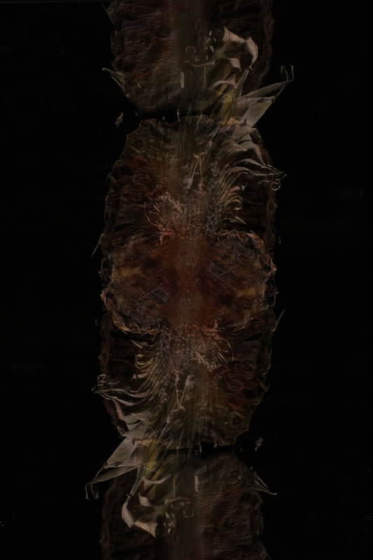
In this image at first glance I can see an edible pineapple displayed floating above a metal fruit bowl. It has been highlighted by a light. When I look more closely I can see that the green is actually mold that has grown in the center of the cut pineapple. The leaves are also brown they look like they are on the verge of falling off. To me it looks as though a studio set up has defiantly been used due to the fact that there is a black background and there is a spotlight on the fruit, and another indicate that this was a studio shot is due to the fact that the pineapple is floating which has defiantly been set up. The focus point in this image is at eye level, which helps to have an impact on the viewer as it fills the picture frame. Although the photographer hasn't used the rule of thirds he has positioned the pineapple in the middle of the picture which naturally forces the viewer to analyse the pineapple. I really like the technician that the photographer has used, so I might use this in my own work. The photographer has manipulated the lighting to be in the central point with a tight outline making the pineapple stand out from the contrast of the black. You don't get a sense of depth of field because of the extremely dark back ground which filters it out, however you get a sense of the background because of the lighting which shows a little of the table.
Comment
I like the contrast between the black and green. It makes the rotten pineapple stand out as it is the only object that contains colour and is colorful. The spot light makes the pineapple stand out even more which gives it a nice delicate glow but, however, the spot light is too bright and it hides some of the pineapples natural colours. In conclusion the lighting was to harsh on the fruit
Connections
In this picture the main theme's are the rotten fruit and the texture and in this picture you can clearly see the texture of the pineapple and there for you can also see that it is rotten. This makes it relevant for the theme that I am going for which is mainly textures and the texture of rotten fruit. The image consists of a dark black background but going towards the middle you can see light behind the pineapple slowly fading in.
5 C's
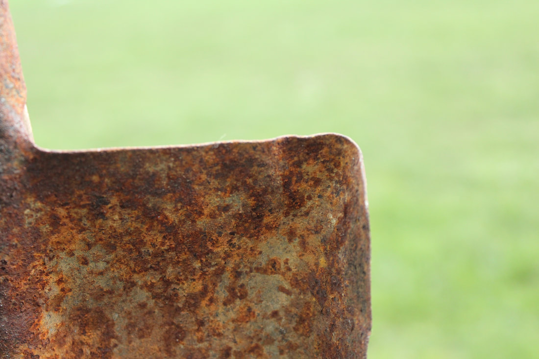
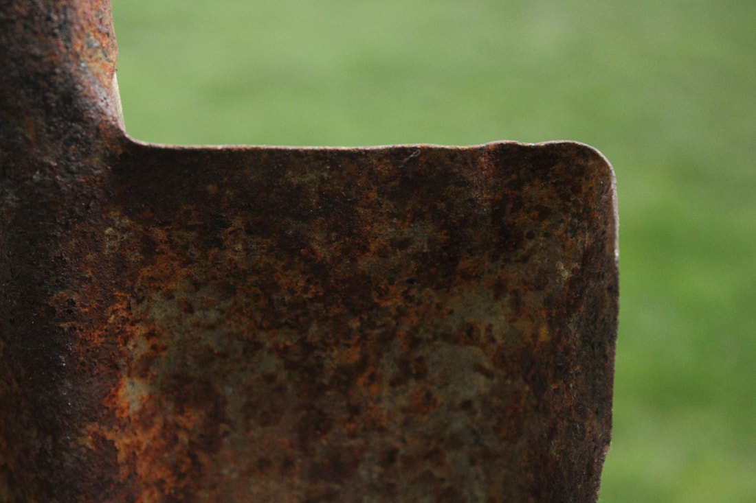
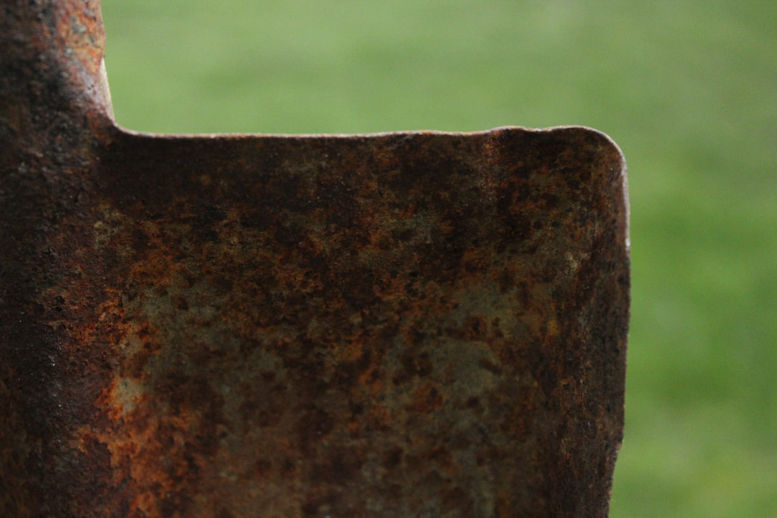
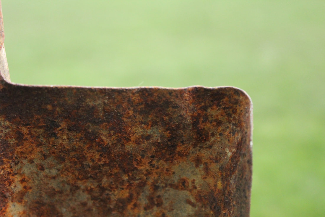
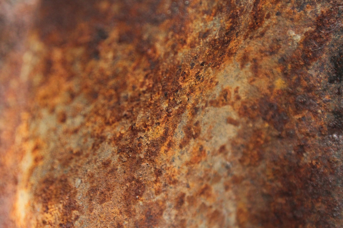
Context
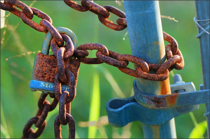
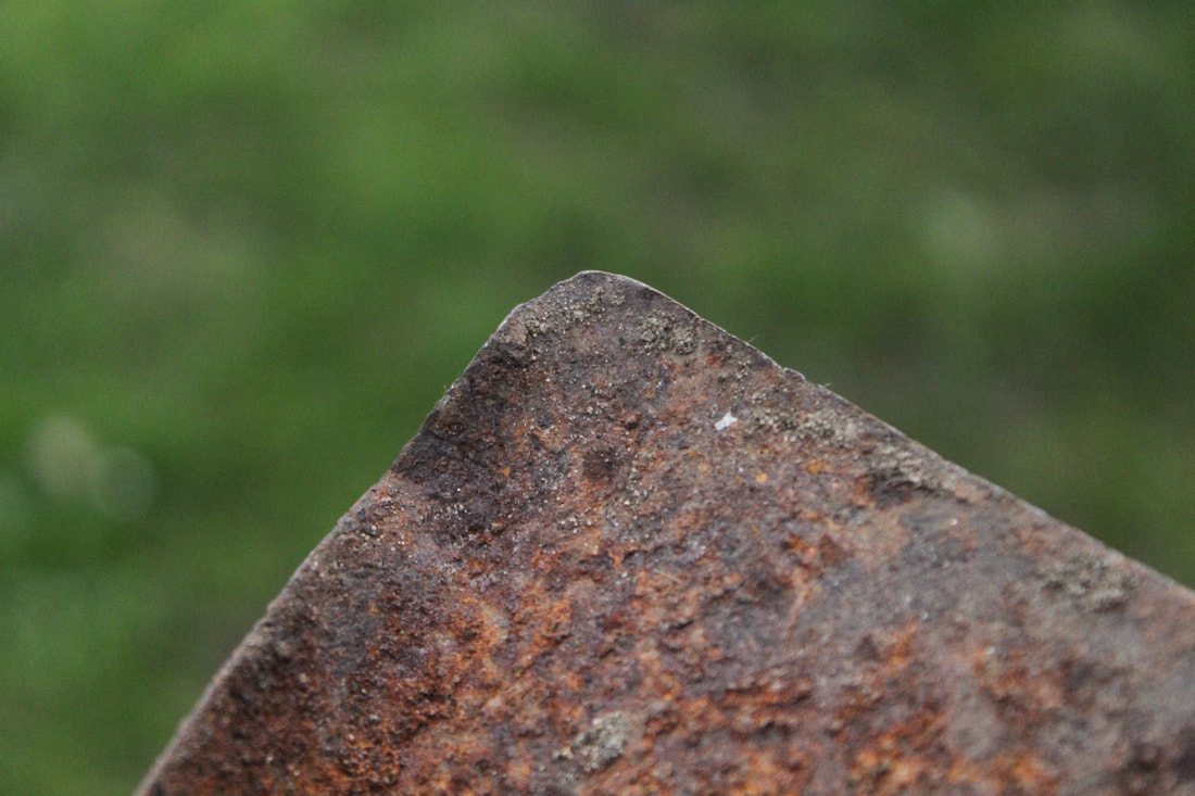
Bill Mangold is a veteran photographer based in Sebastian, Florida recently returned to photography after a 40 year break. Although most of his early photos were candid and what we today call “street photography” only a few of the pictures he have recently taken fall into this category.
Content/Composition
In this image at first glance you shift your focus to the padlock with the chains locked around, but then you can see the rust all around the padlock and the chains. There is a contrast between the blue and green. The photographer has used the rule of thirds in this picture and it makes you mainly shift your focus to the padlock and chains. He also uses a shallow depth of field to make the padlock and the chains stand out from the blued background. You can pick out barley that it is grass. This picture could've been taken anywhere outside so it is difficult to say where I think this picture could've been taken, but the lighting is natural and soft. This picture could've been setup, but I don't think it is because, it would be a time consuming project just to get one picture because it takes time for rust to form, so therefor I think he found this out somewhere. You can see greenery in the back which makes me think that this picture was take;
There are strong leading lines from the blue poles which are in contrast to the blurred background which makes them stand out and adds a strong composition to the image. There is a real sense of scale because the padlock is close to the lens or its been zoomed it and cropped closely and appropriately.
There are strong leading lines from the blue poles which are in contrast to the blurred background which makes them stand out and adds a strong composition to the image. There is a real sense of scale because the padlock is close to the lens or its been zoomed it and cropped closely and appropriately.
Comment
I like the contrast between the brown, blue and green. It makes the rust on the padlock and pole stand out and you can also tell that there is grass in the background. The depth of field makes the rust on the objects stand out even more which gives it a nice range of focus but, however, the depth of field sould have been a little more less shollow to capture more of the background too bright.
Connection
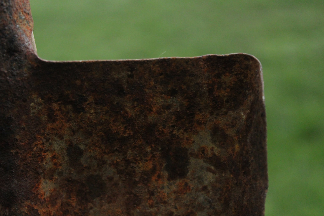
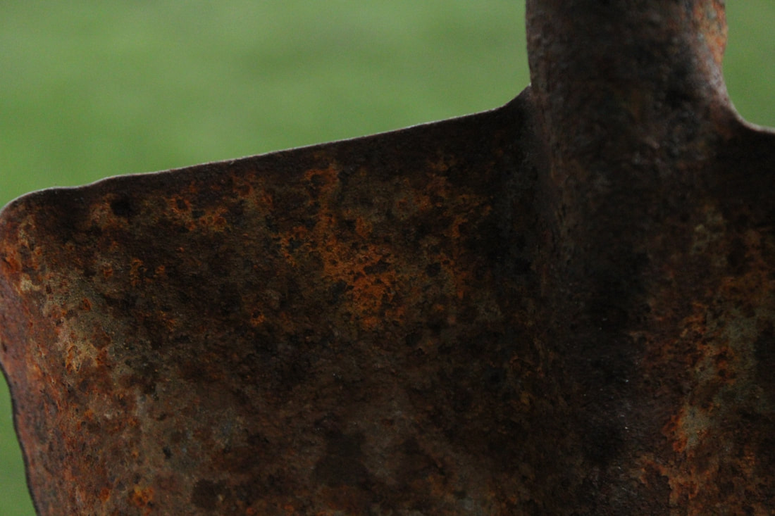
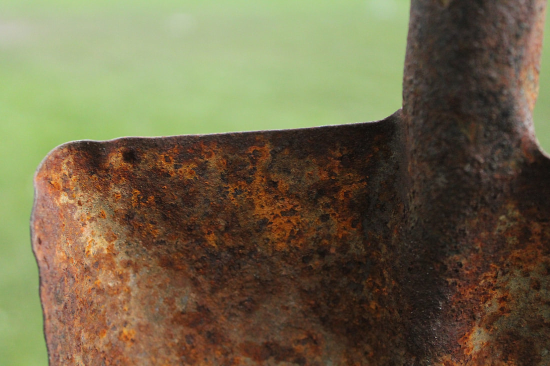
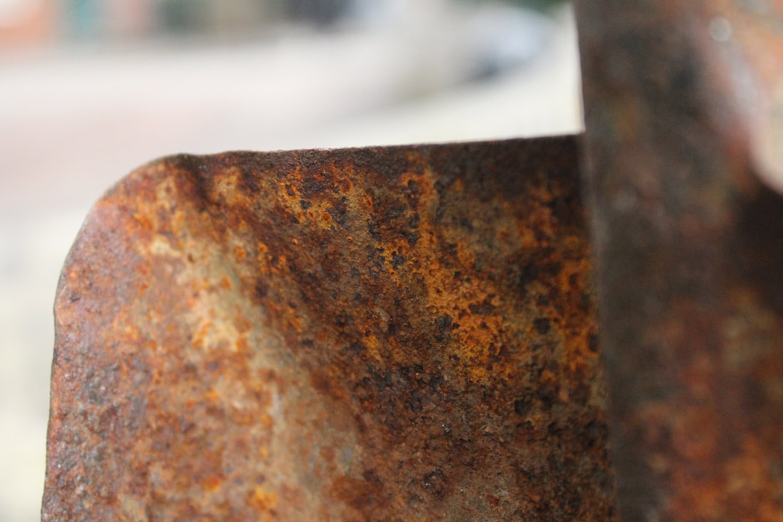
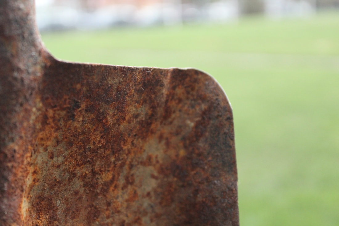
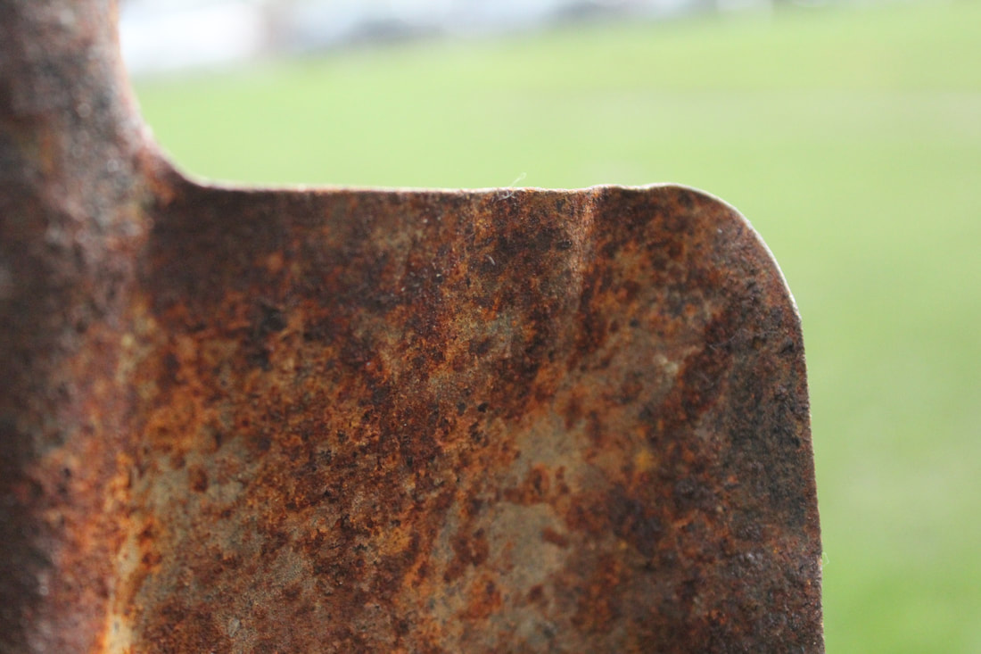
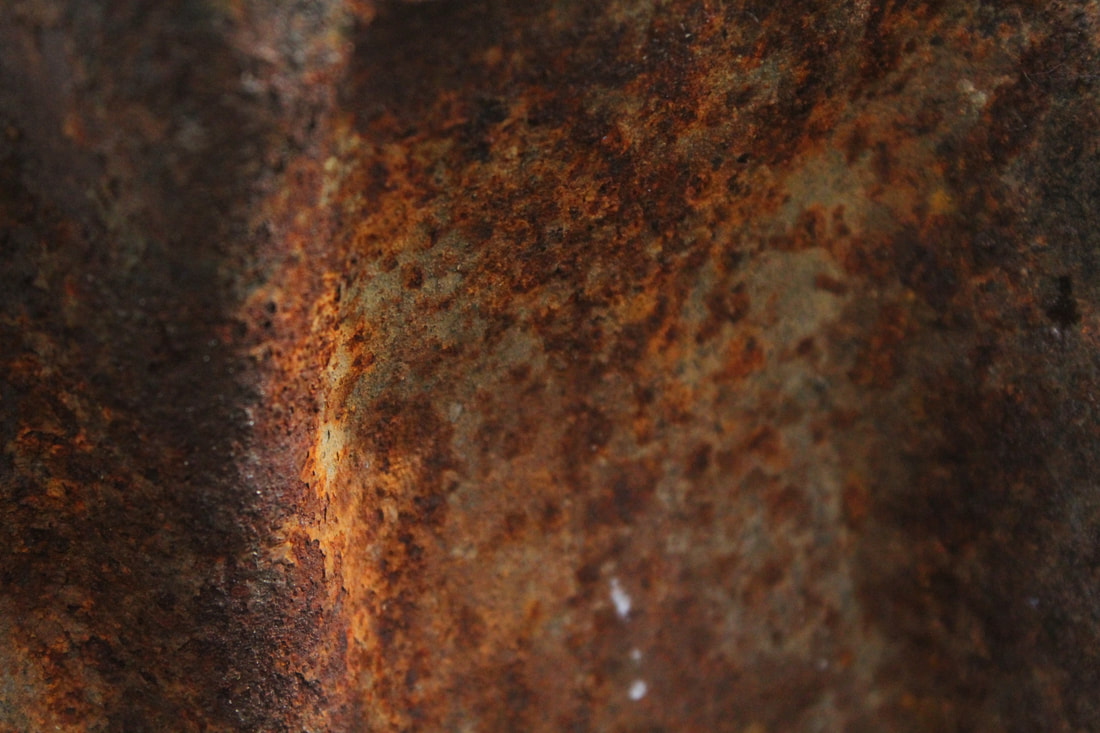
I have found a rusty spade which has a beautiful rust pattern and I will take inspiration from the photo to create my own with my own spin on it. You can see the texture the rust created which has inspired me to to find my own rusty object and explore the theme of rust and texture. Although I like the rust I am not sure if it will be my main idea as it is limited to a certain extent.
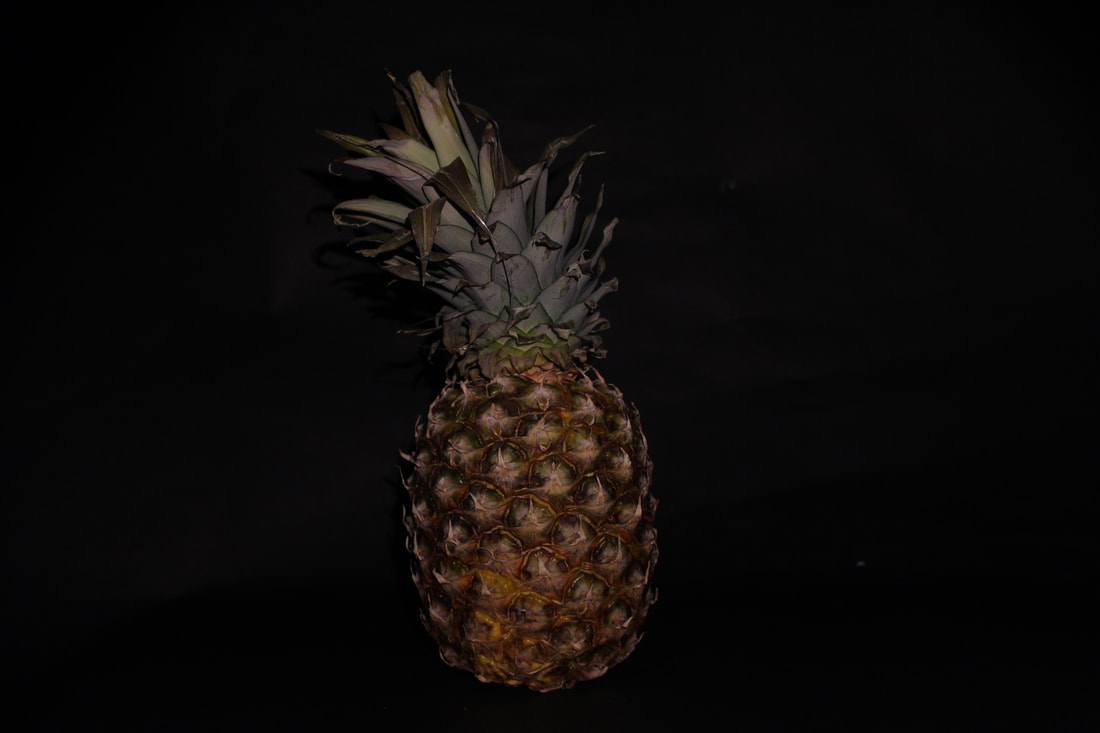
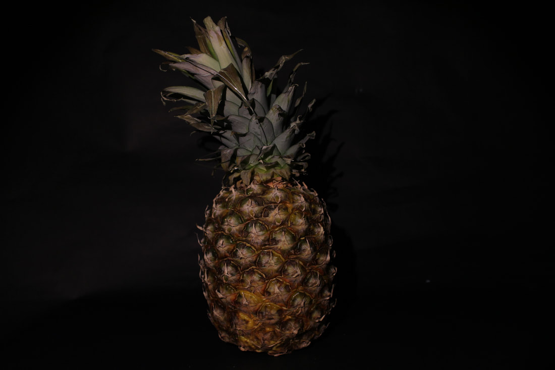
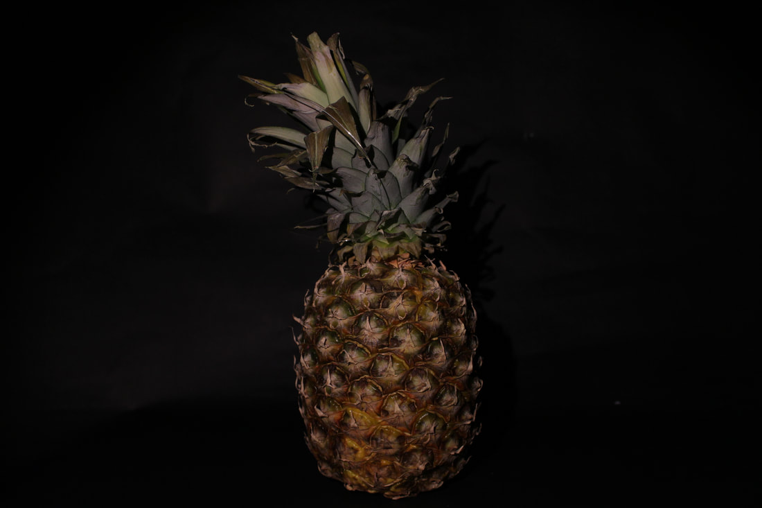
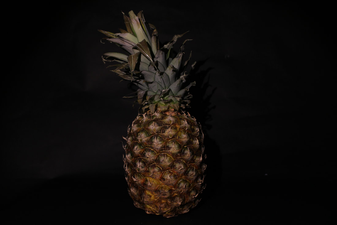
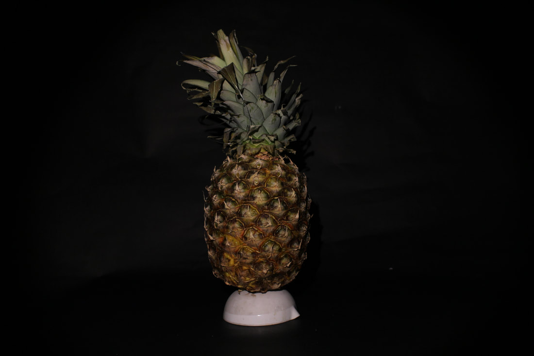
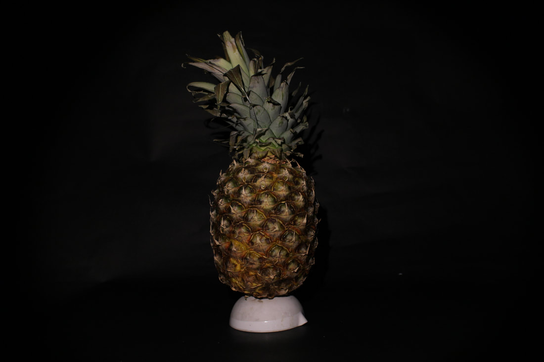
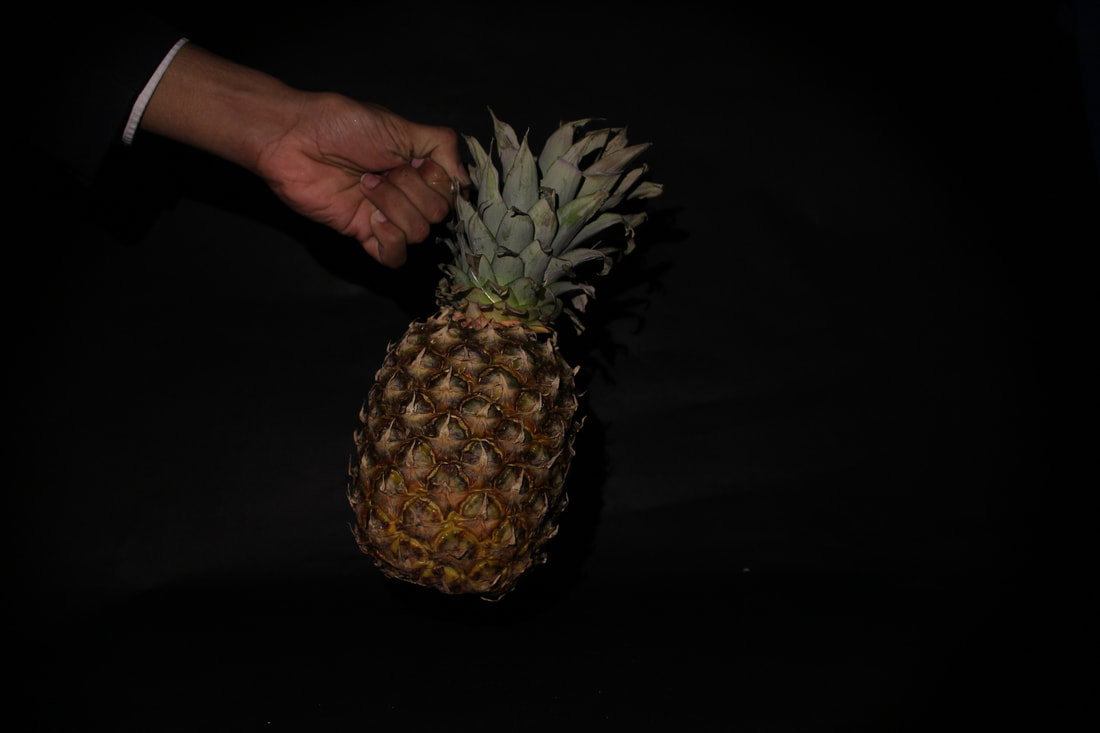
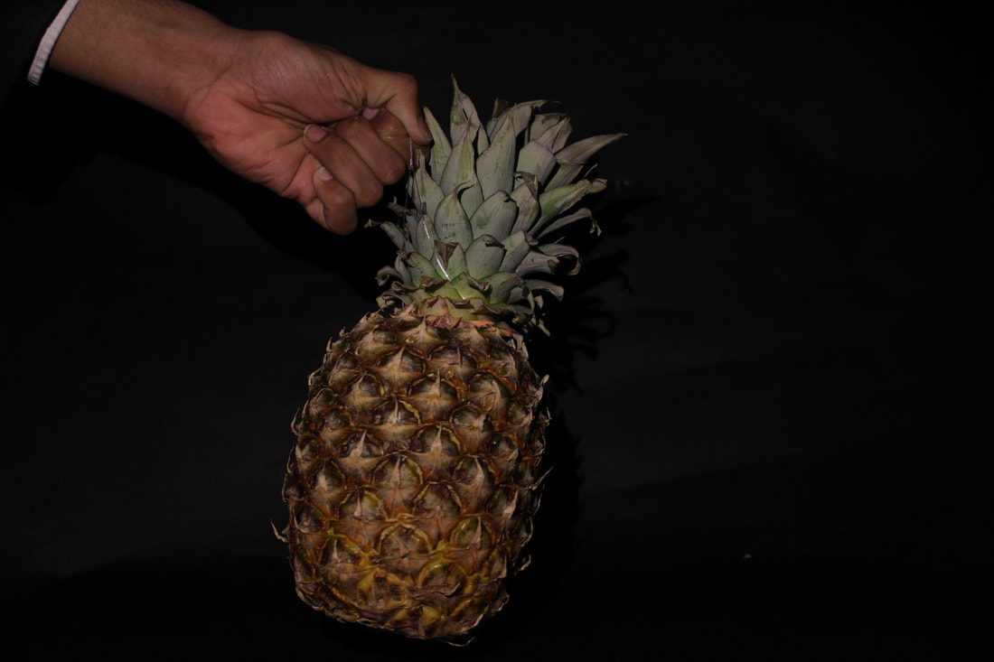
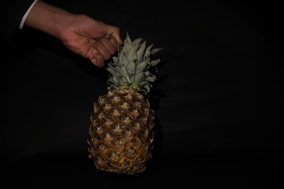
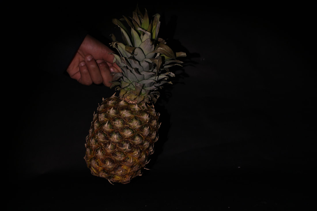
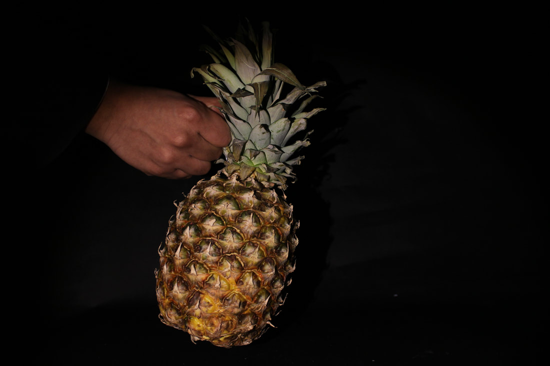
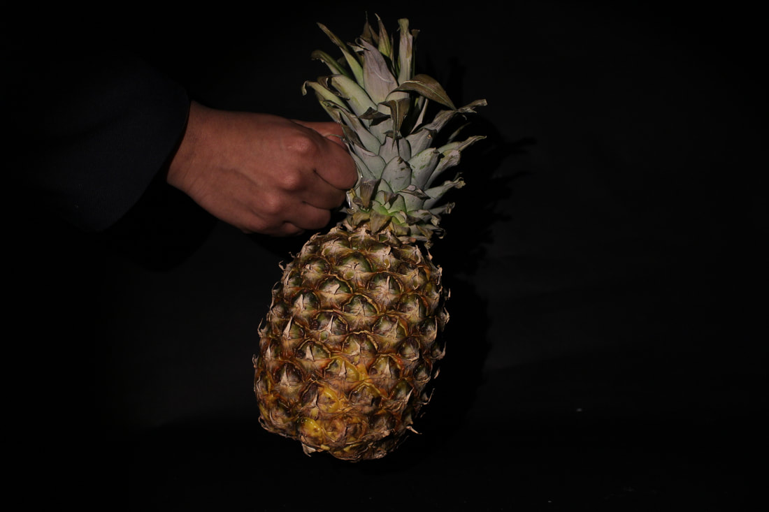
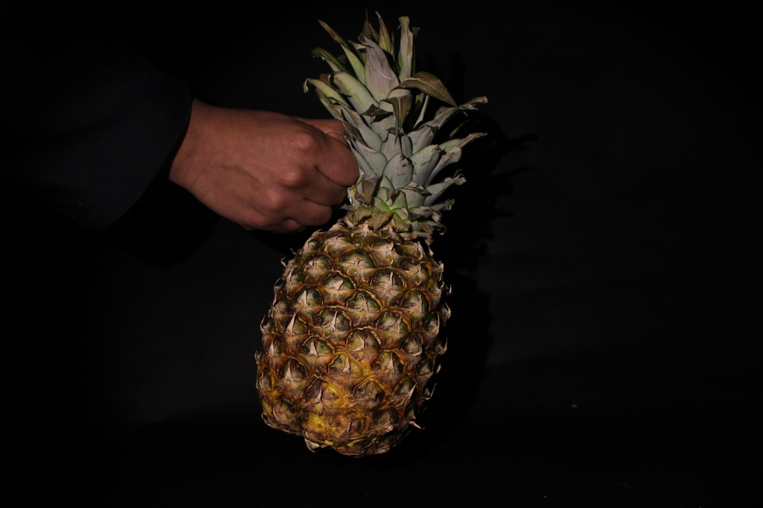
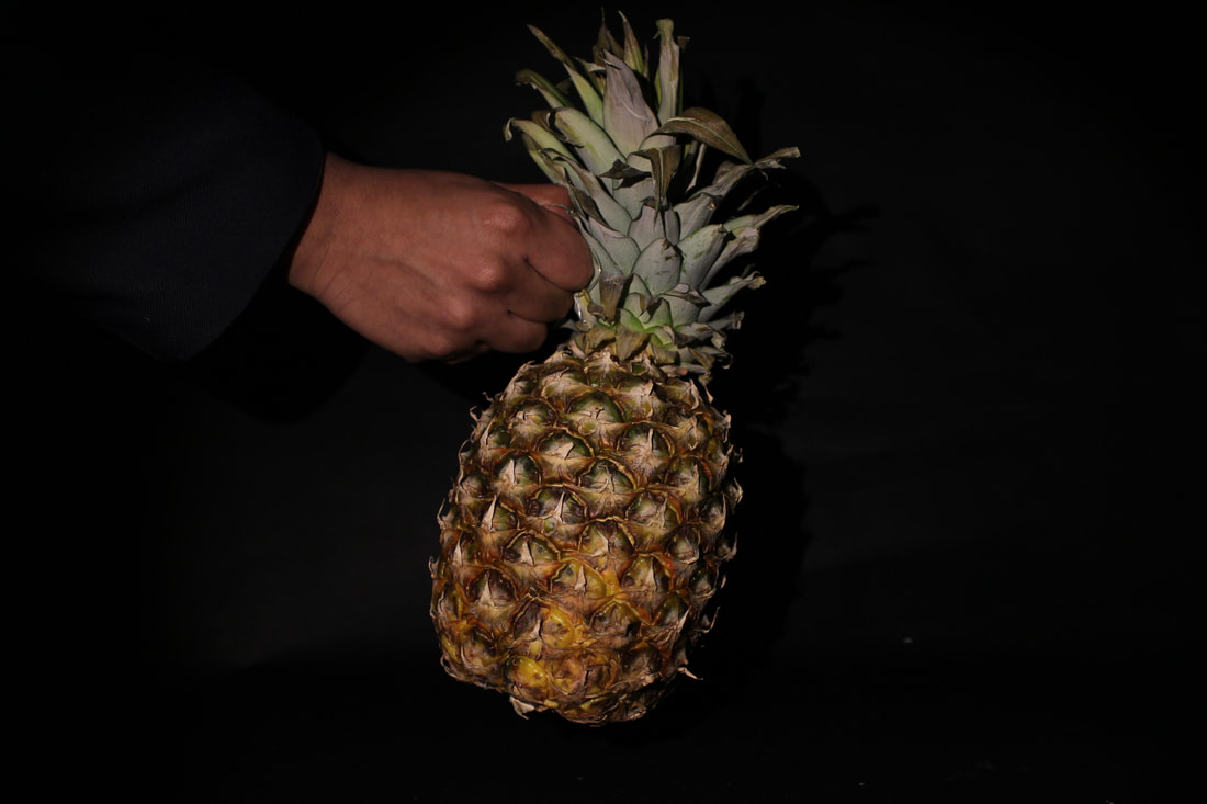
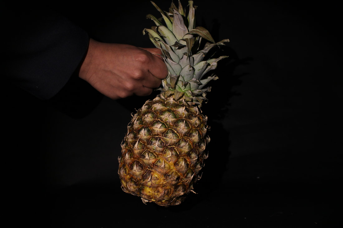
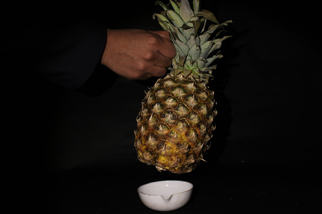
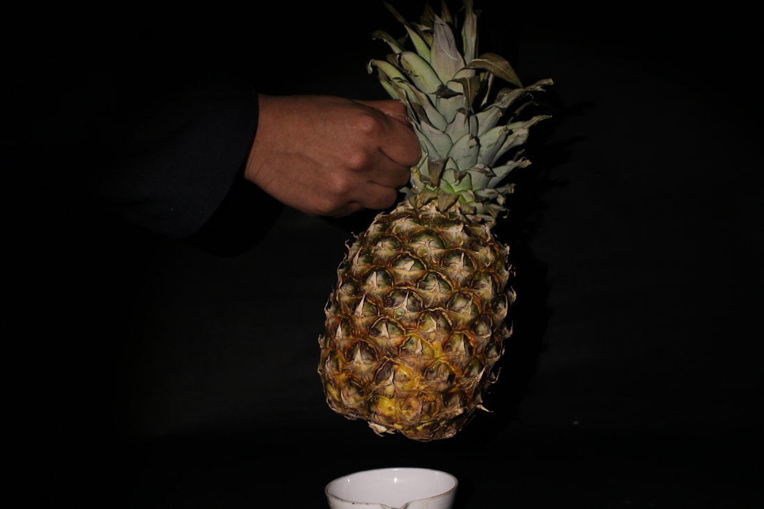
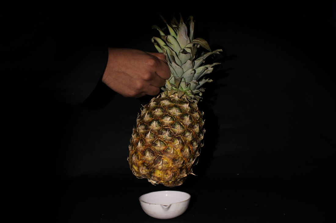
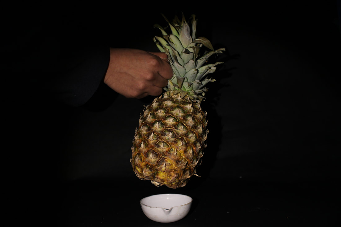
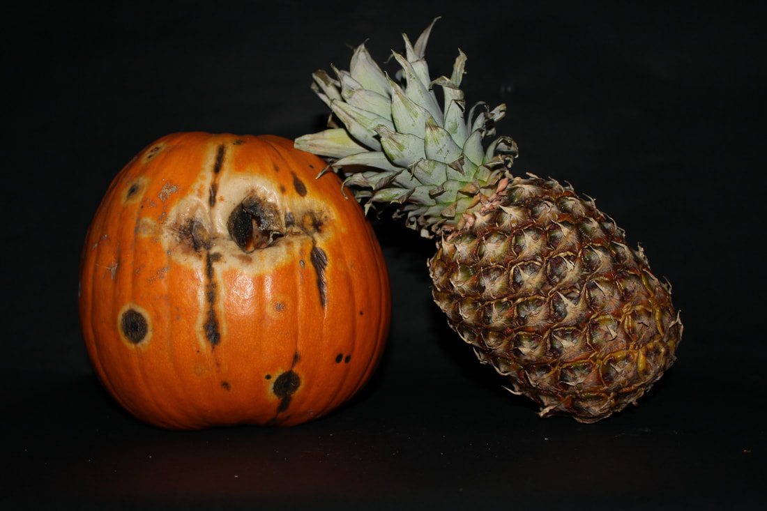
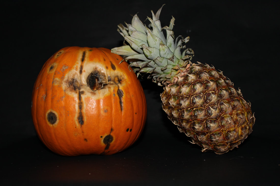
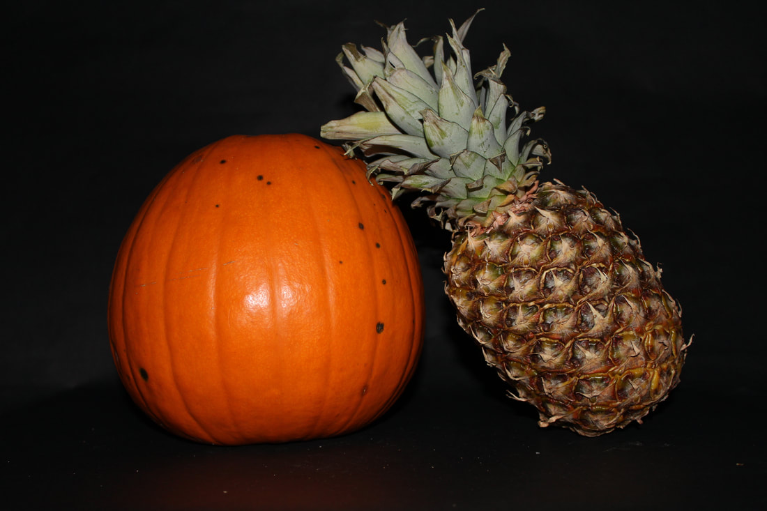
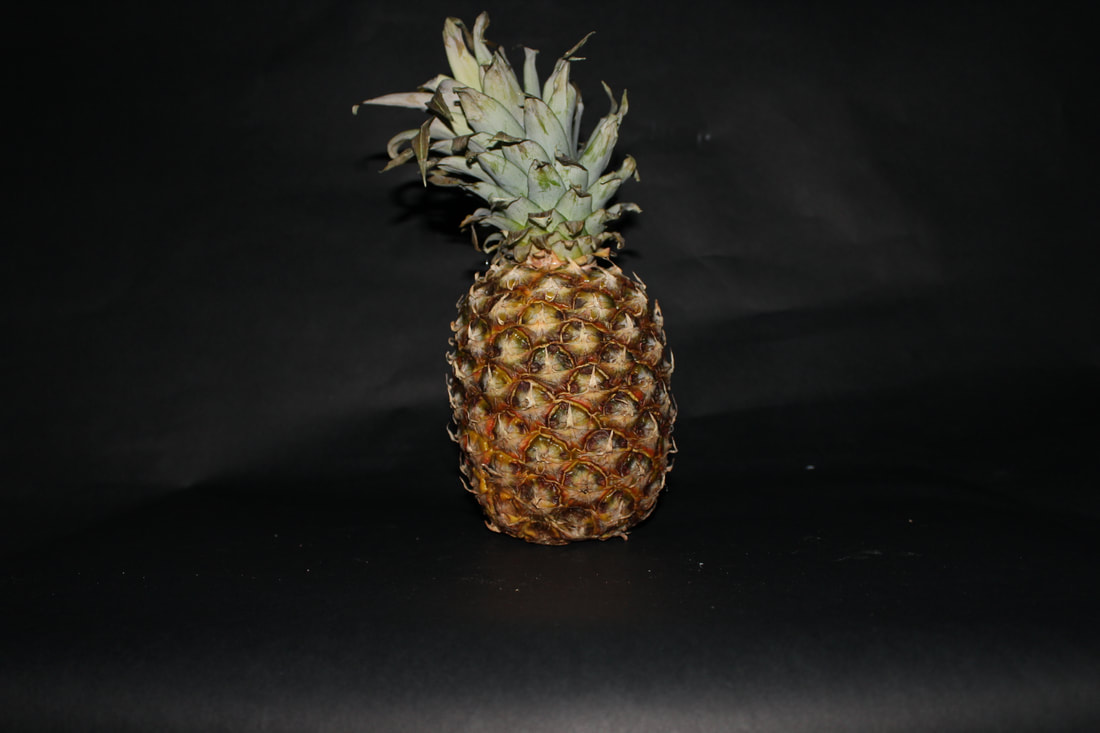
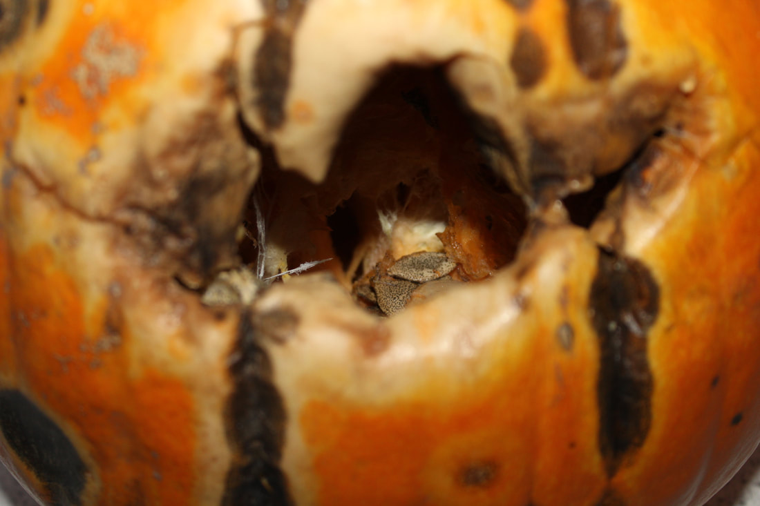
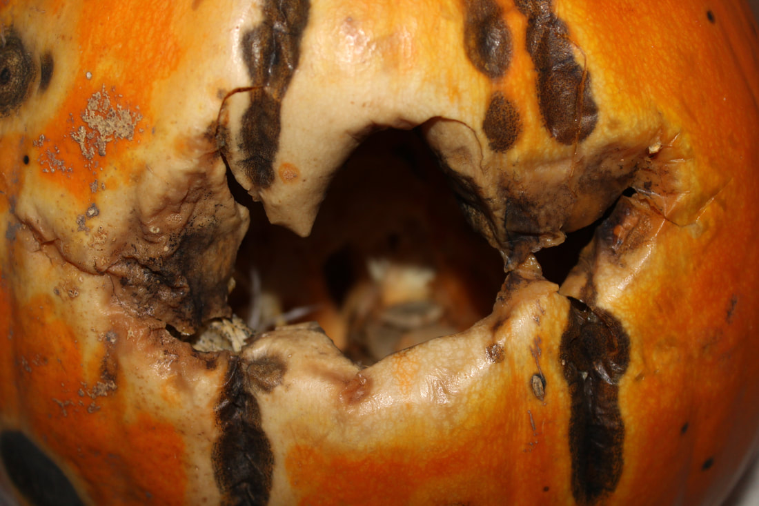
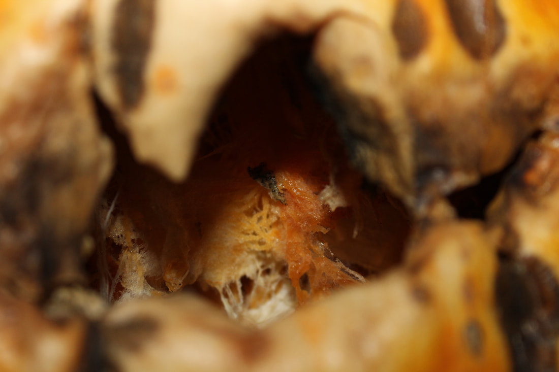
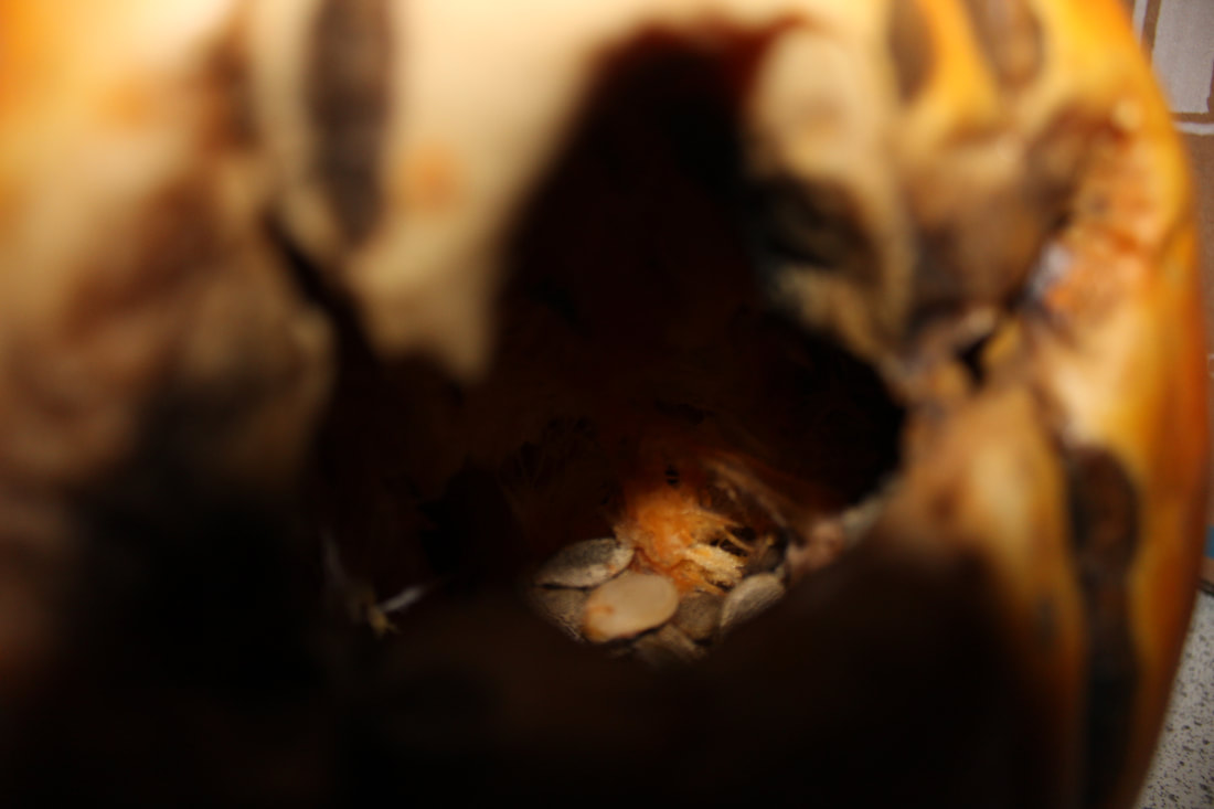
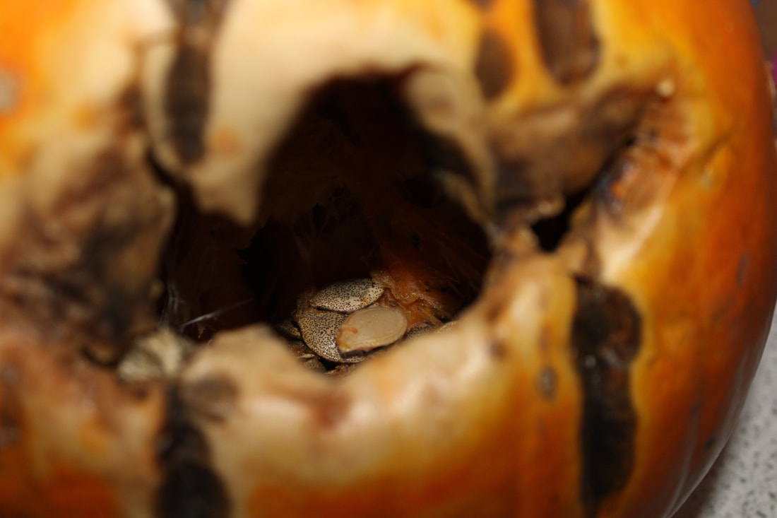
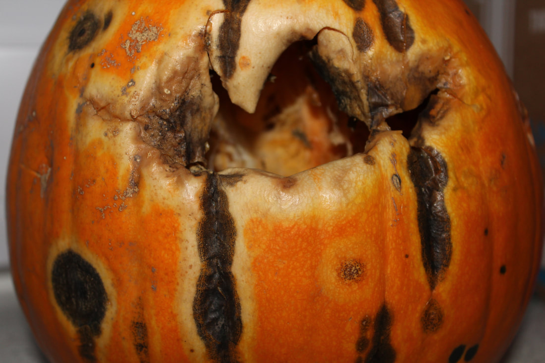
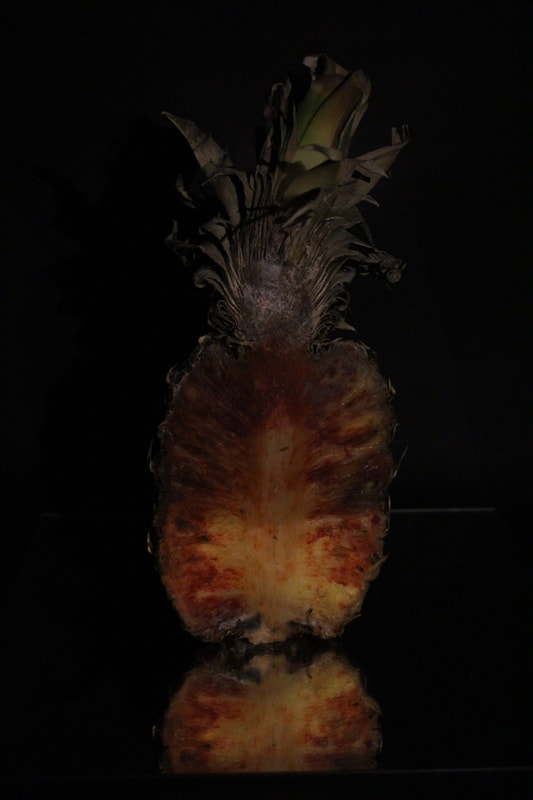
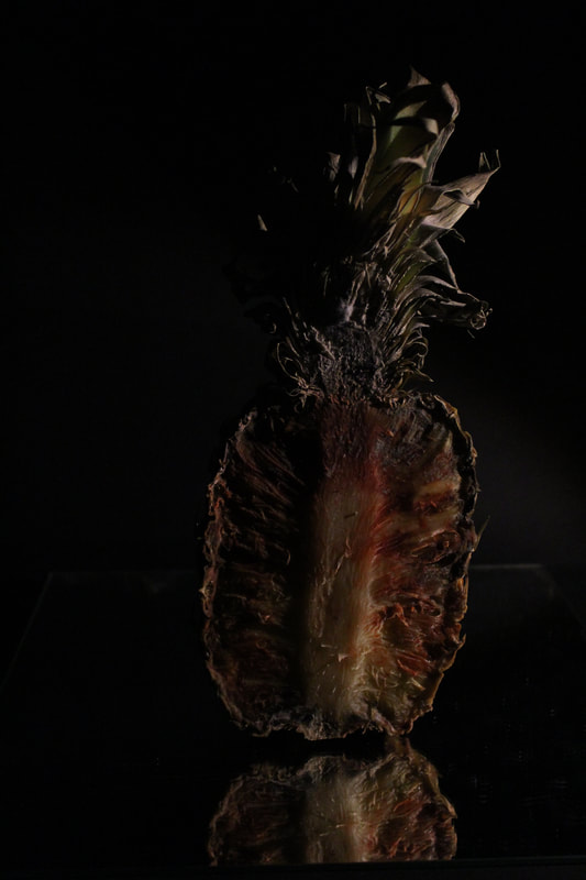
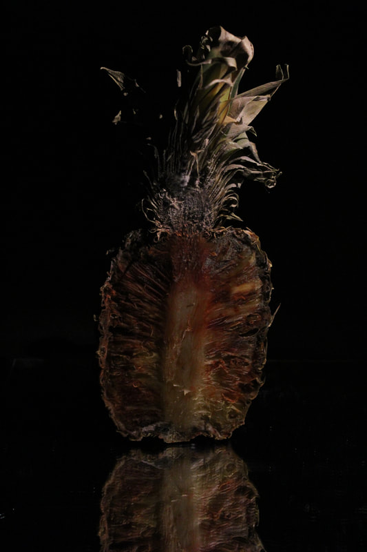
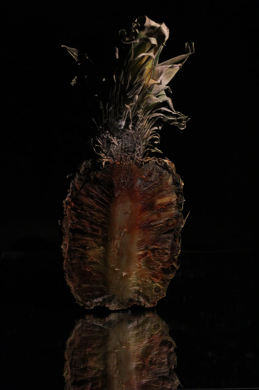
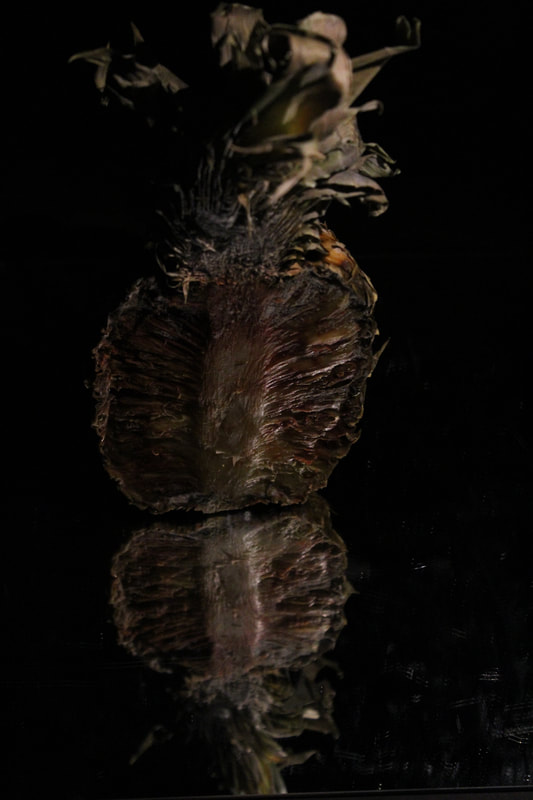
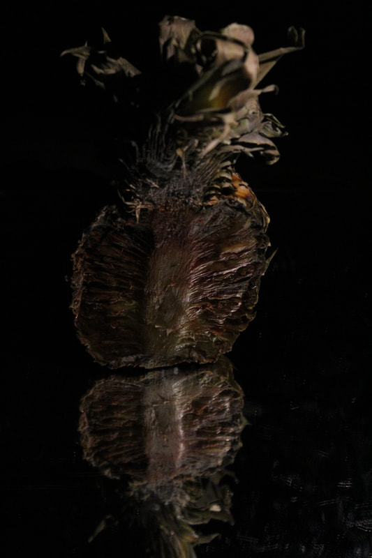
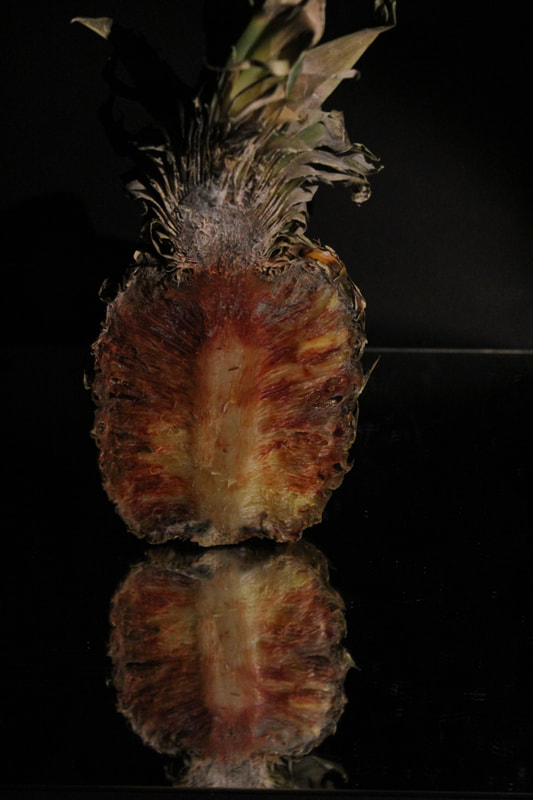
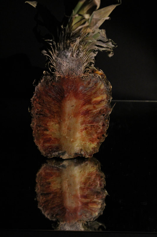
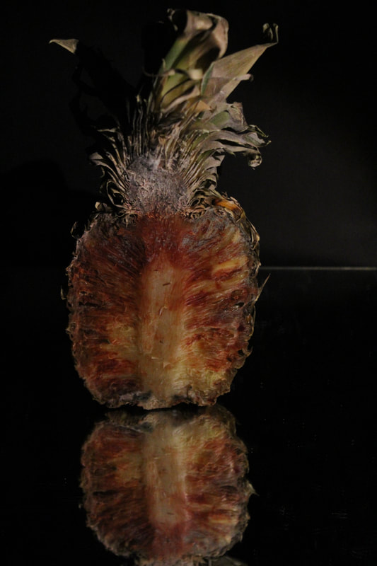
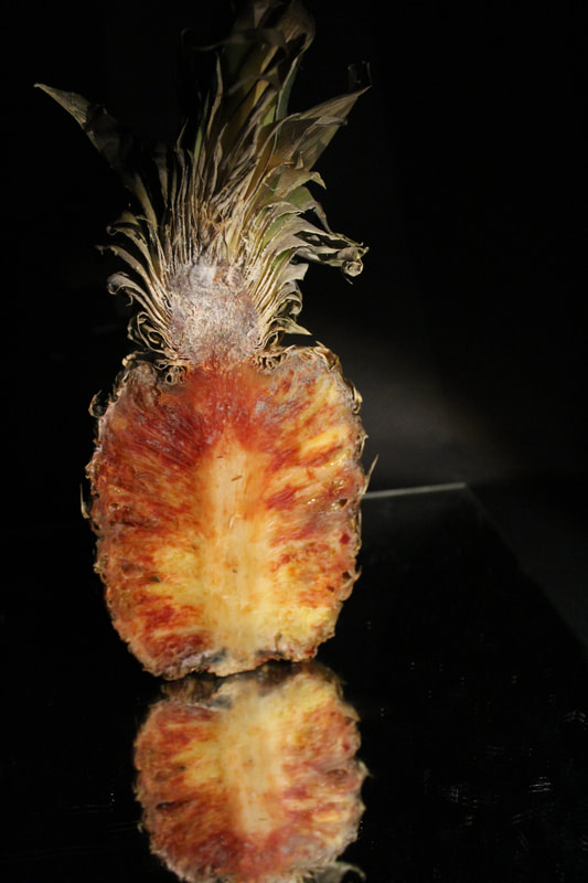
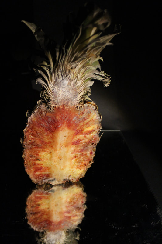
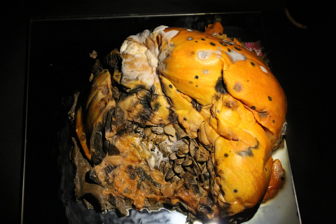
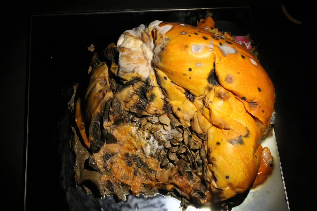
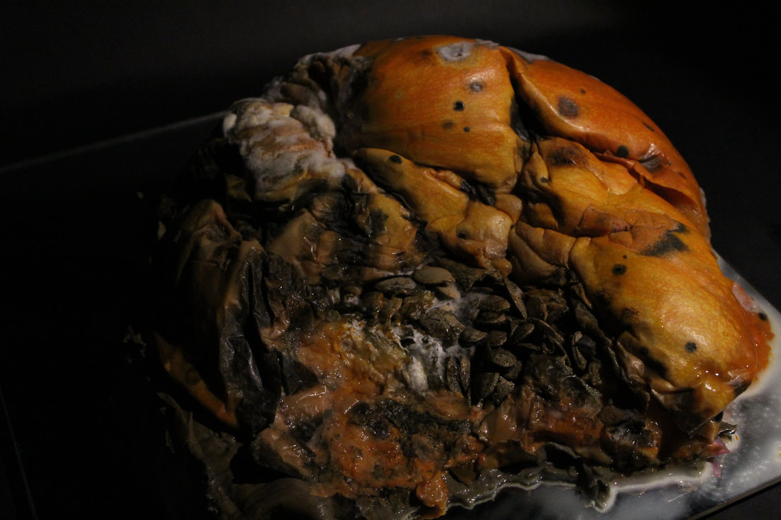
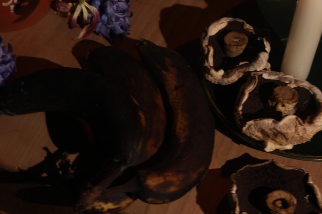
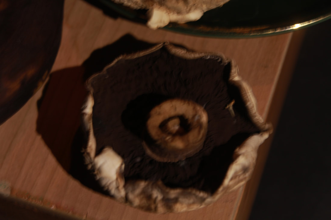
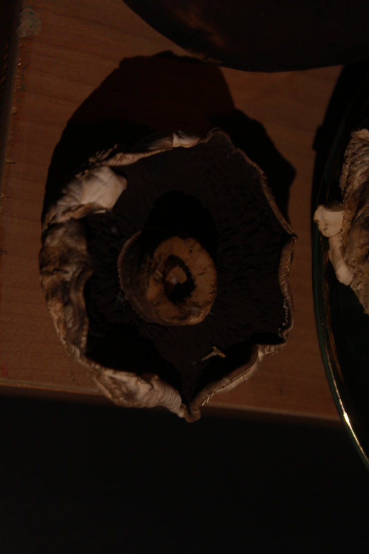
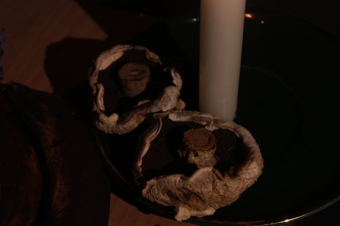
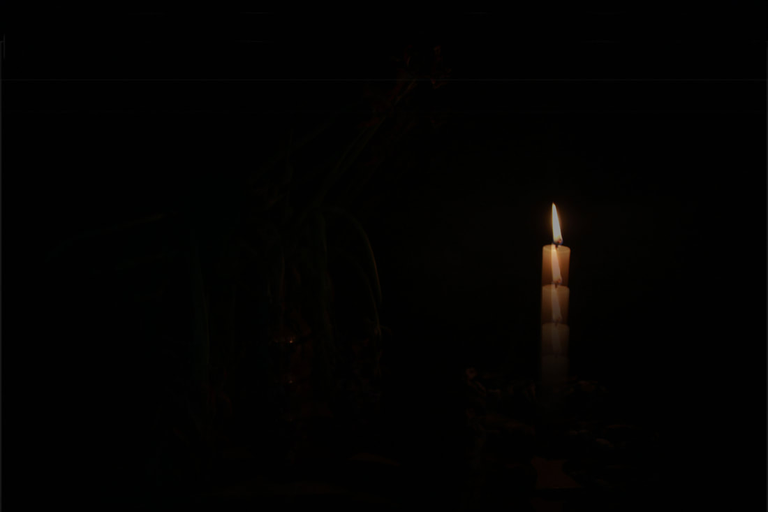
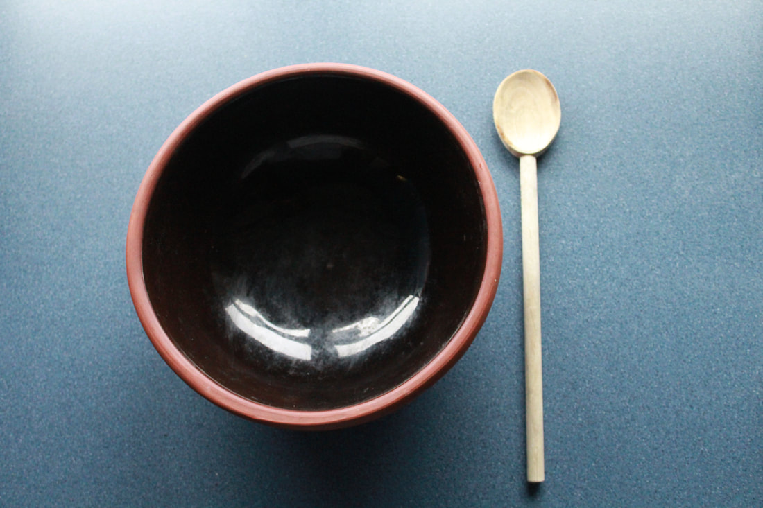
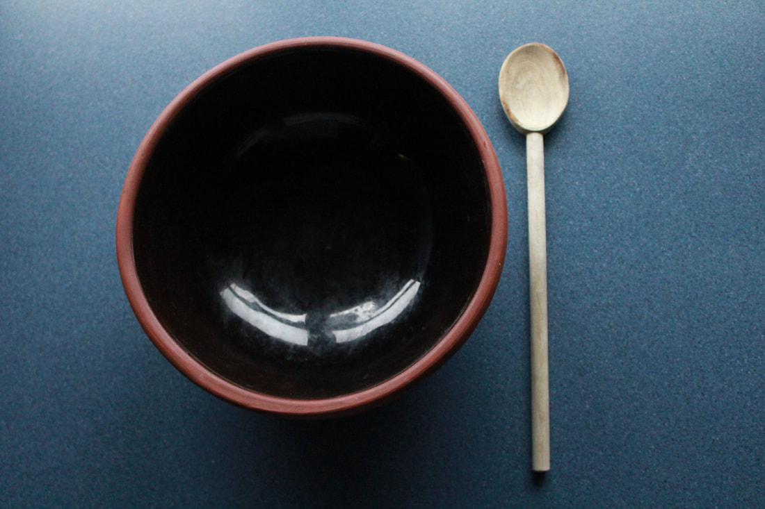
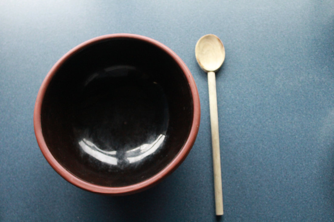
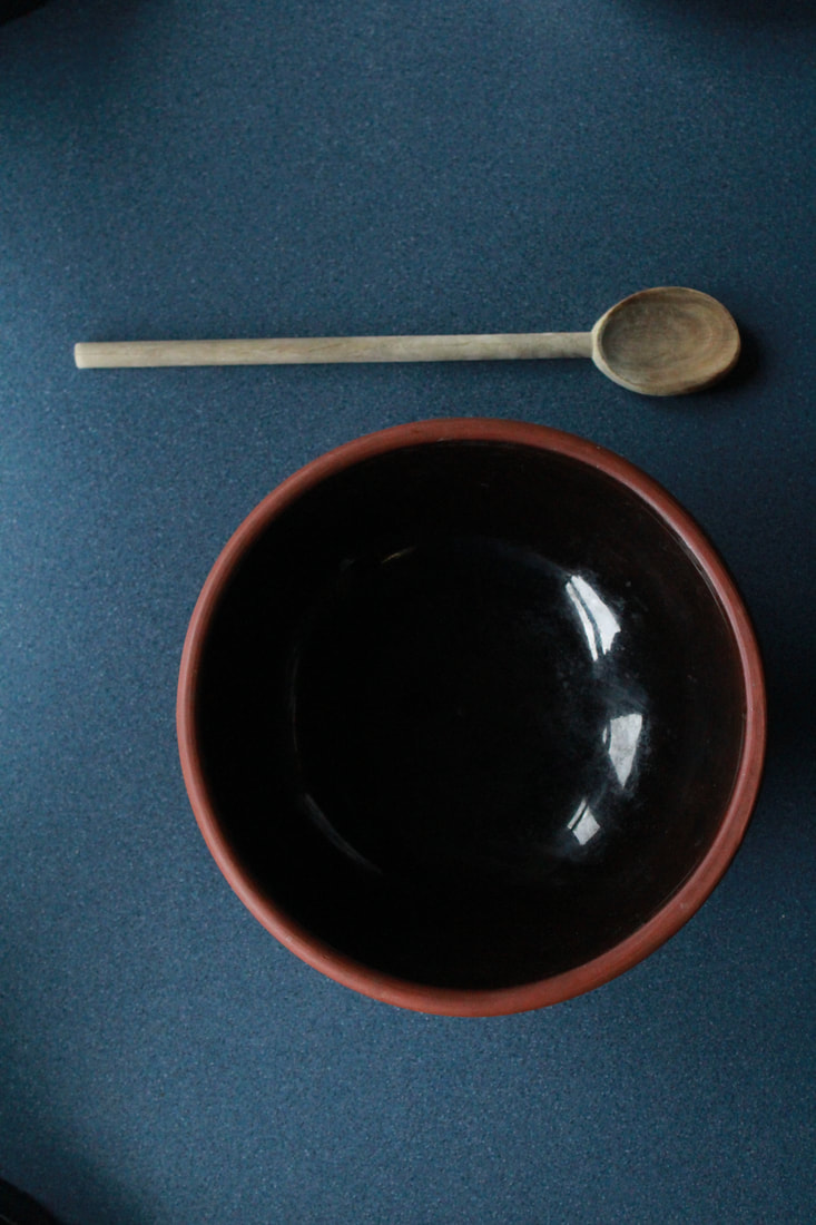
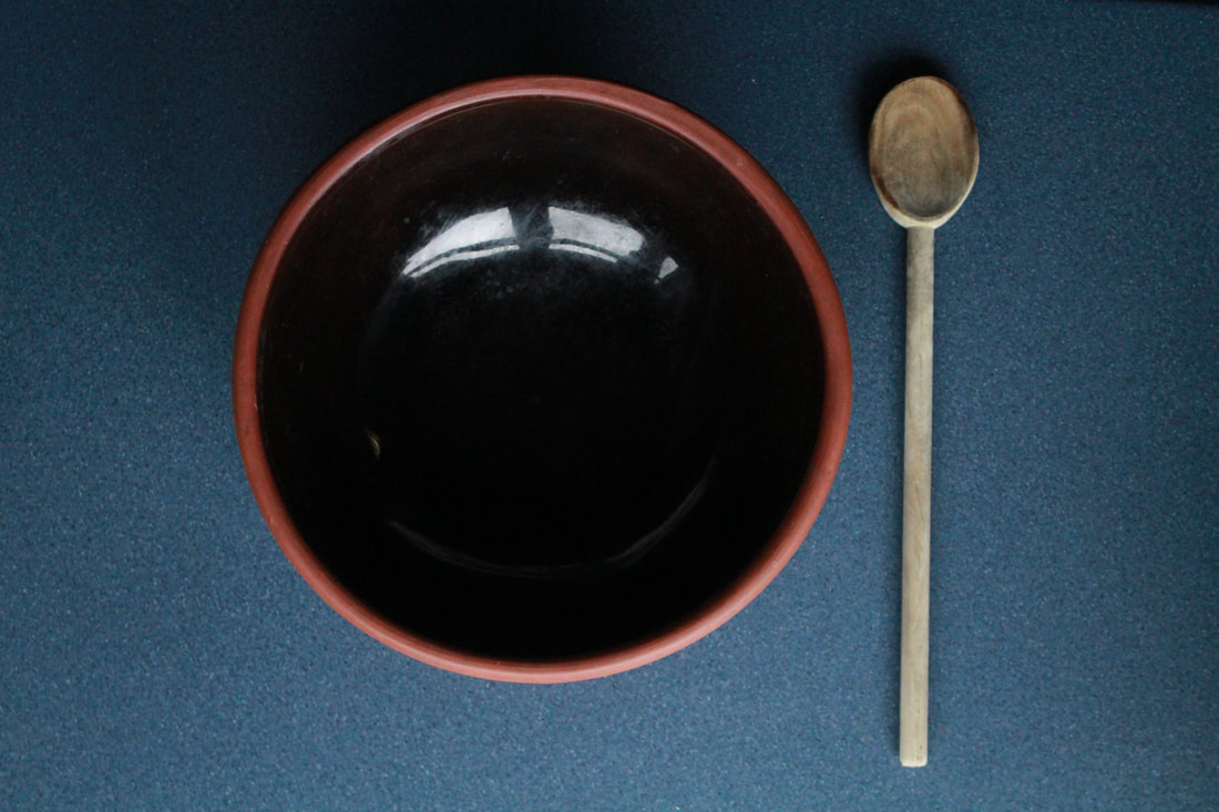
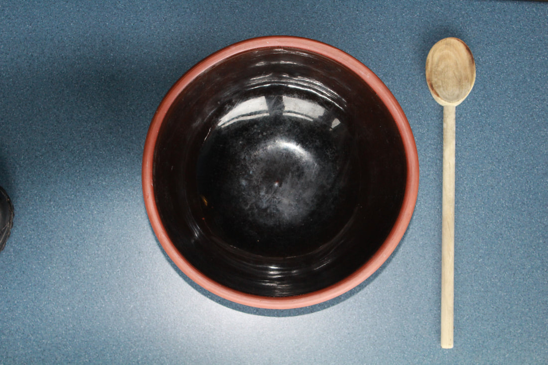
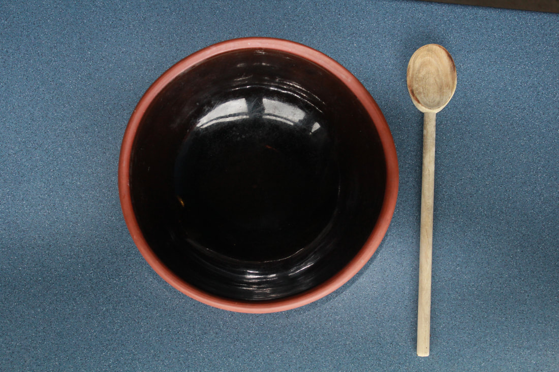
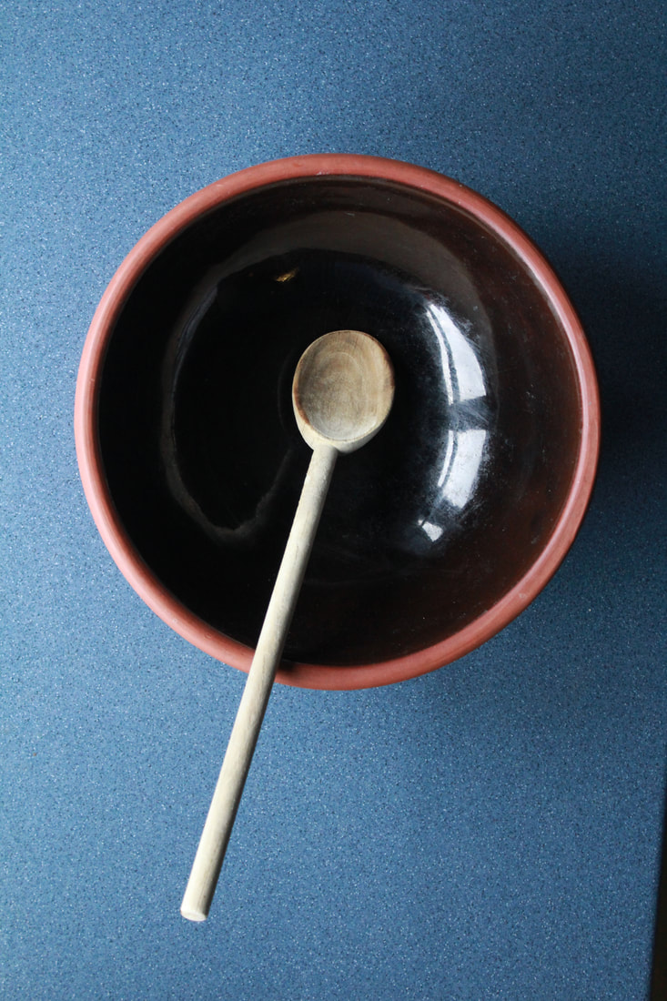
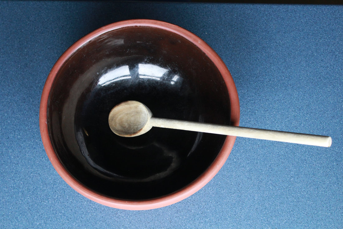
Test Shoot #1
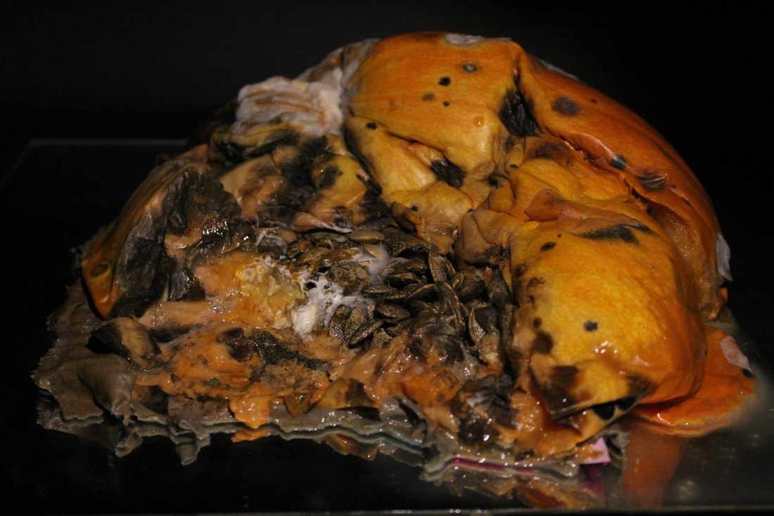
Moldy Pineapple |
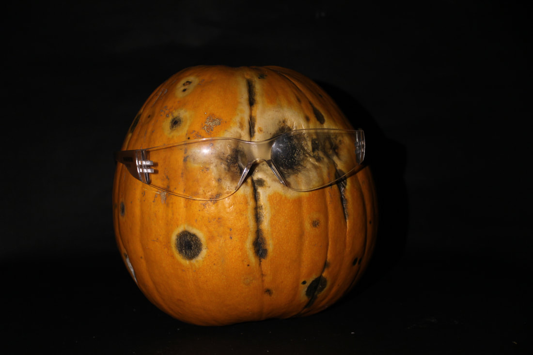
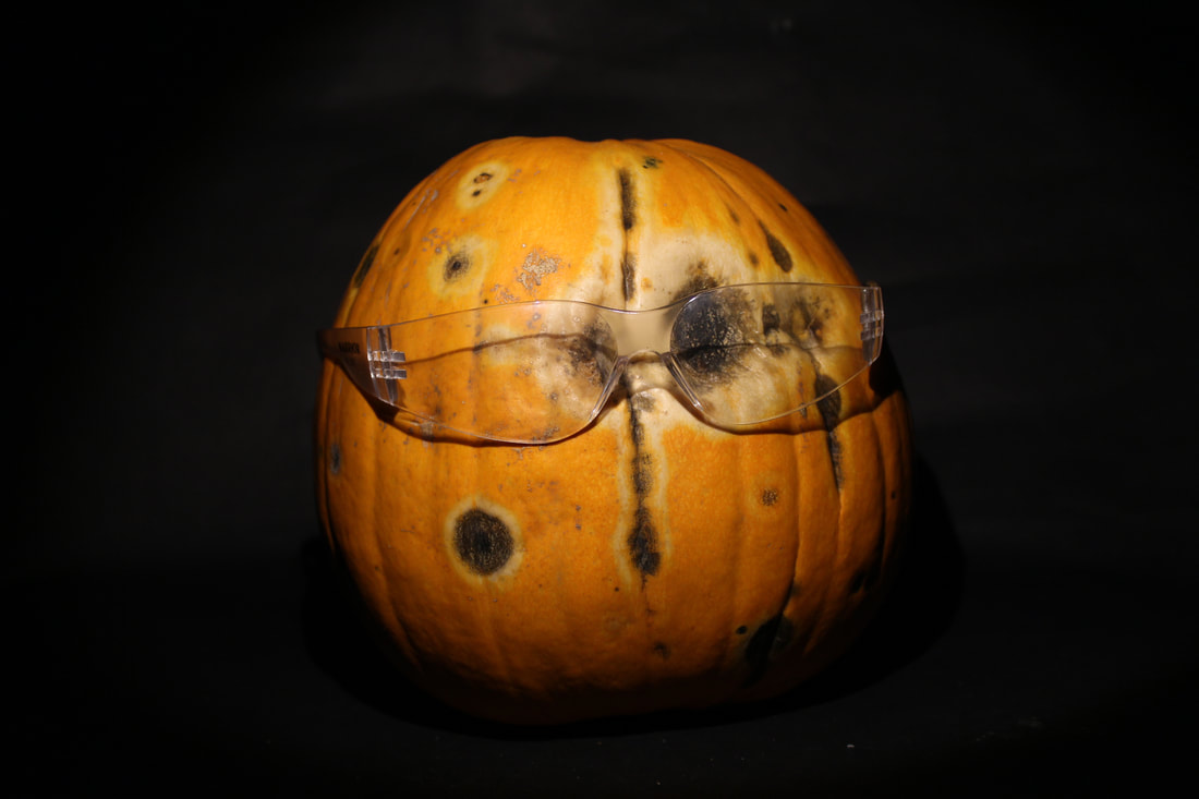
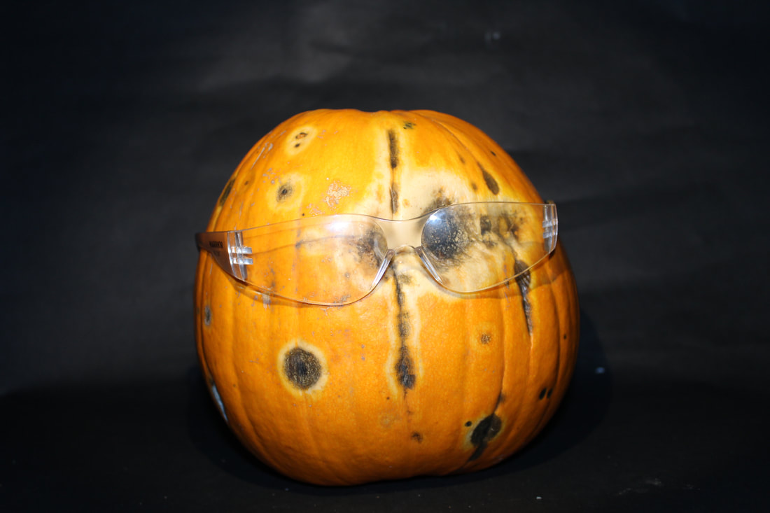
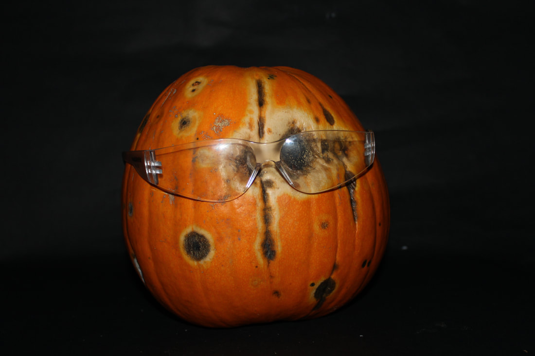
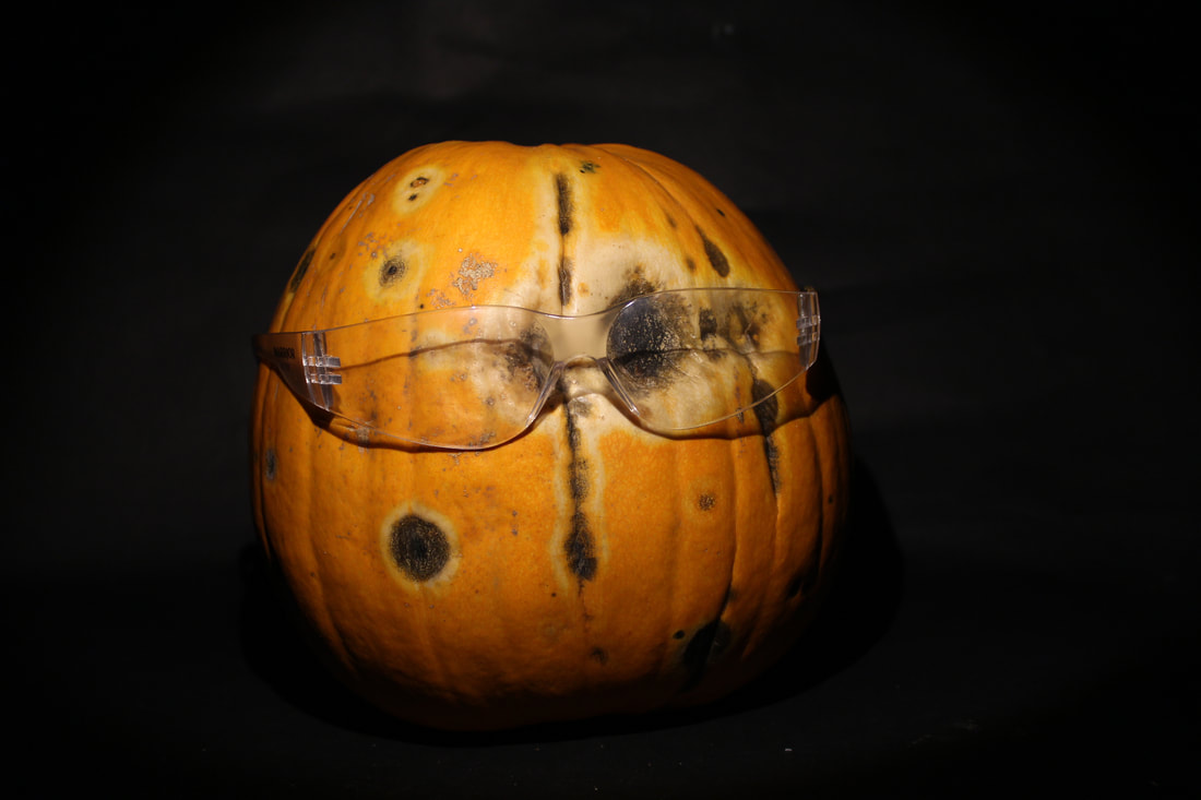
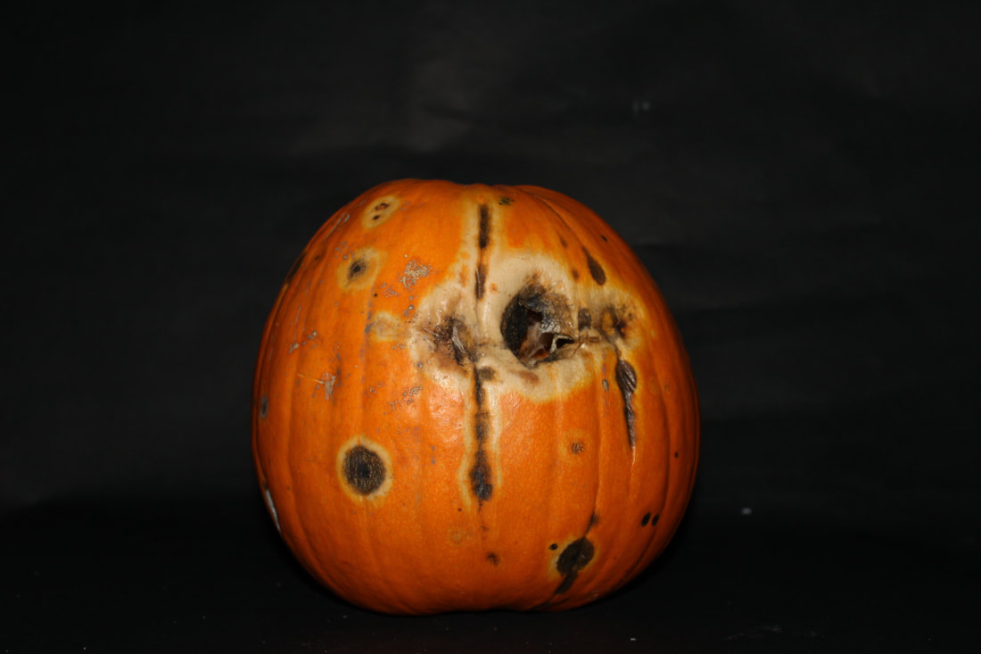
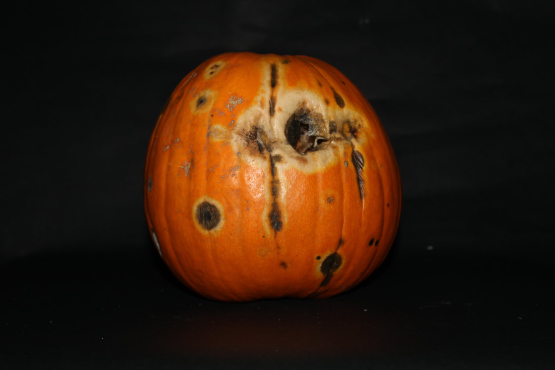
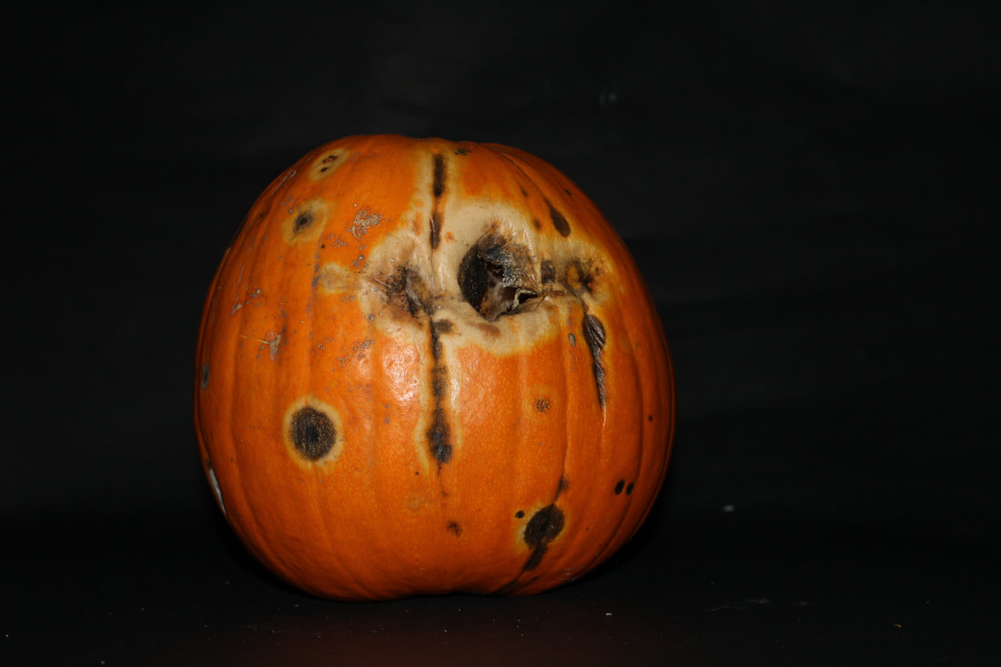
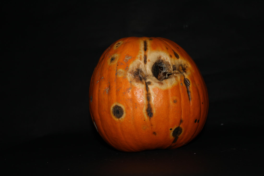
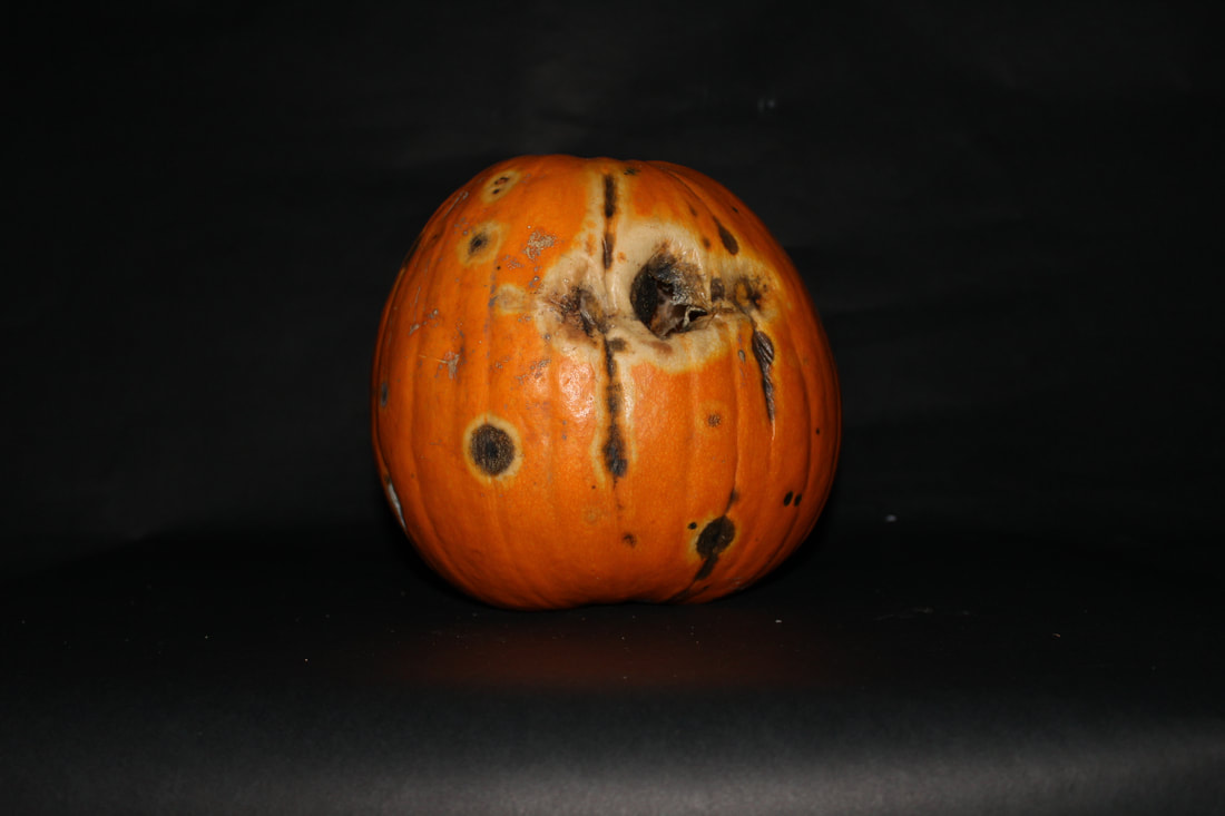
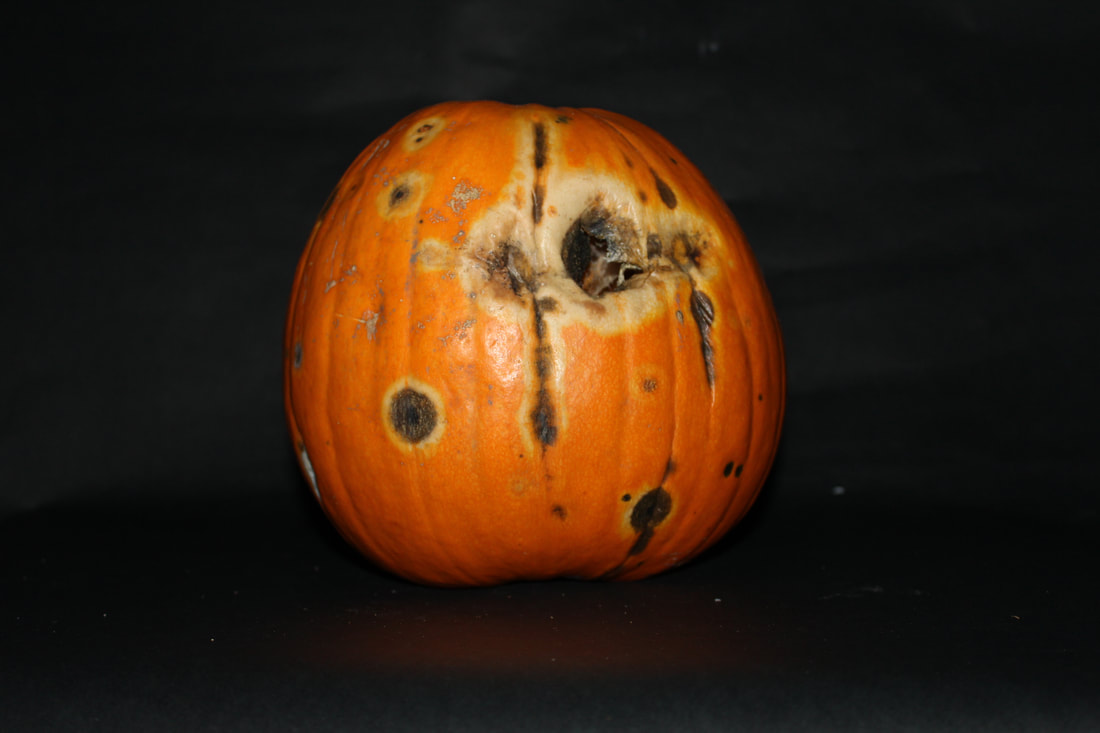
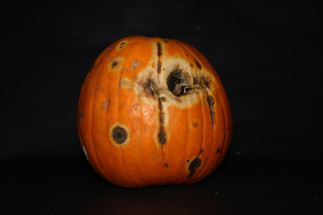
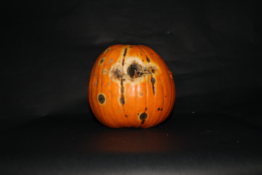
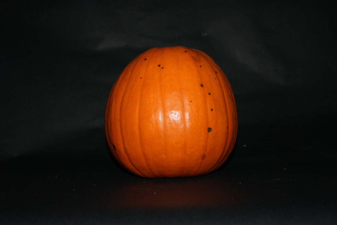
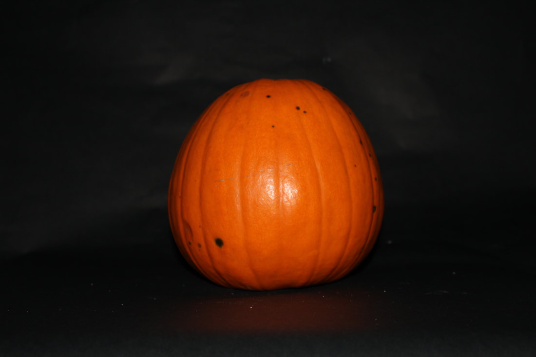
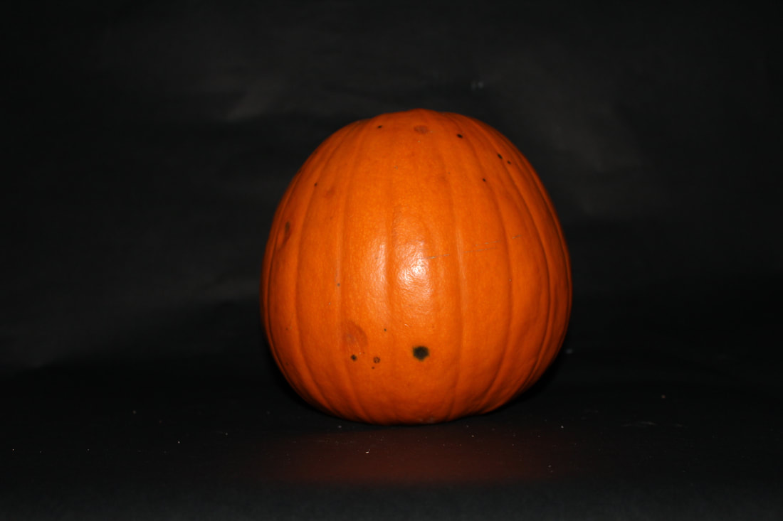
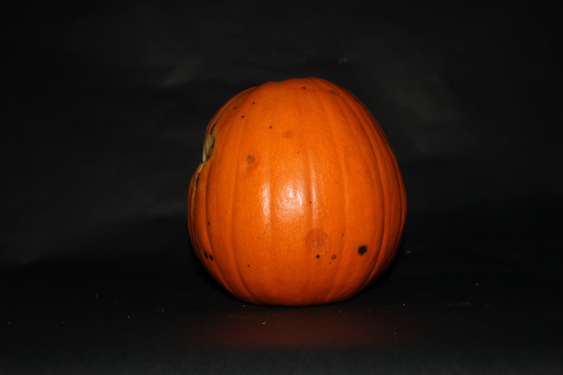
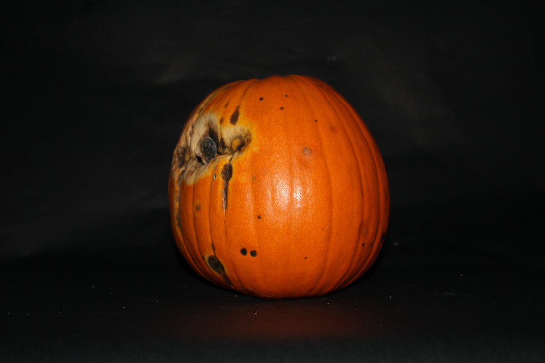
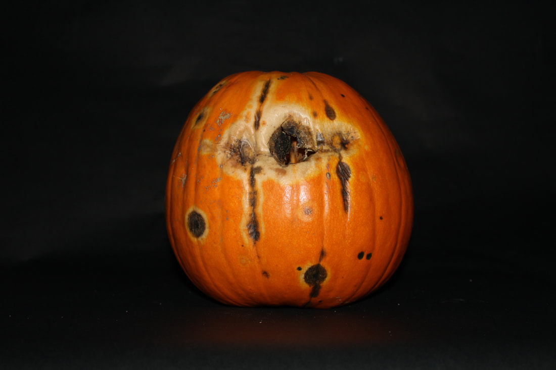
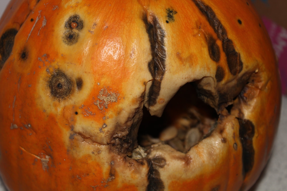
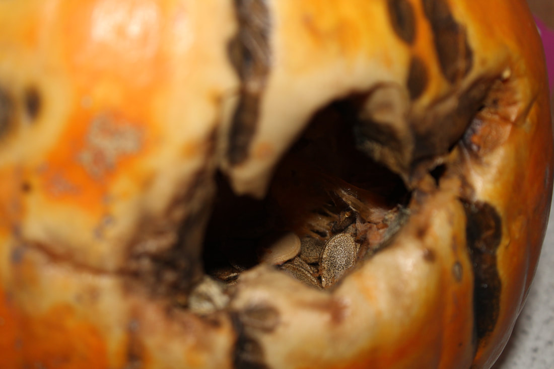
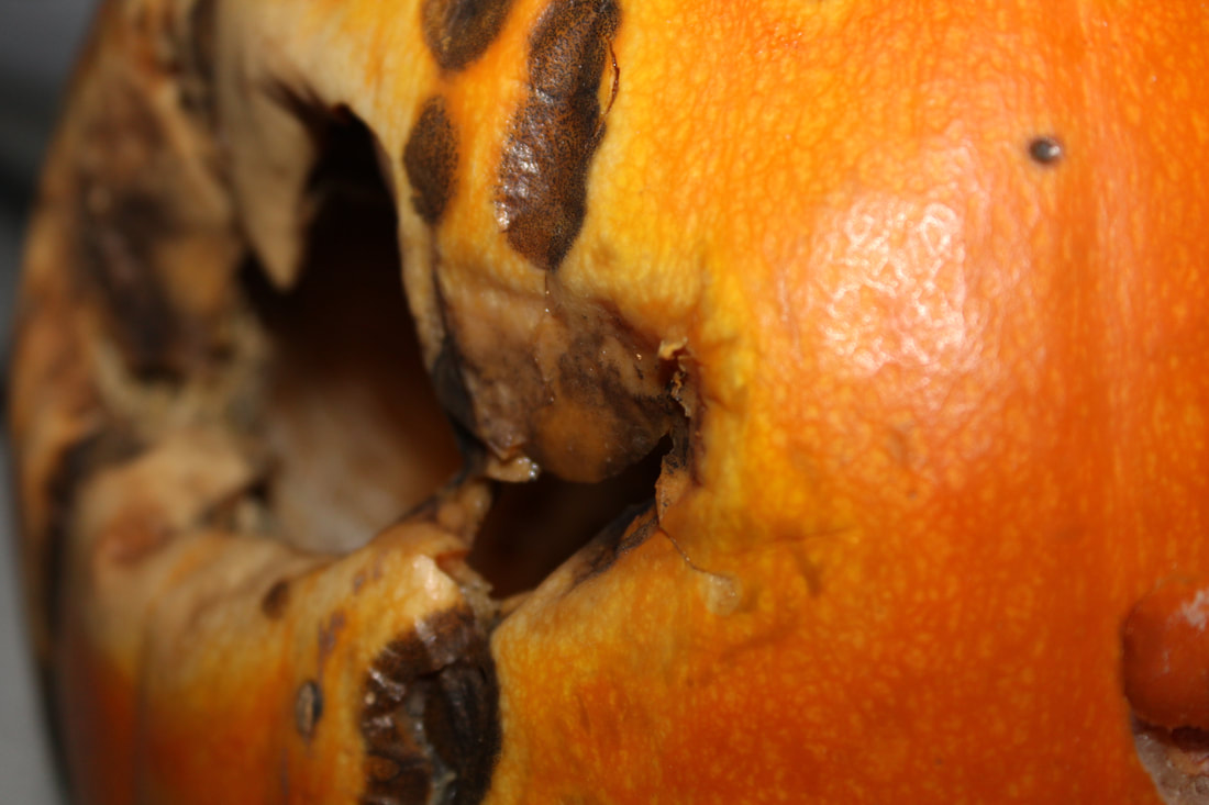
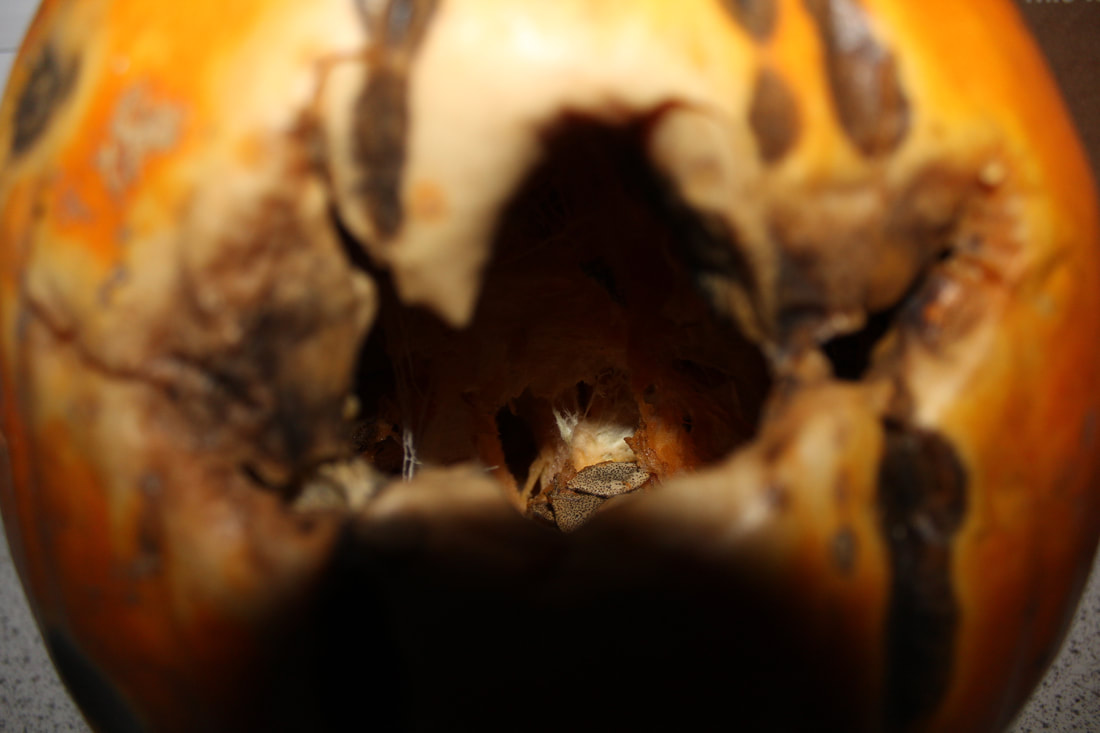
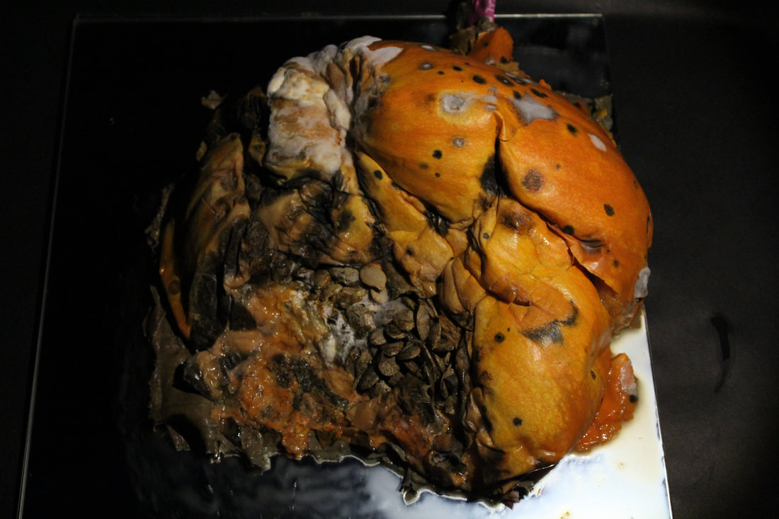
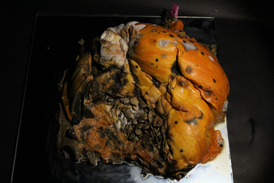
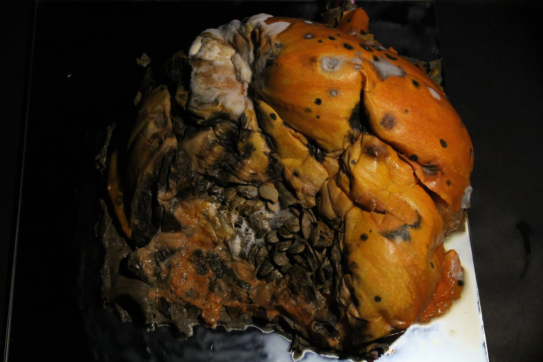
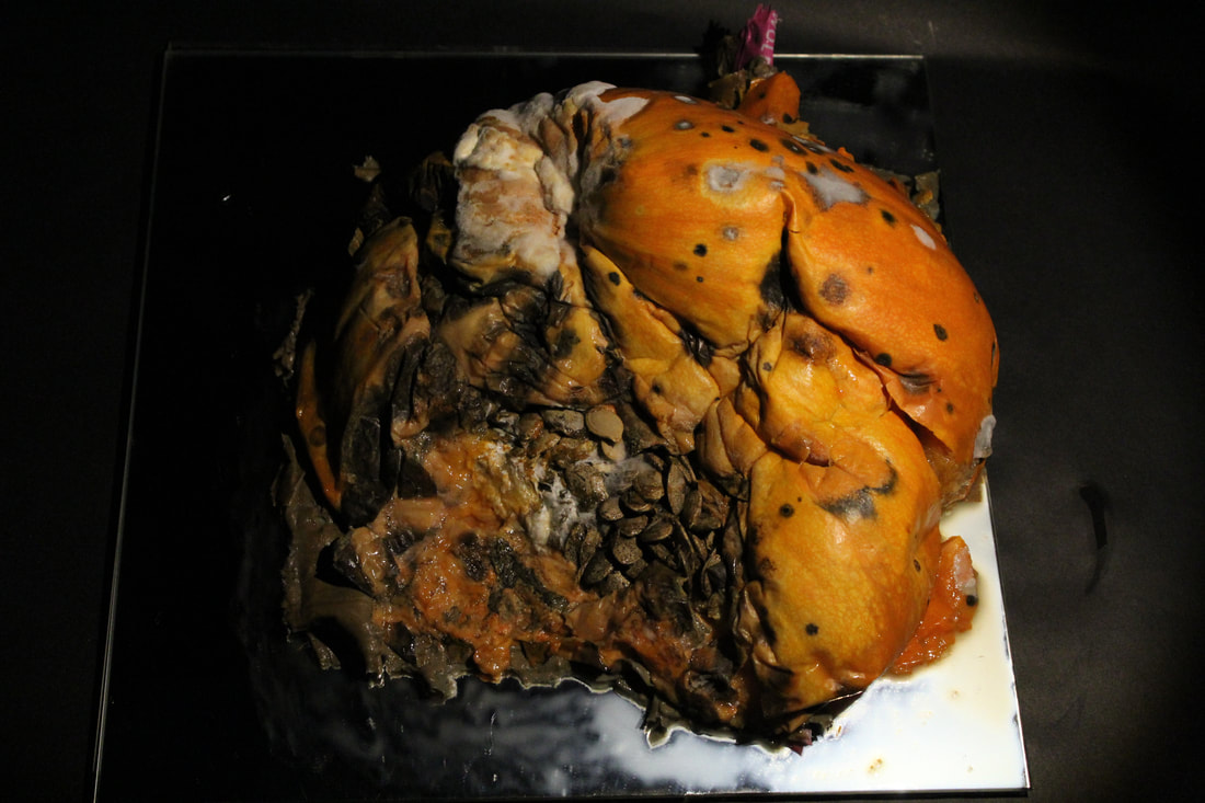
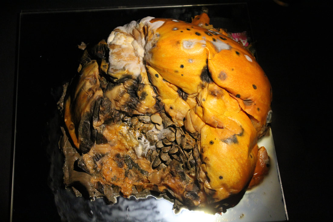
Moldy Pumpkin |
                     |
                     |
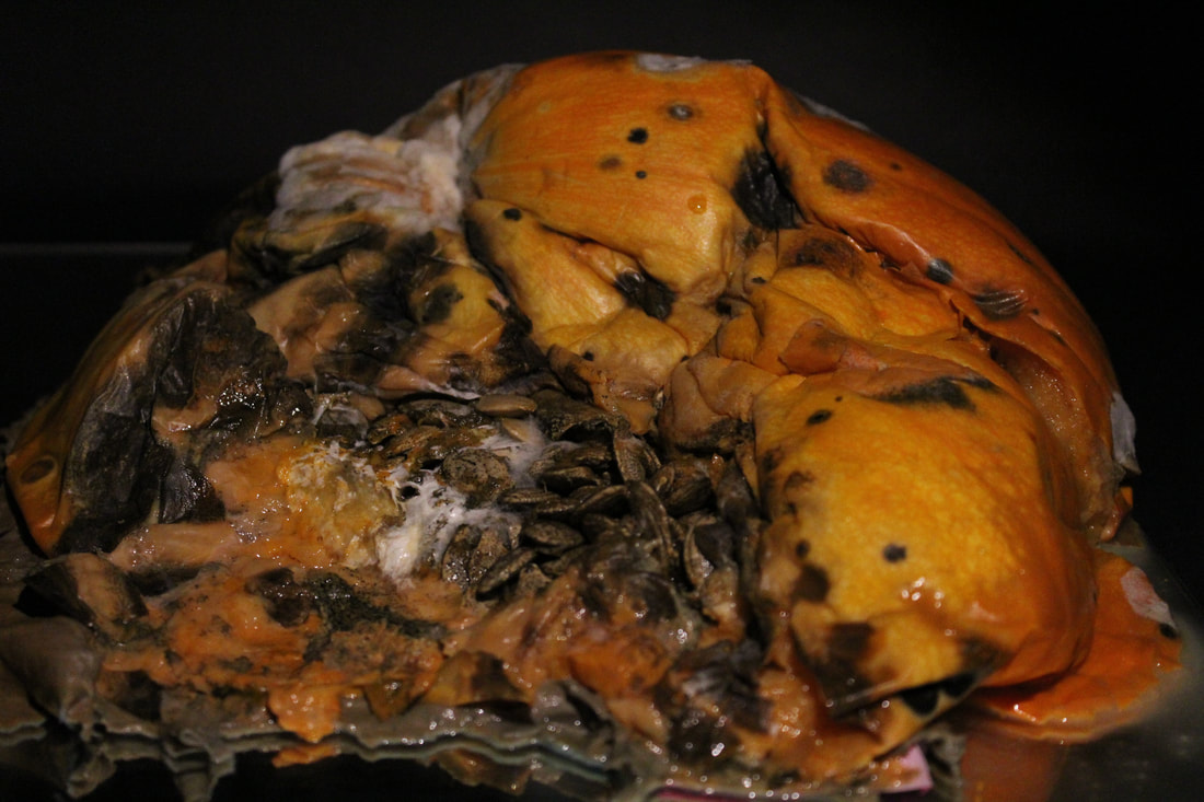
Moldy Pineapple & Pumpkin |
Spinning Pumpkin |
     |
      |
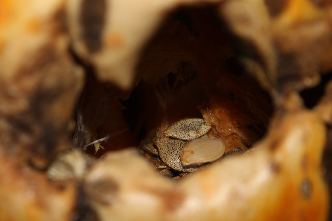
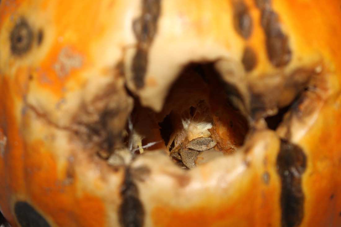
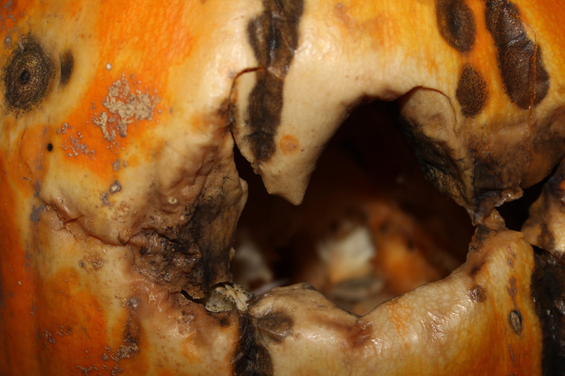
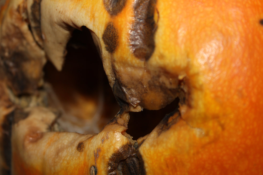
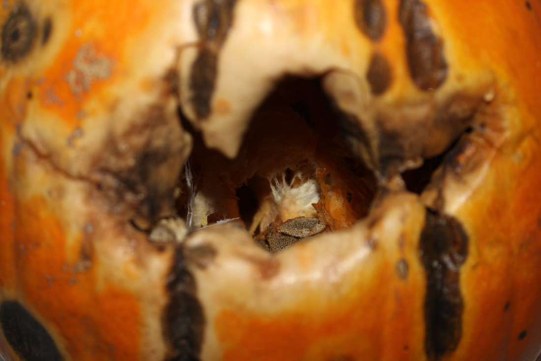
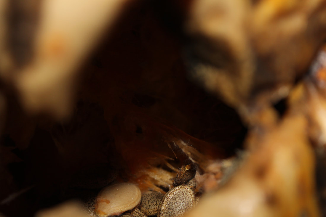
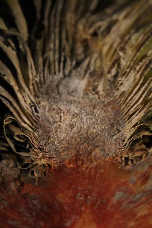
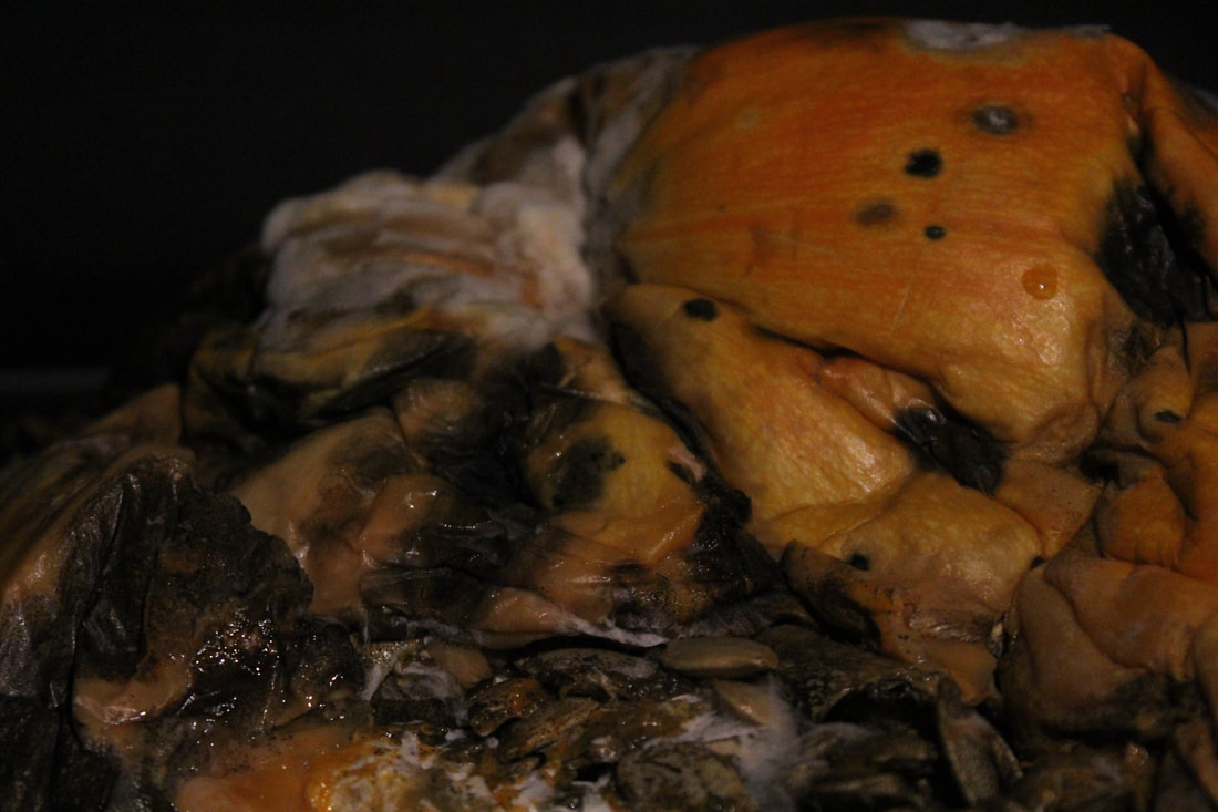
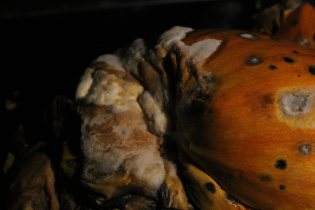
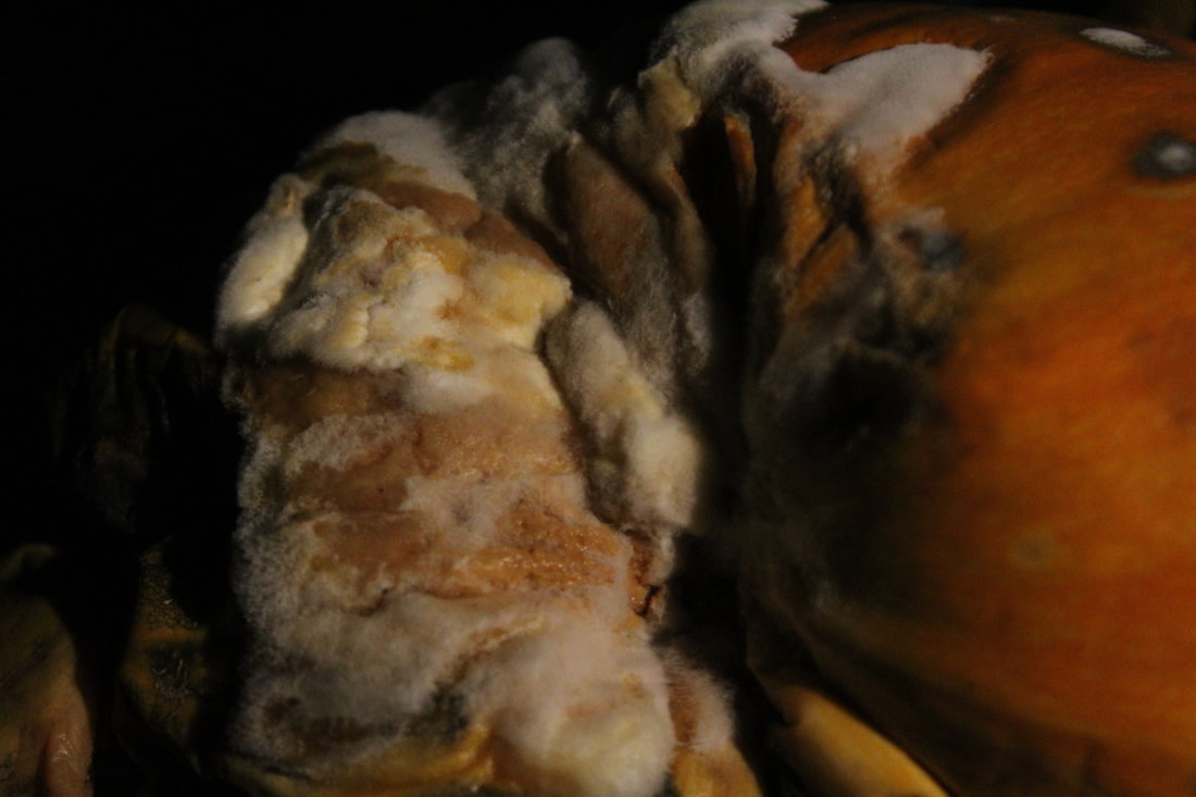
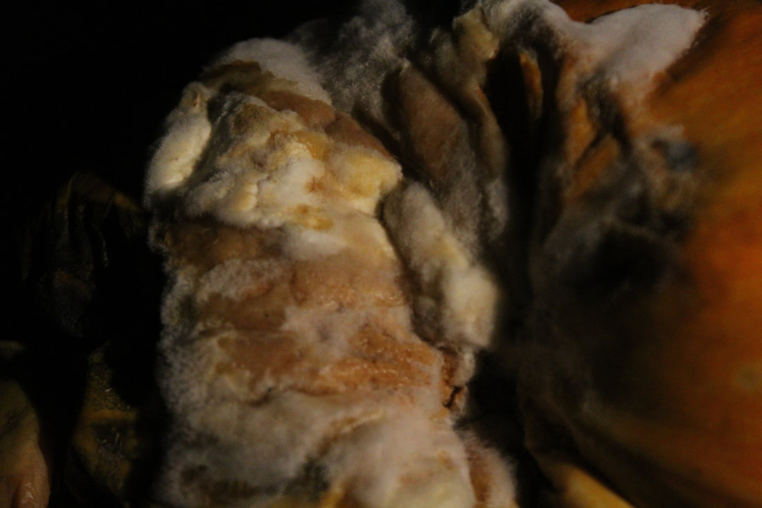
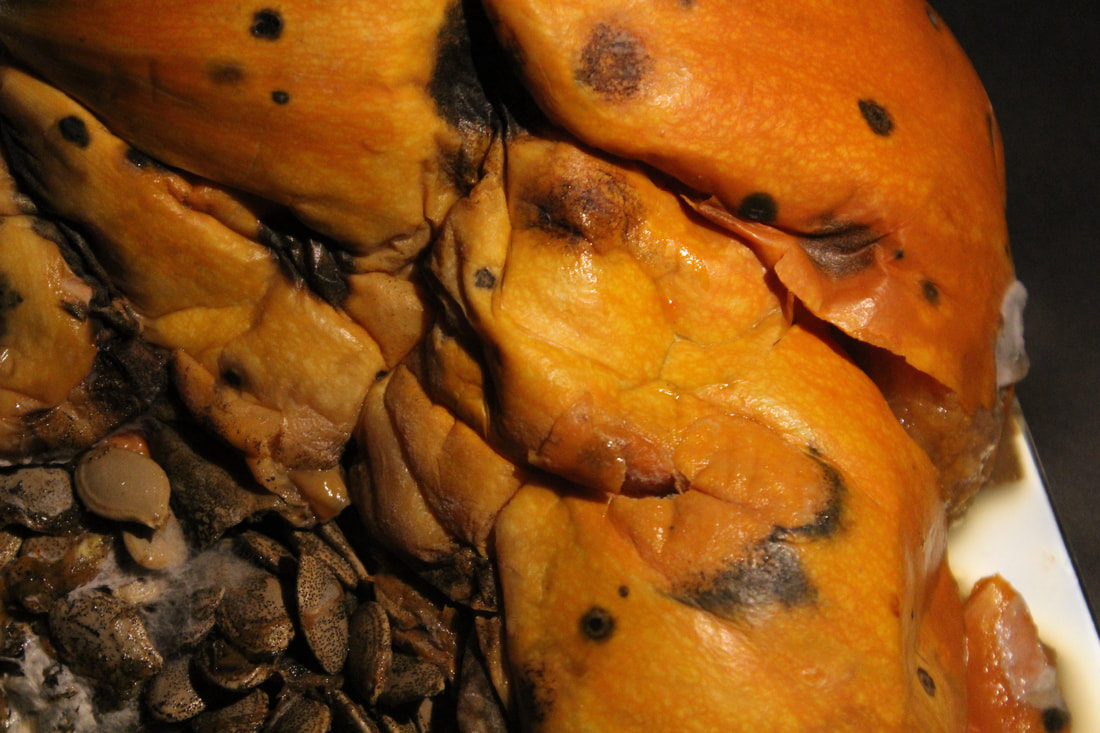
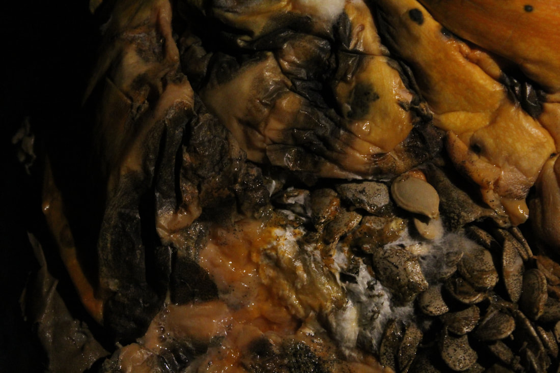
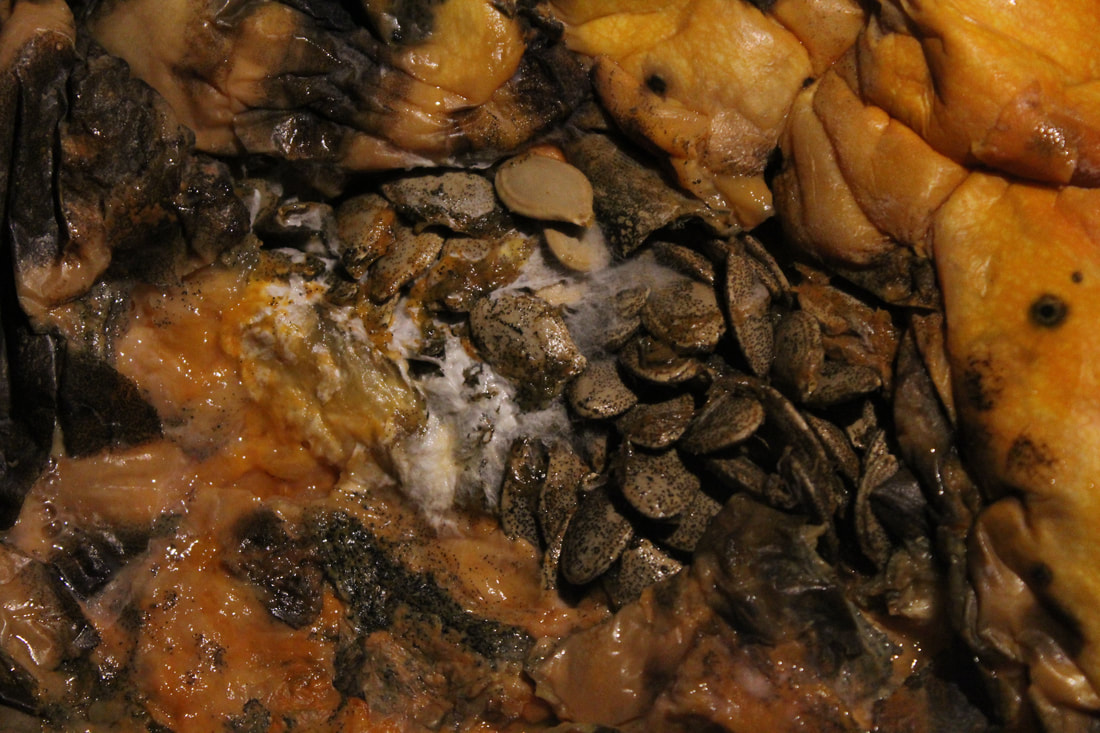
Mold Close Ups
                |
         |
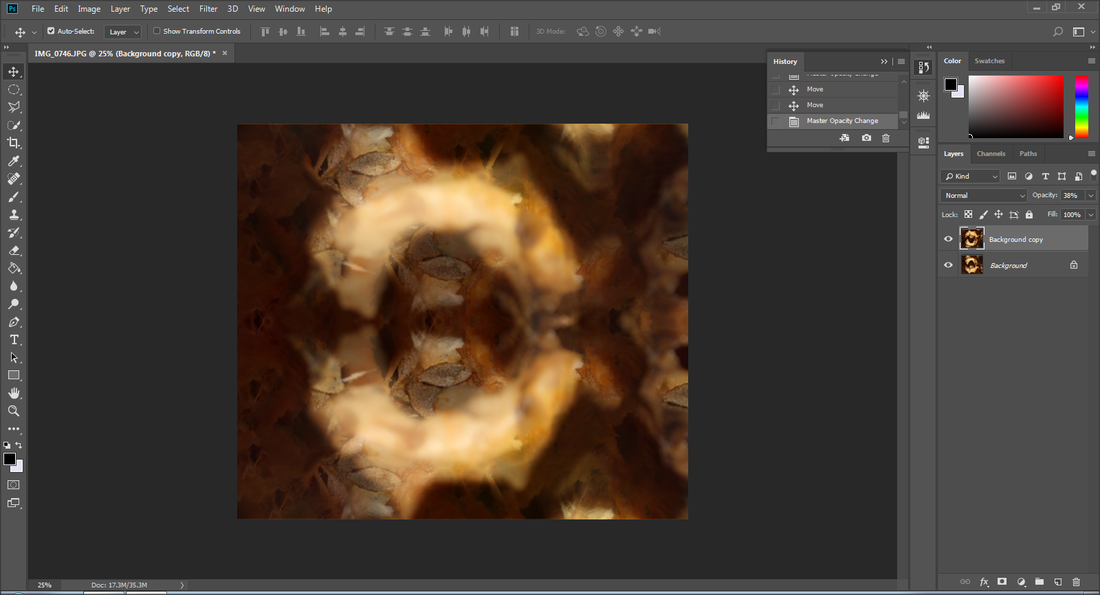
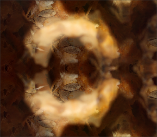
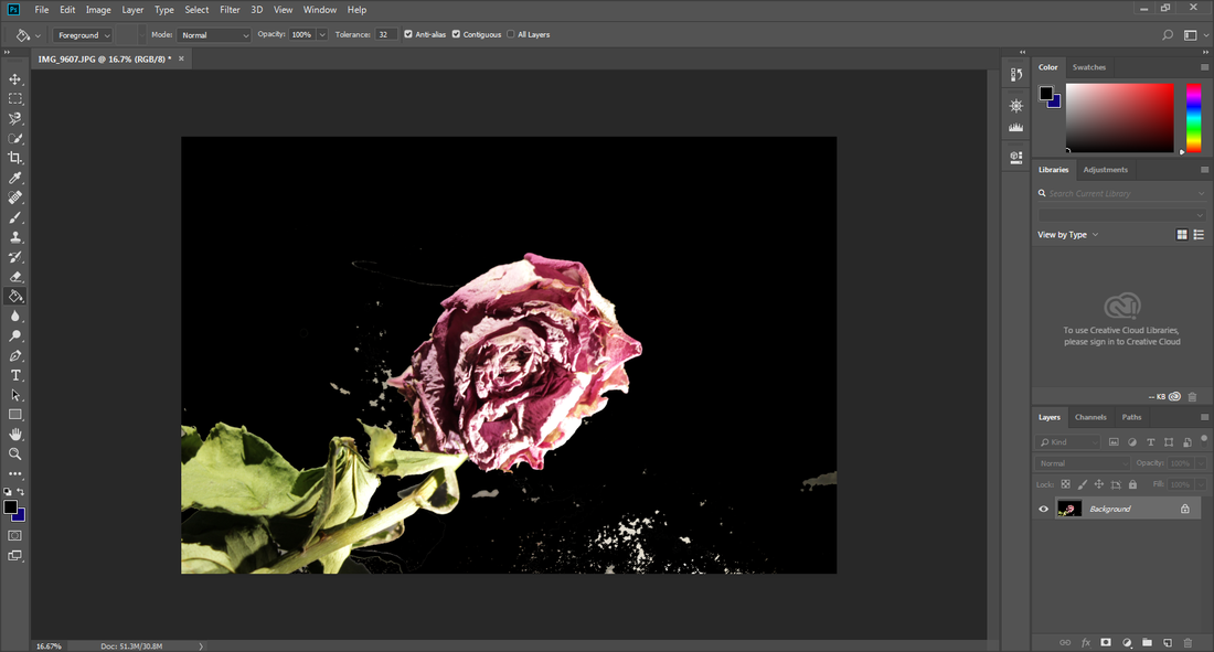
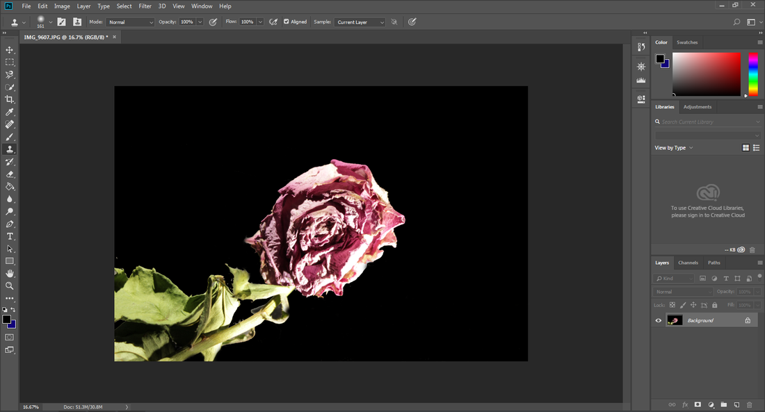
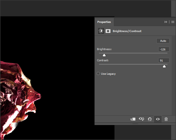
Photoshop
Final outcome
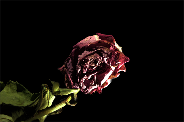
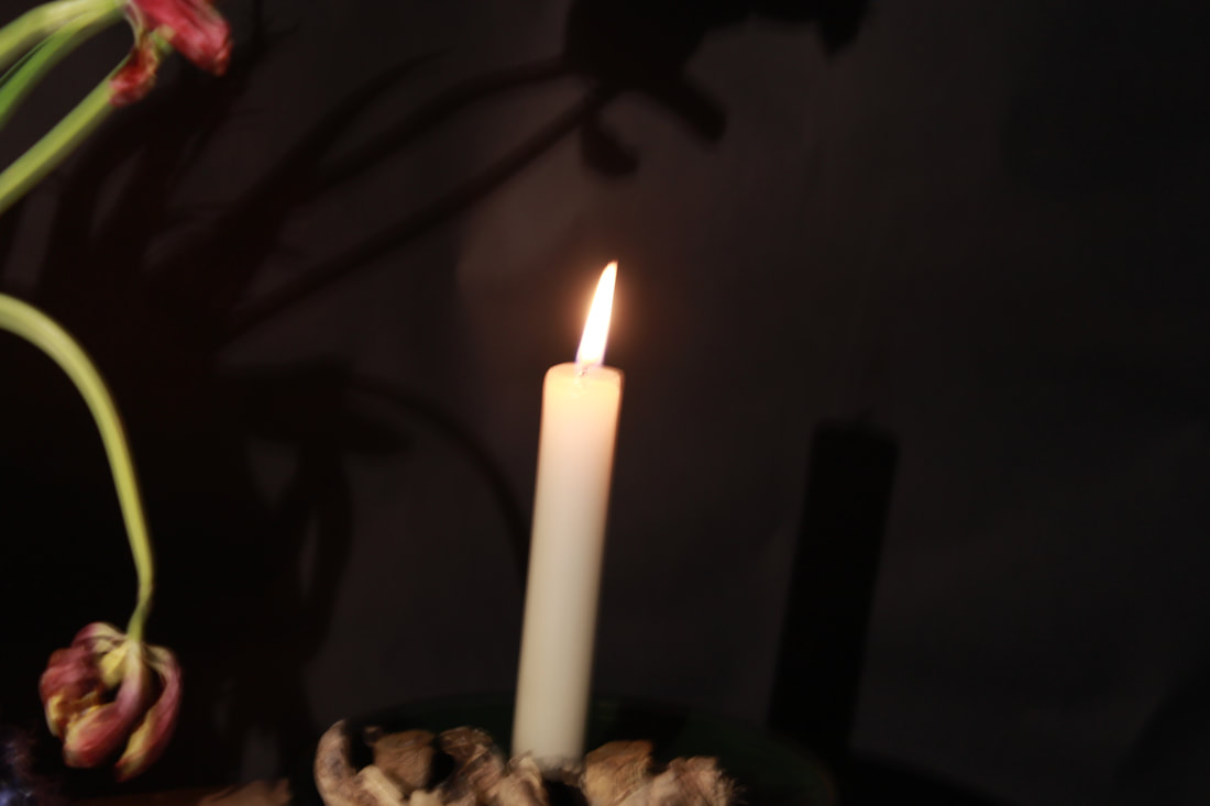
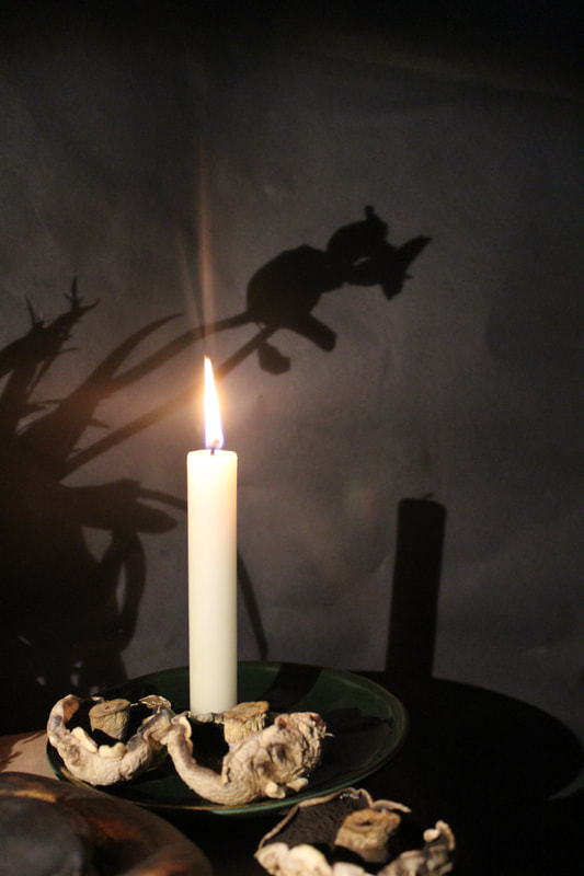
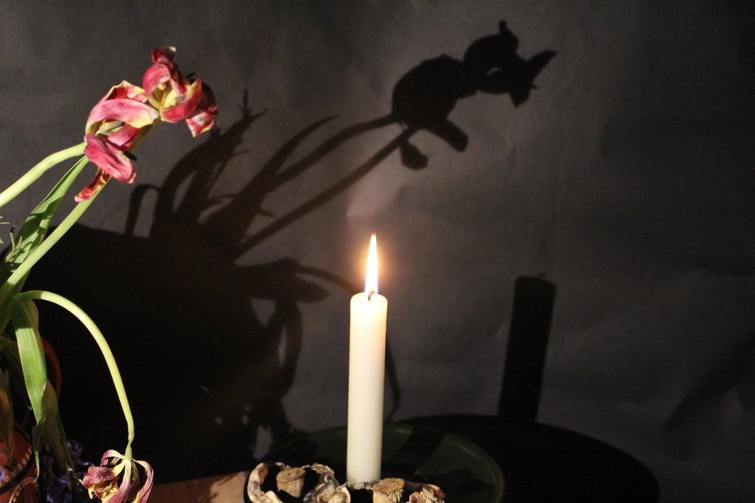
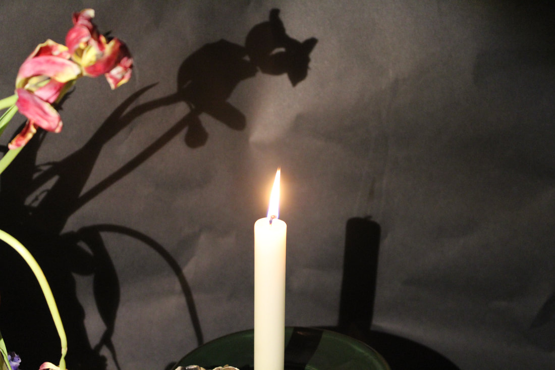
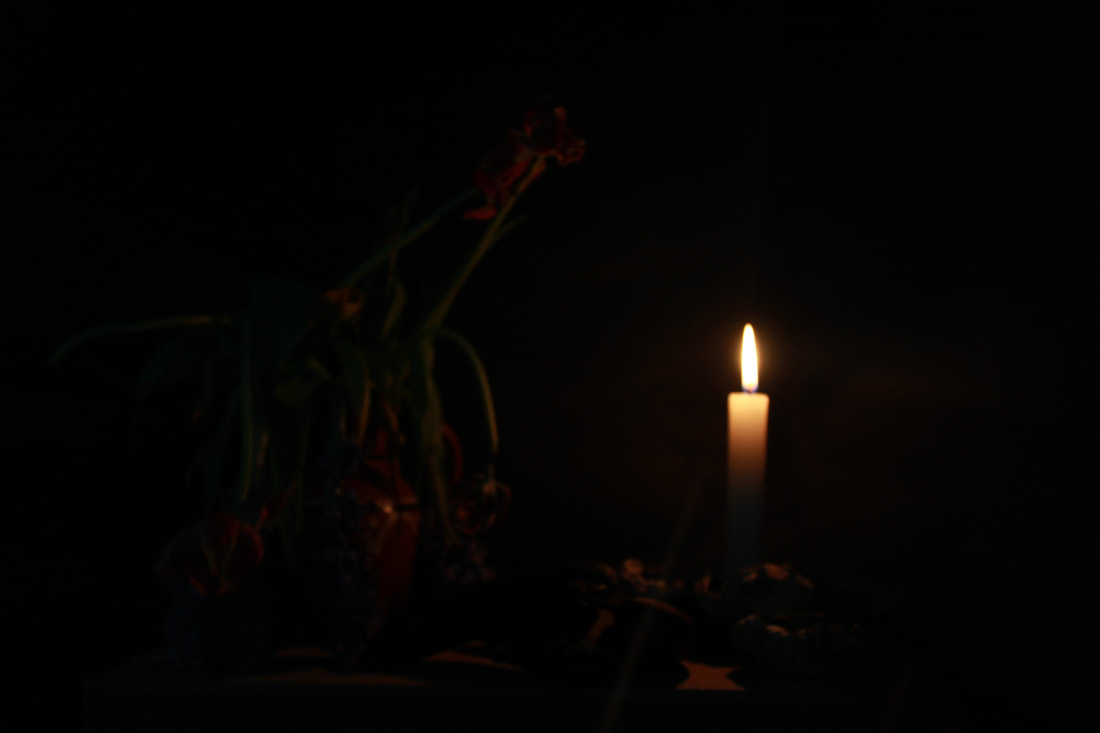
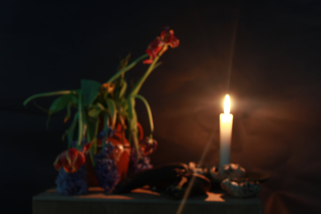
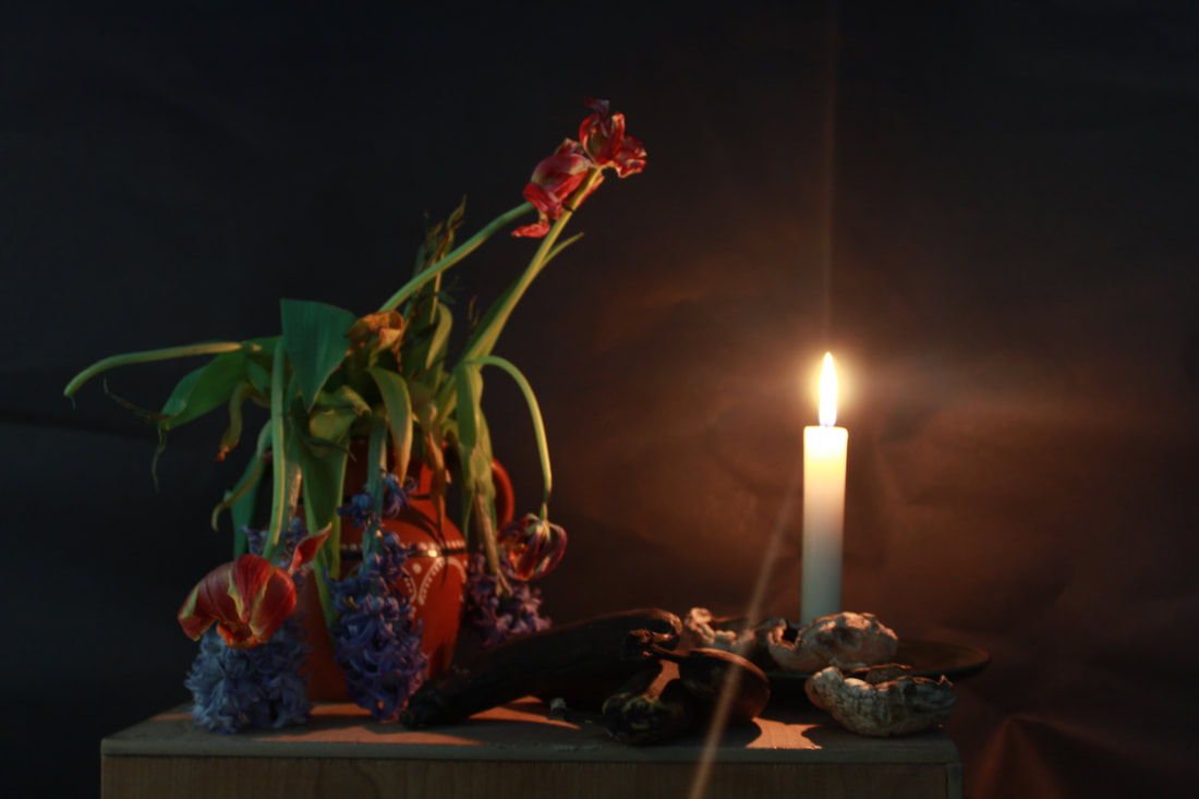
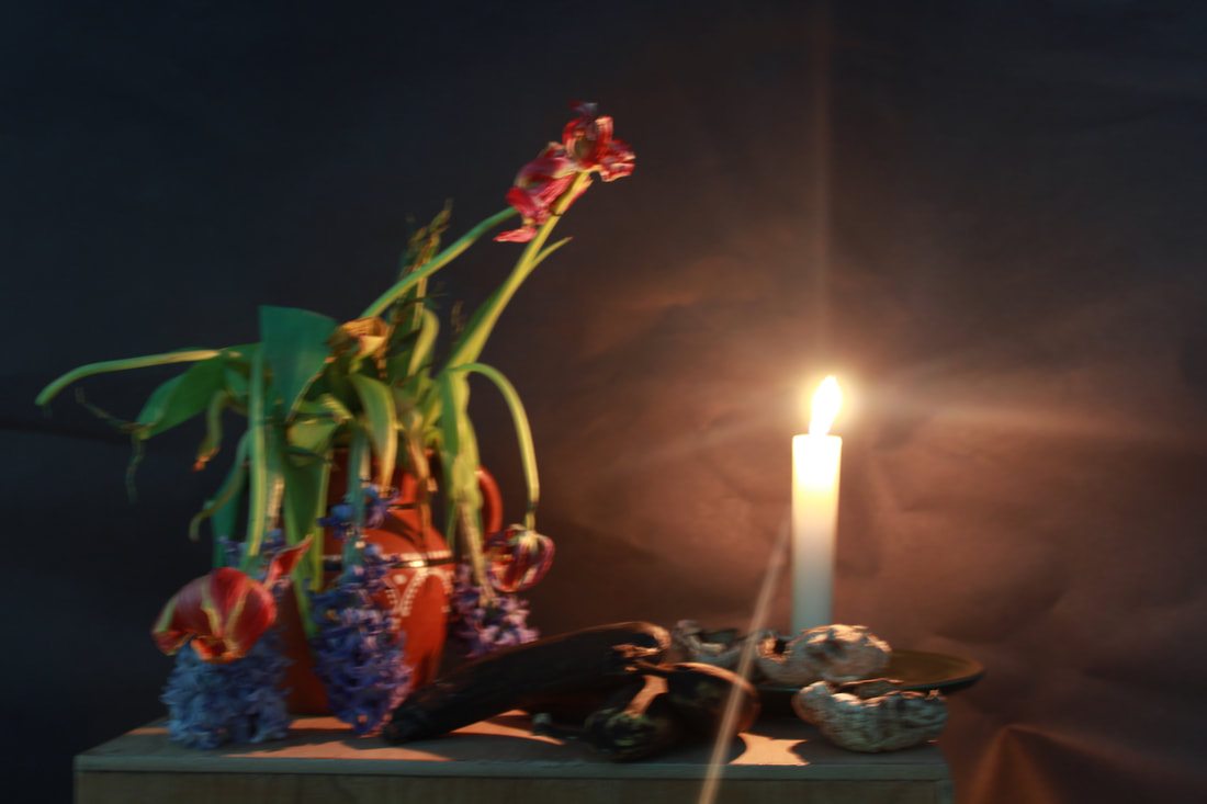
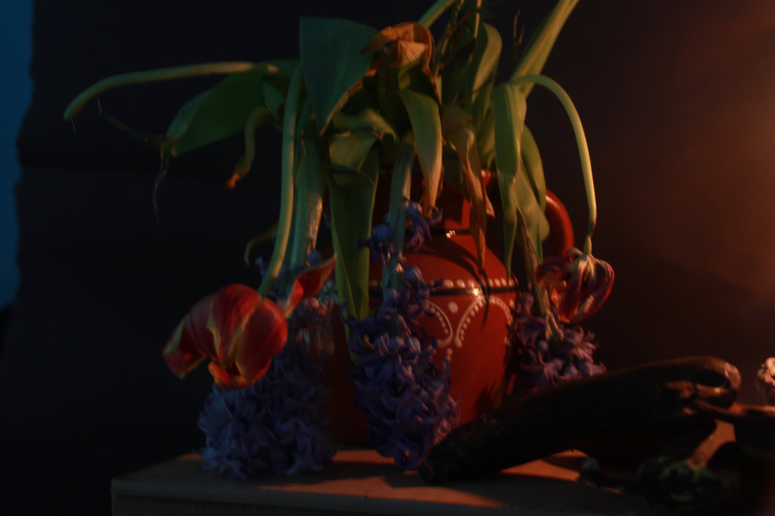
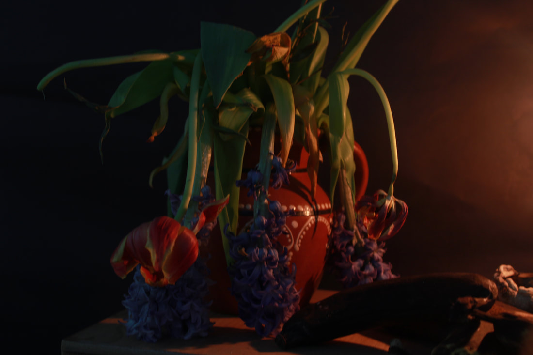
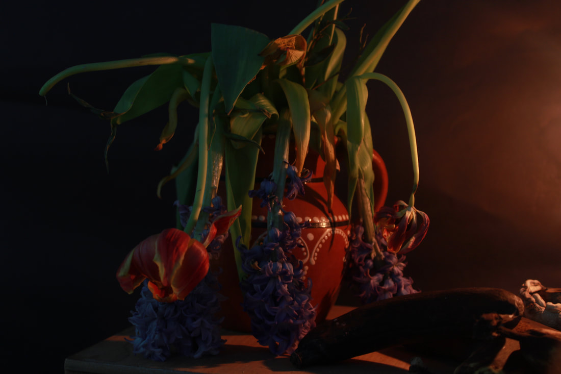
Flowers
Photoshop
Test Shoot #2
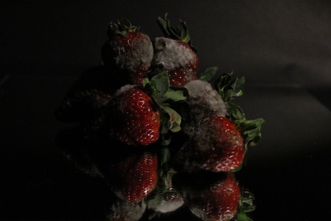
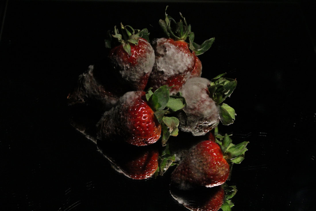
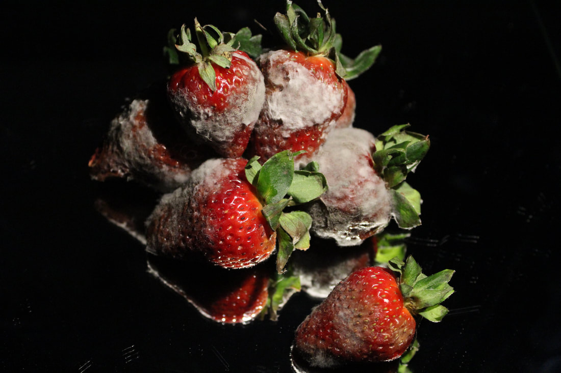
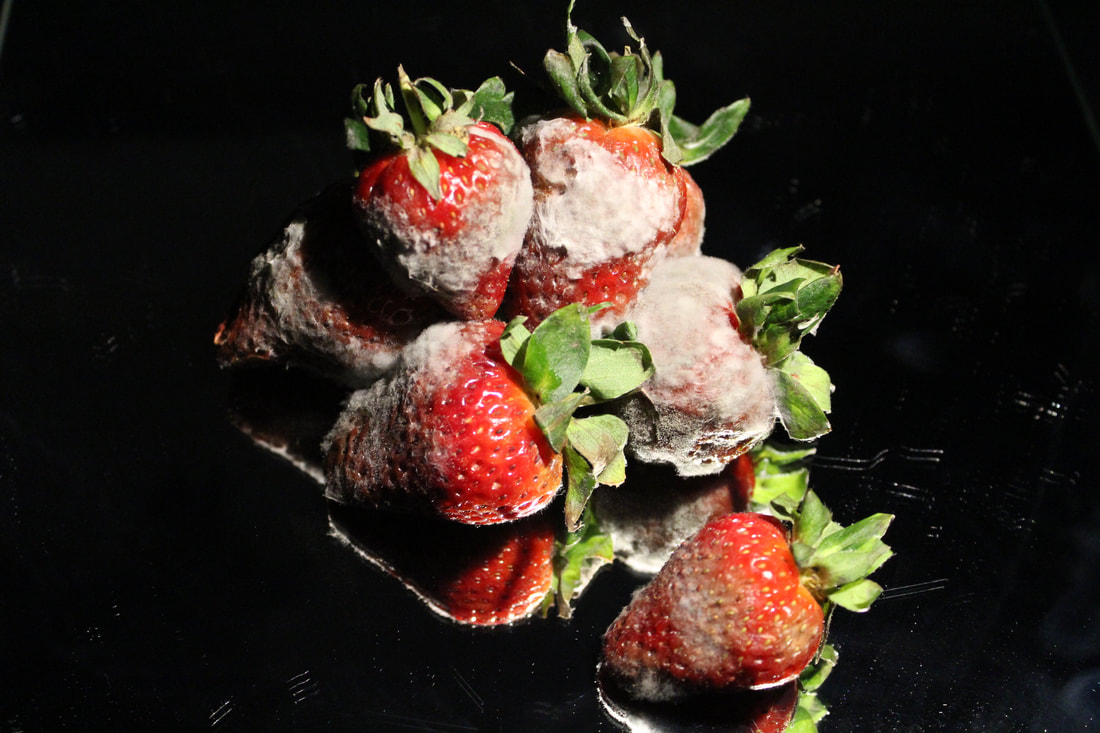
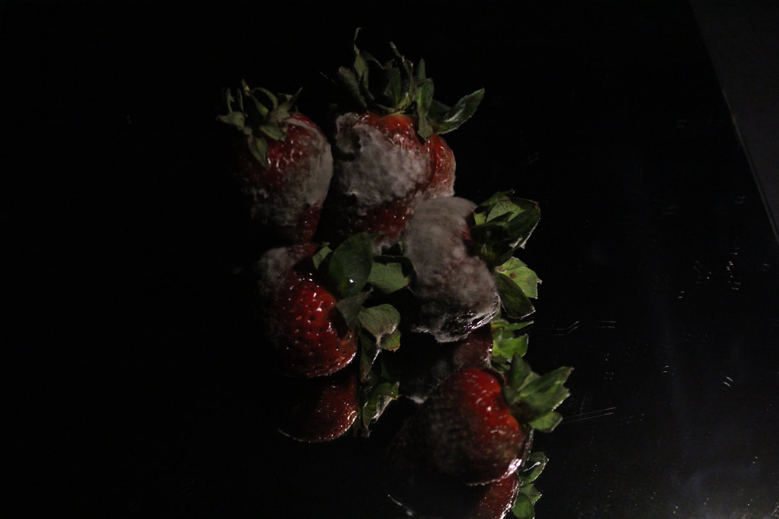
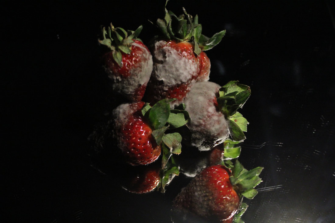
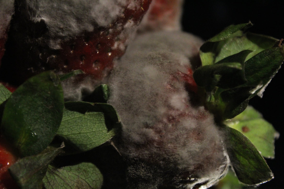
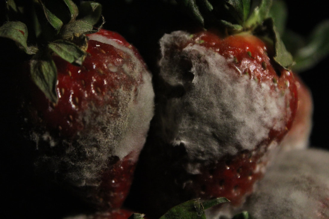
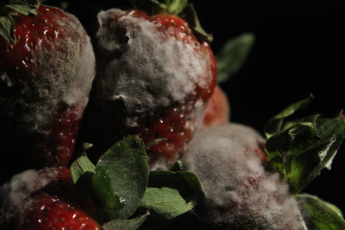
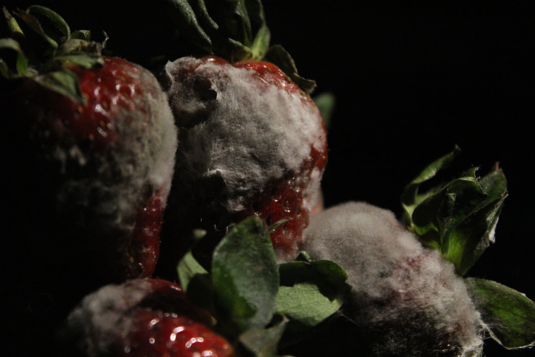
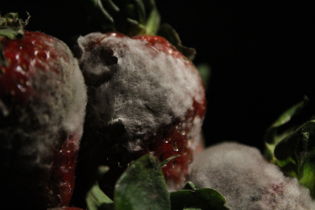
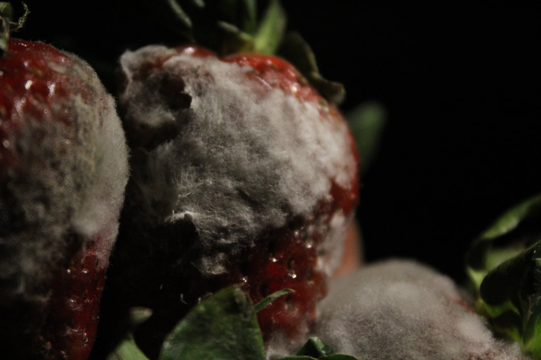
Strawberry's |
Pineapple |
Pumpkin |
               |
              |
                  |
Final outcomes
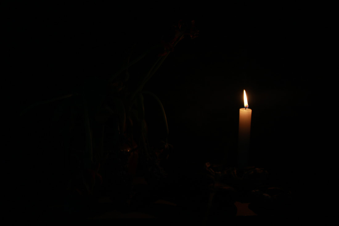
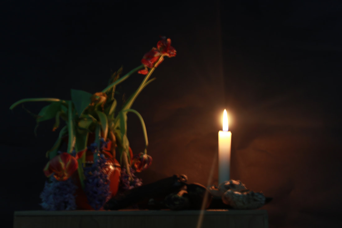
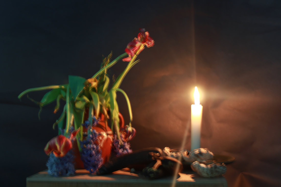
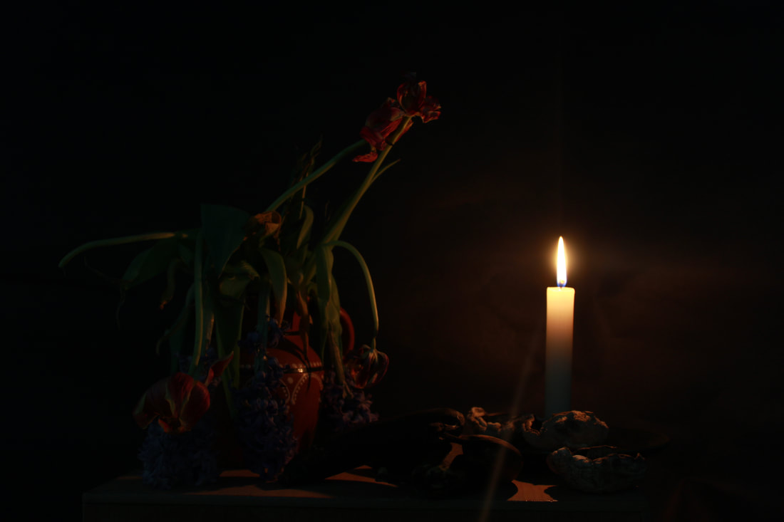
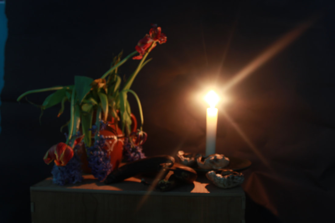
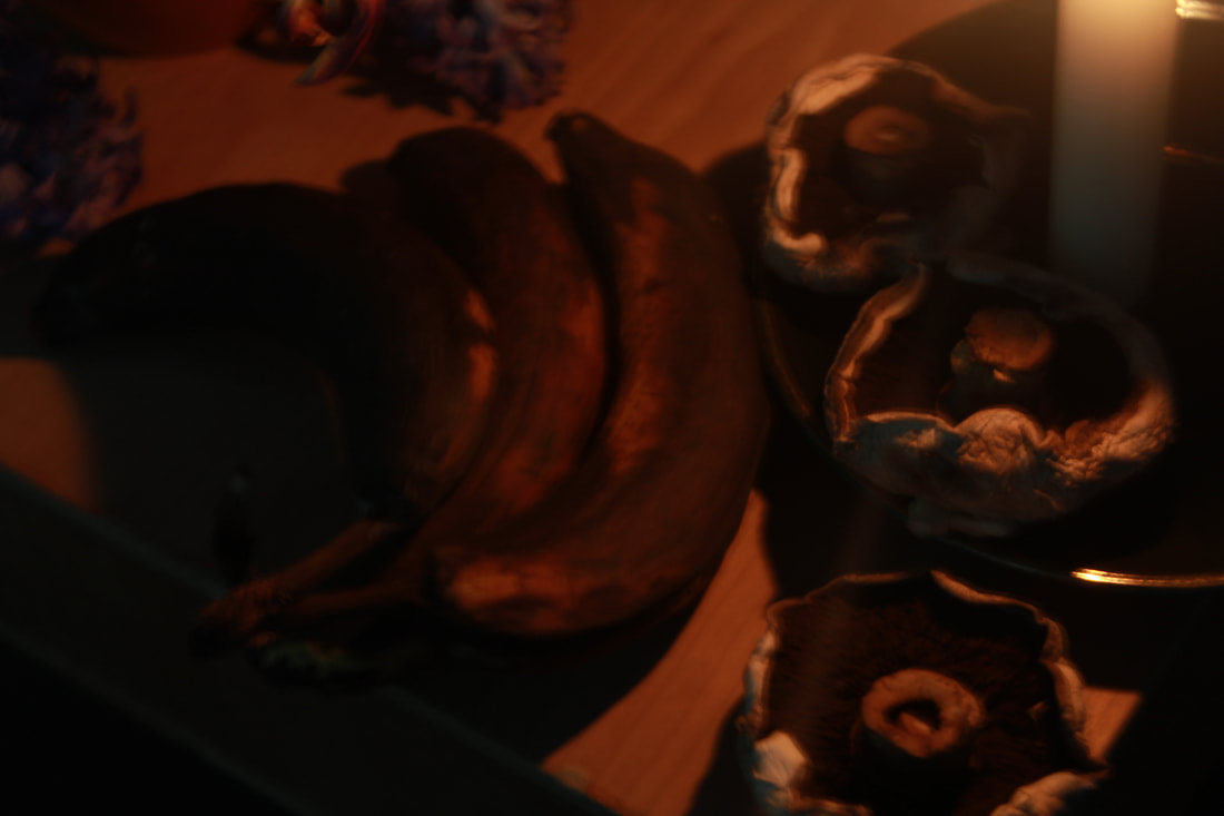
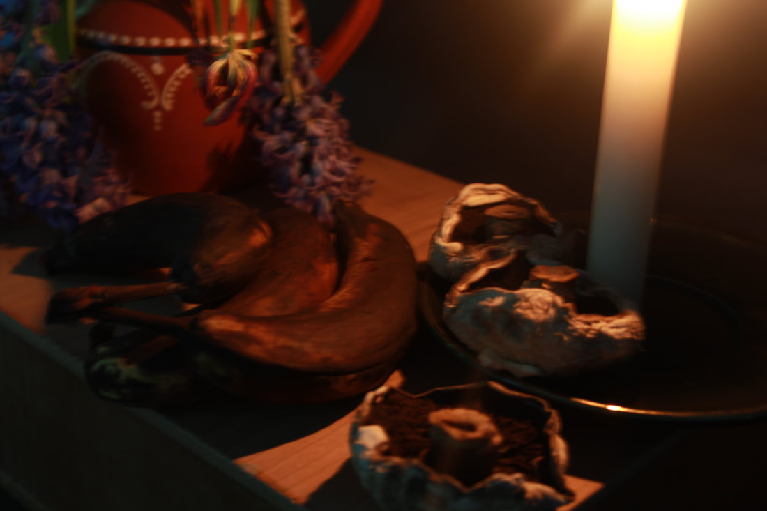
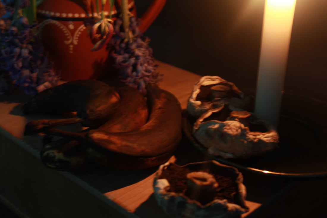
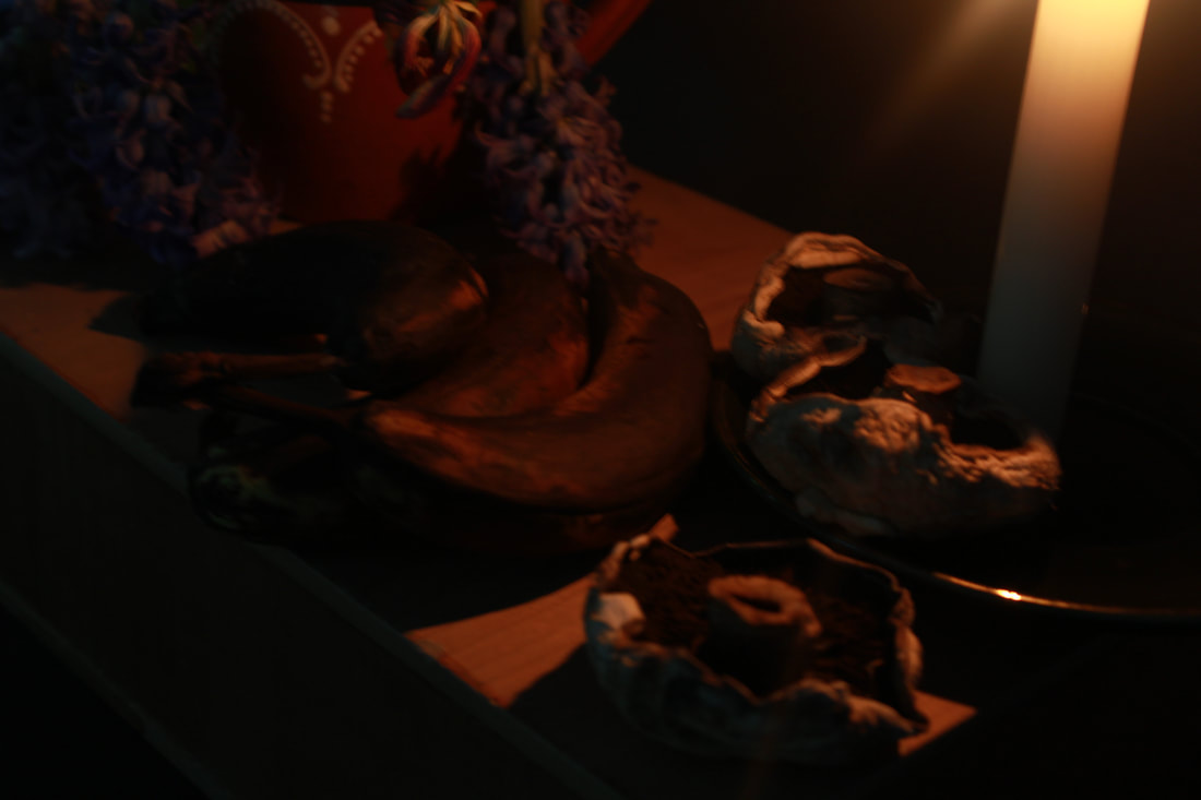
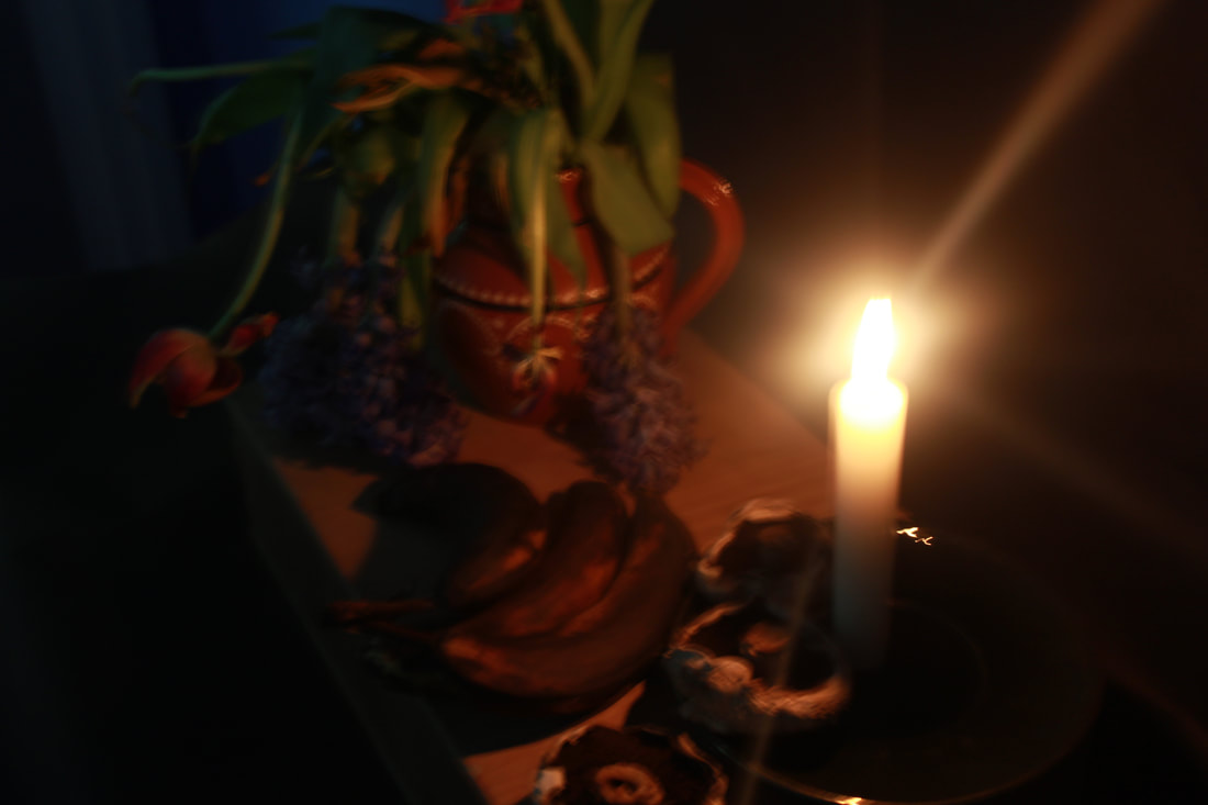
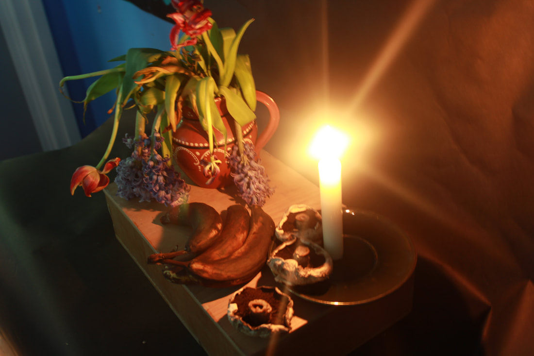
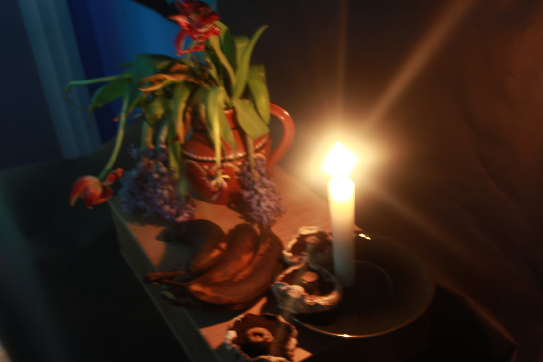
Test Shoot #3
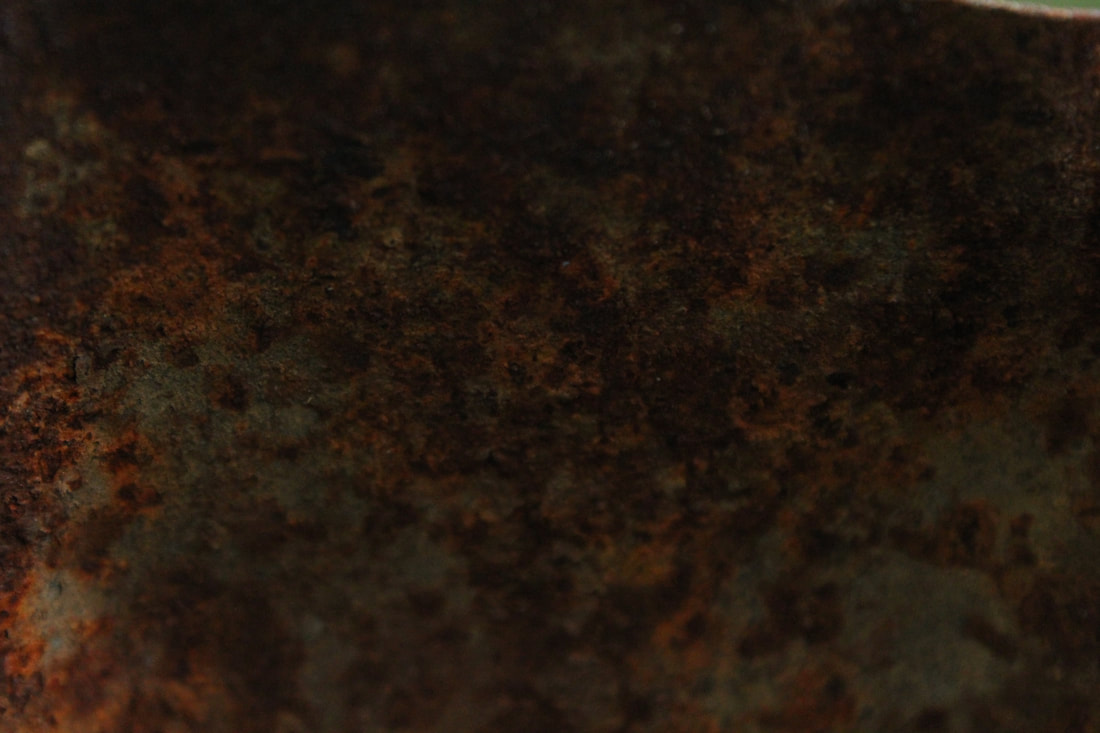
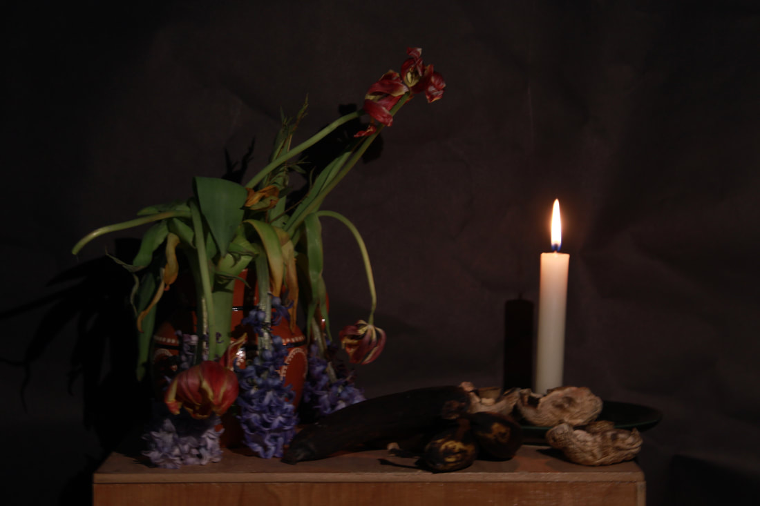
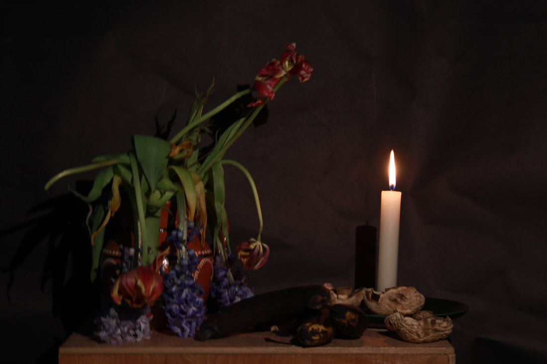
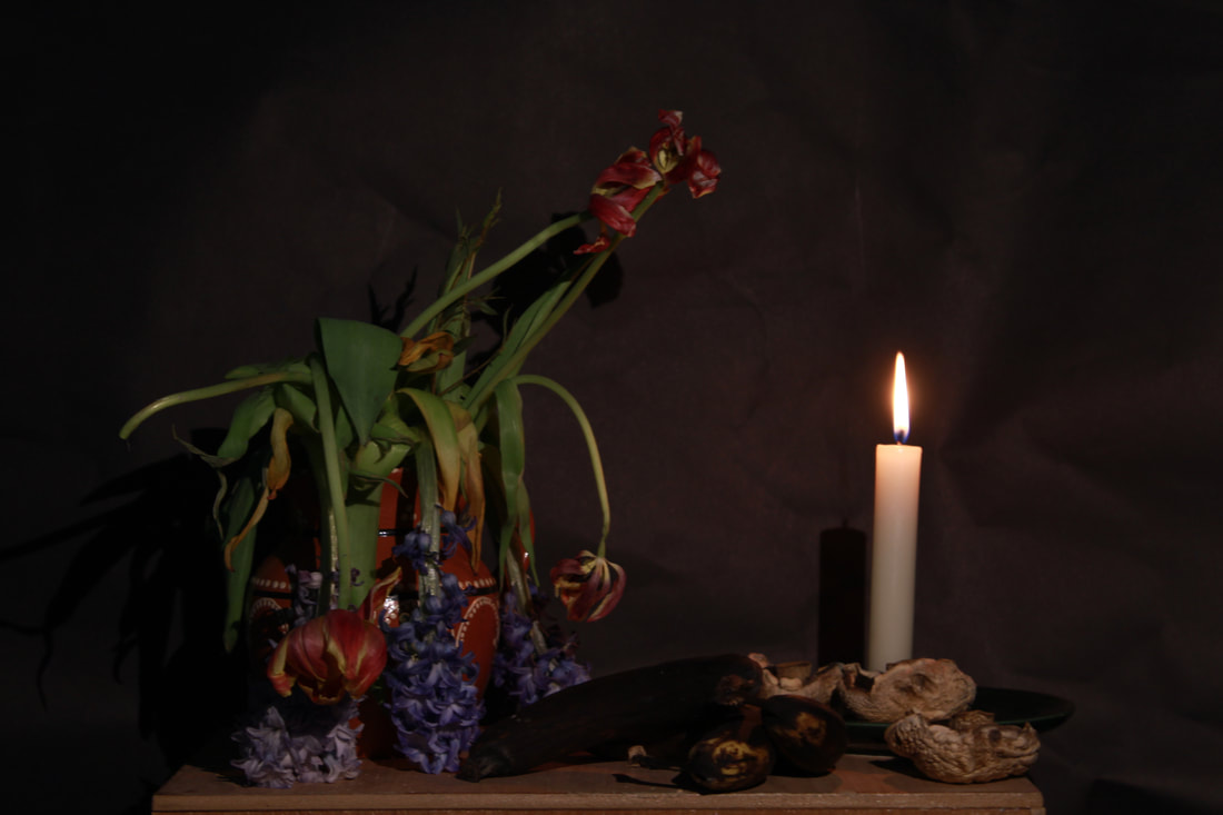
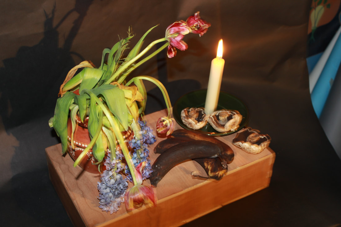
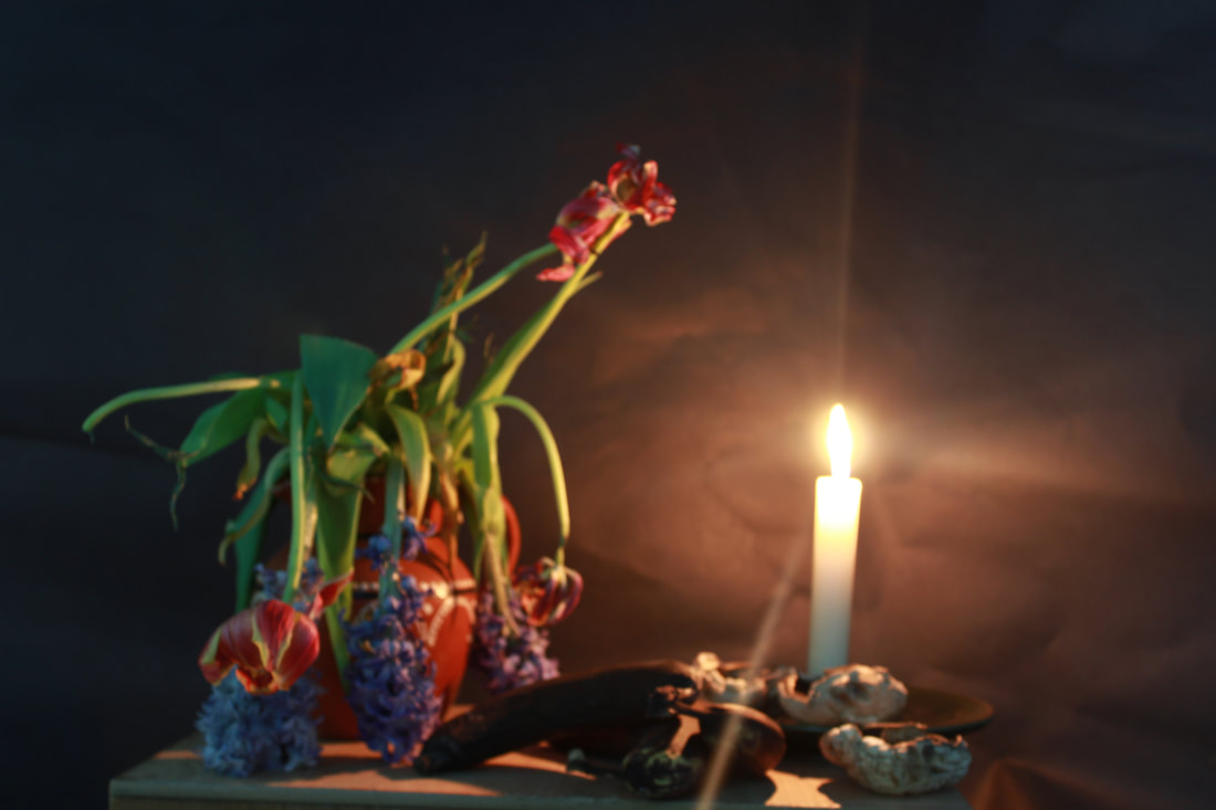
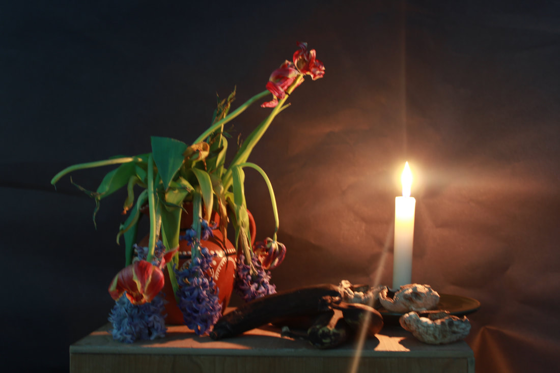
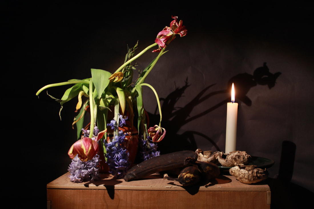
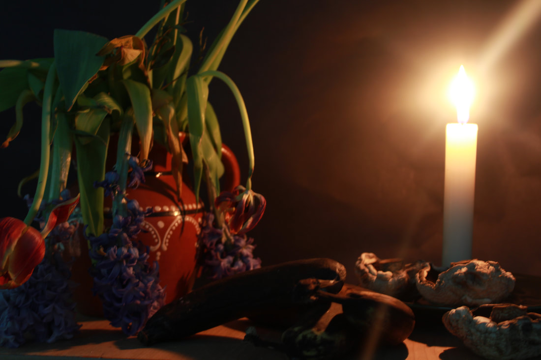
Rust

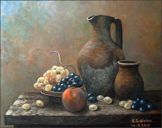
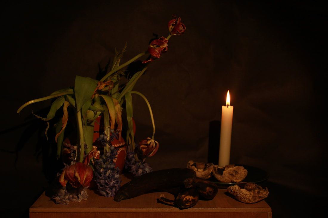
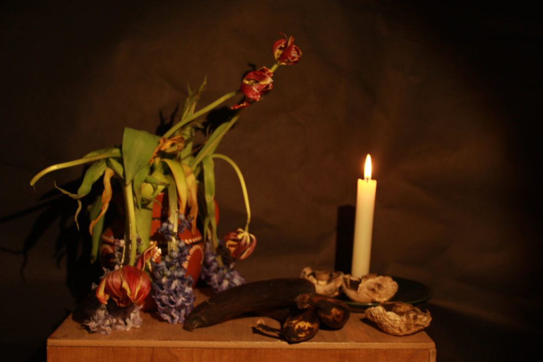
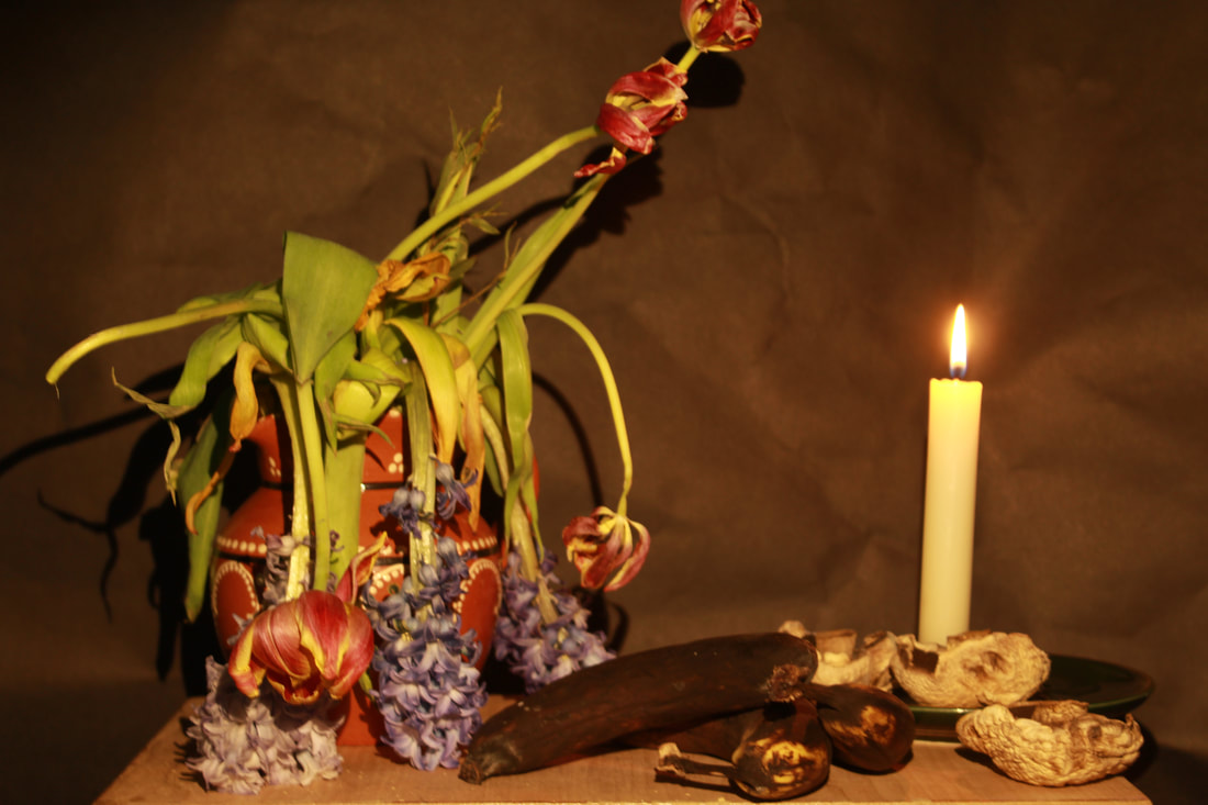
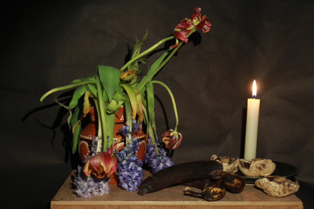
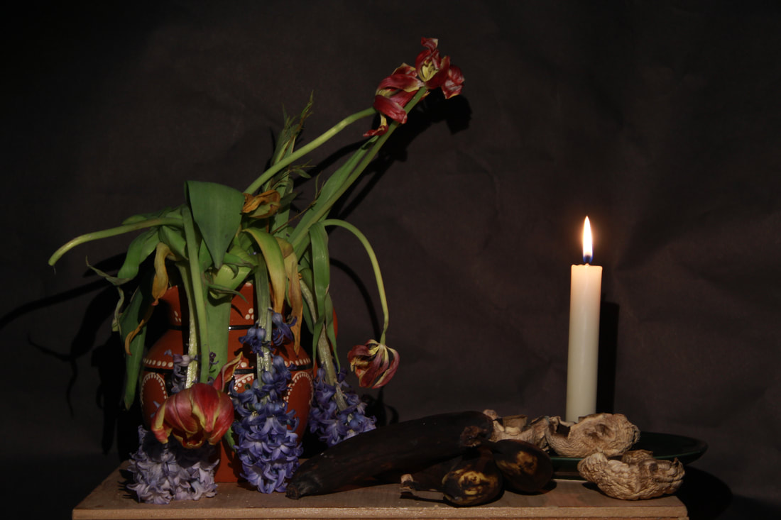
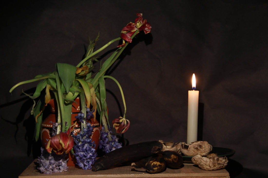
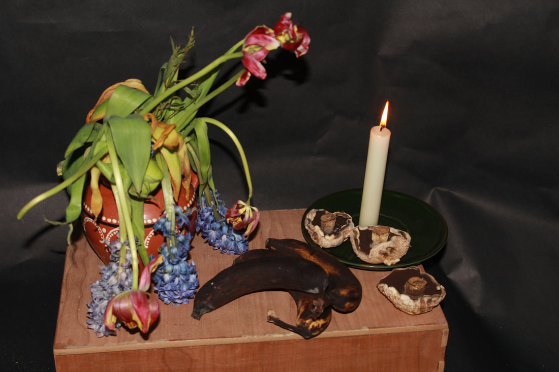
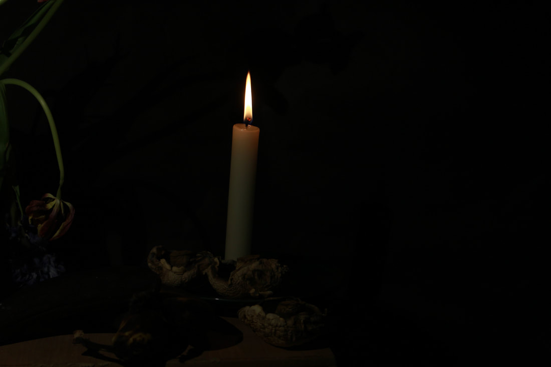
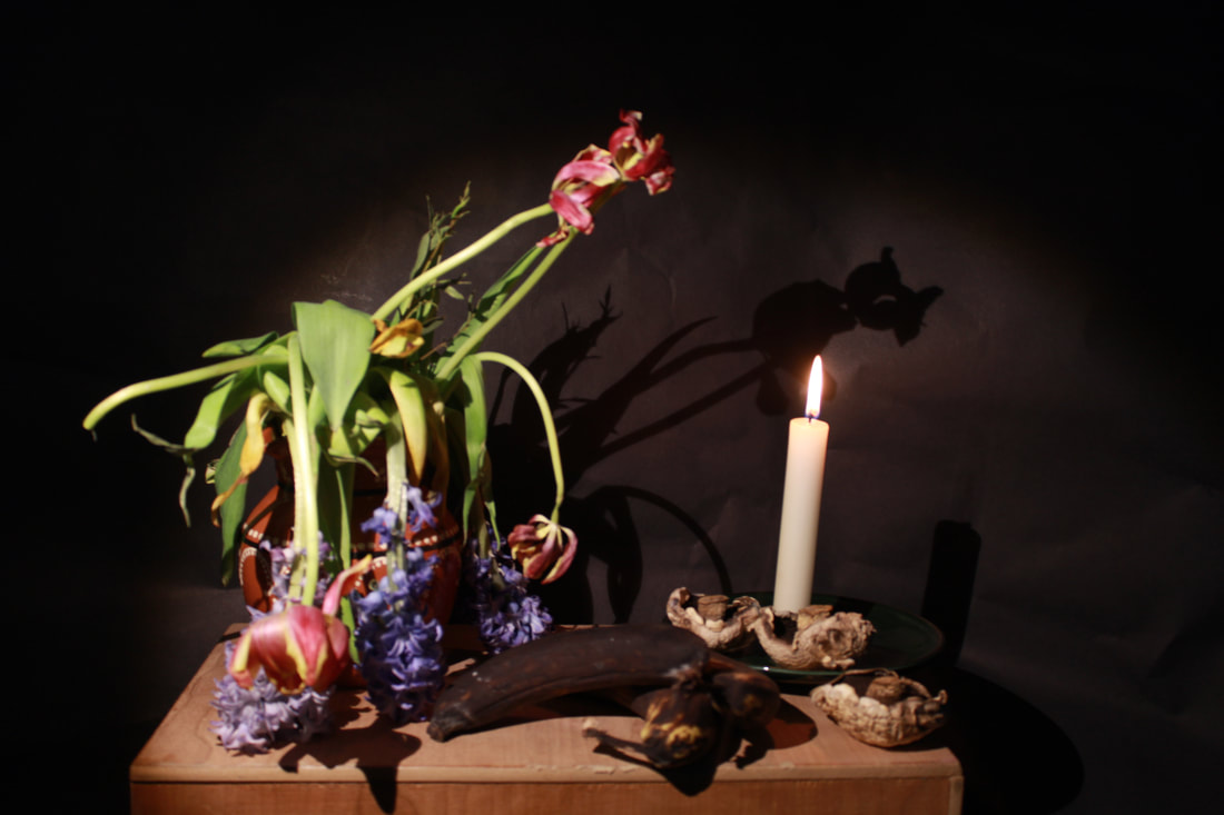
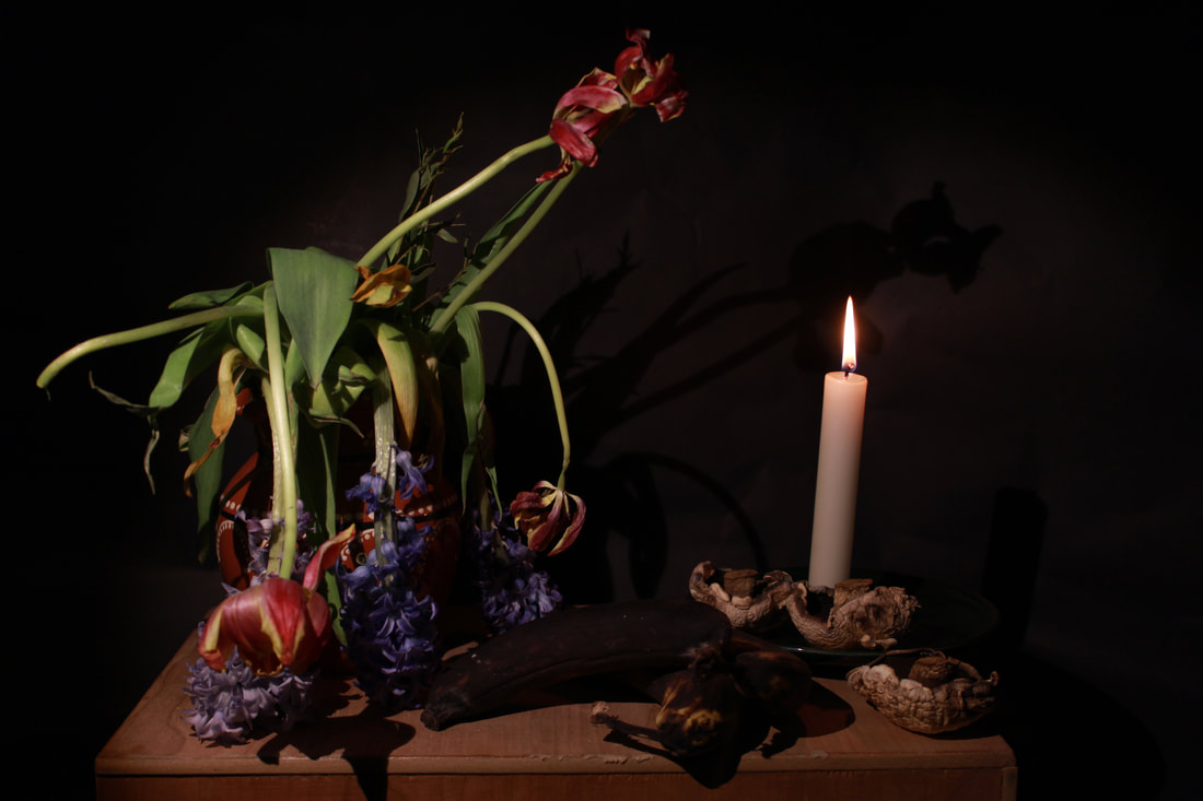
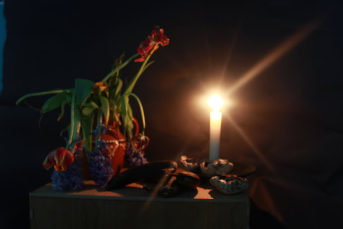
17th Century Still Life and my version


Photoshop #2

Next step to develop my outcomes
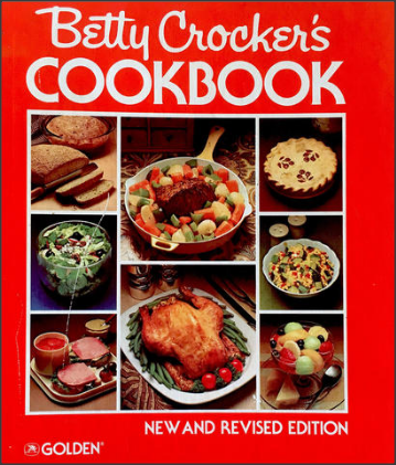
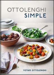
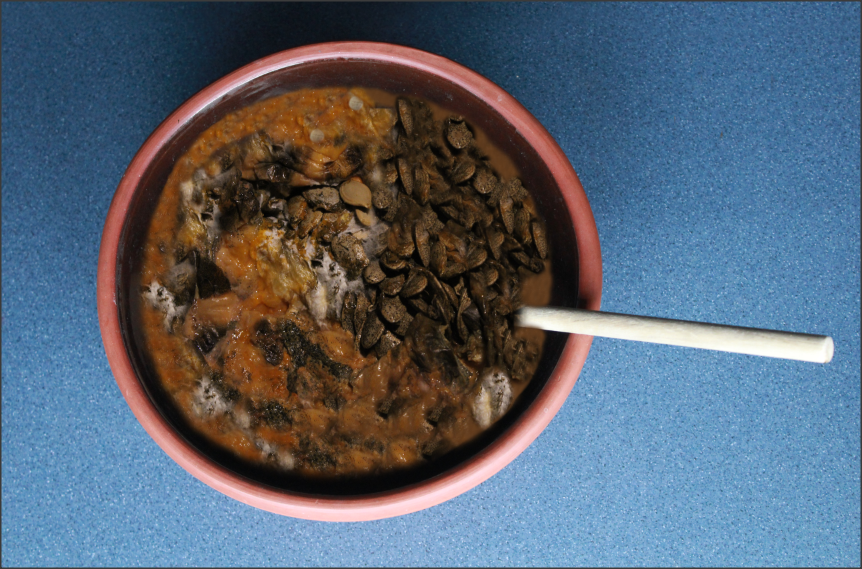
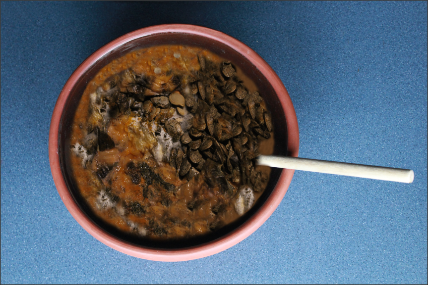
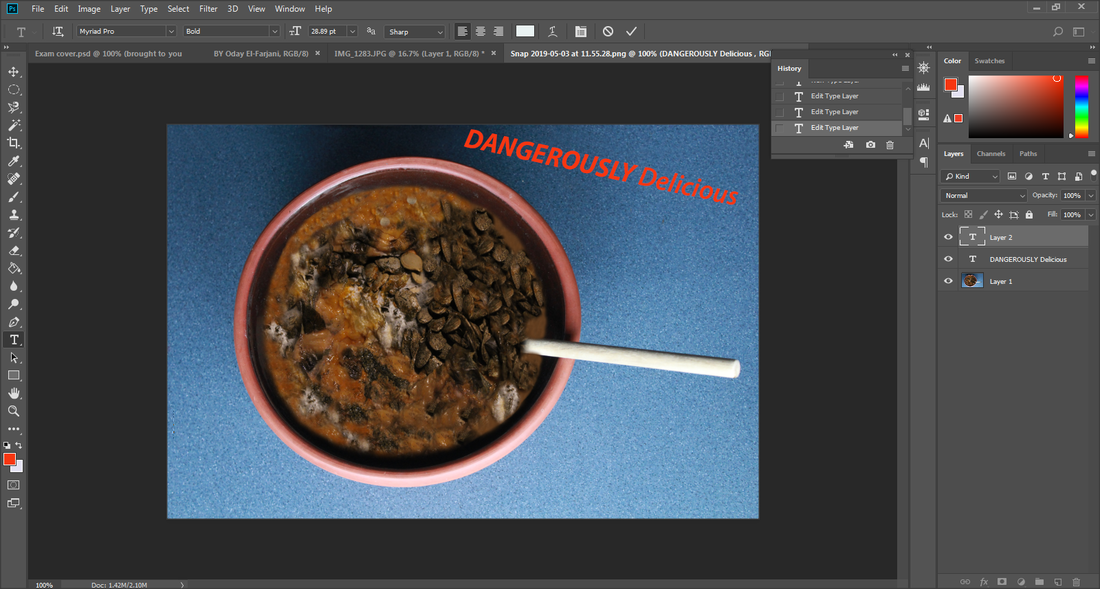
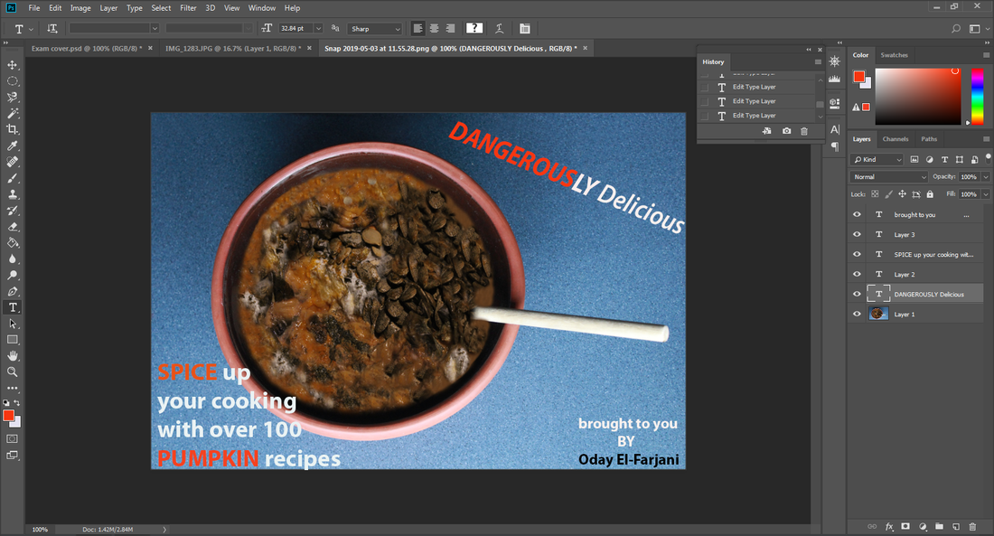
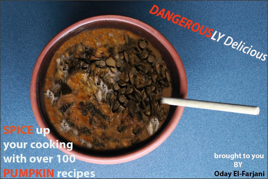
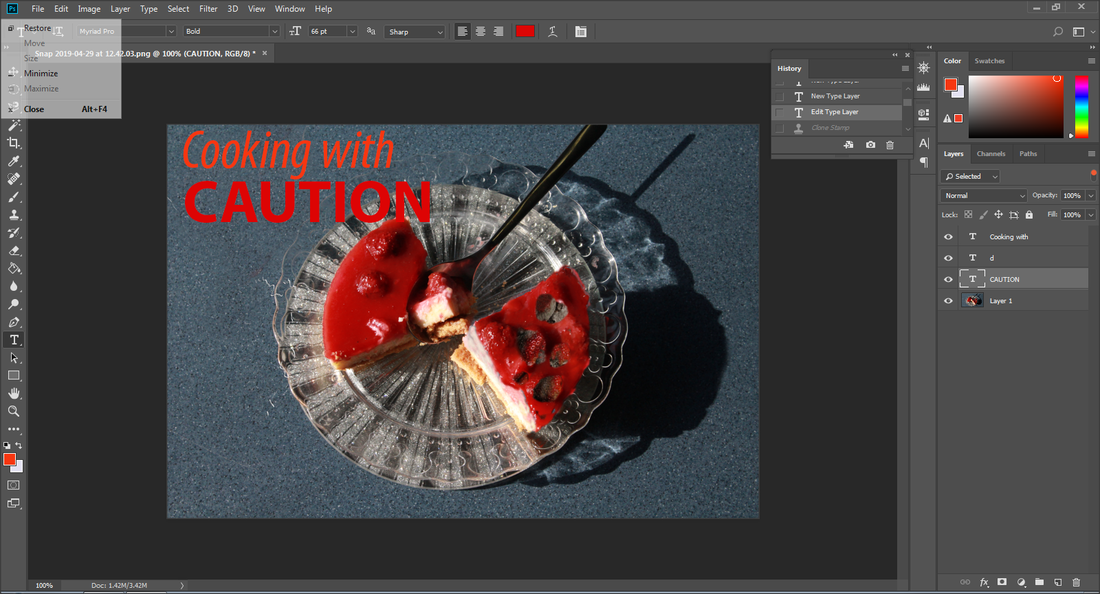
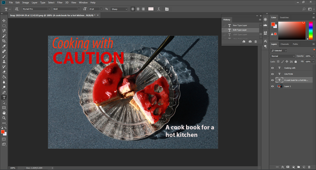
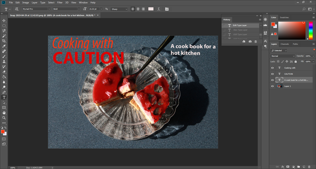
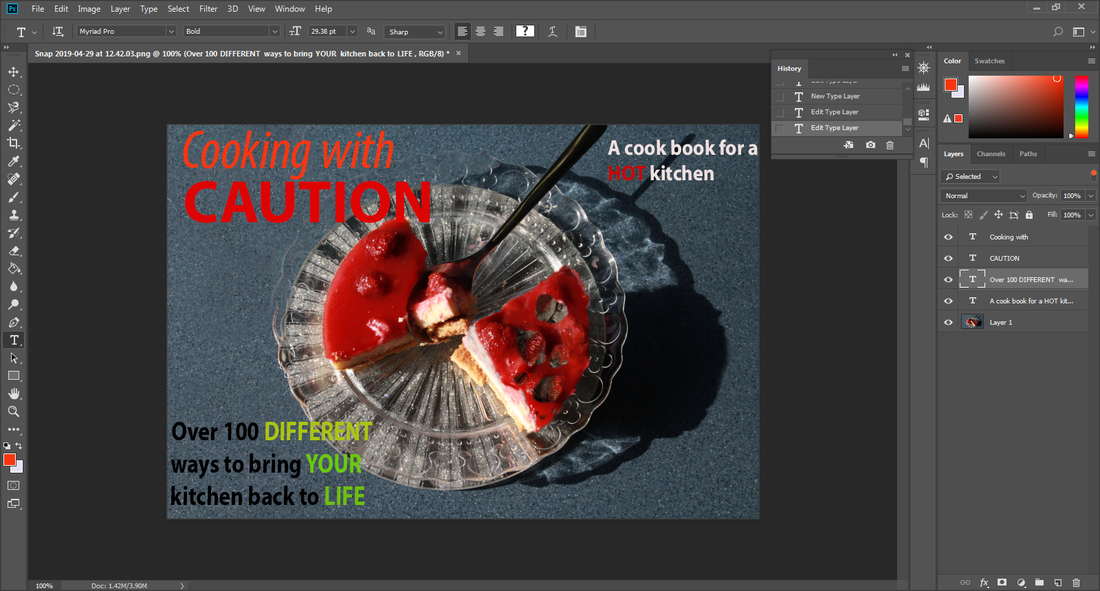
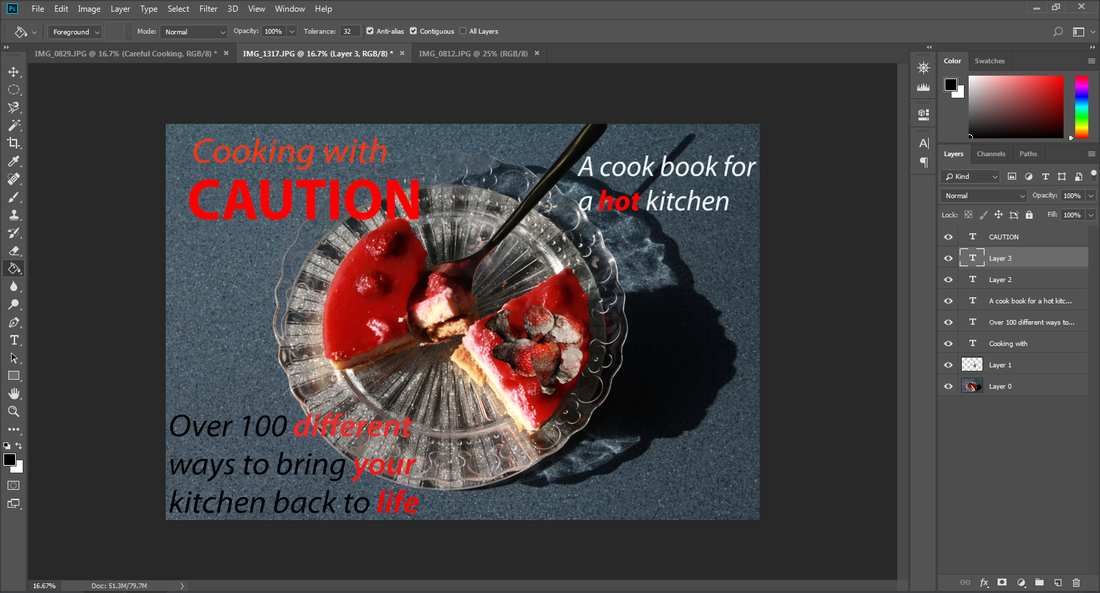
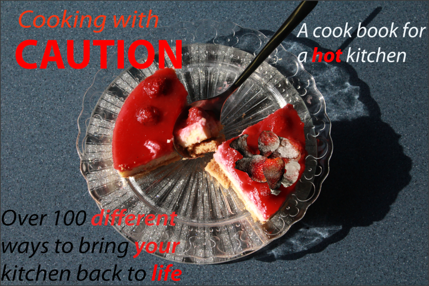
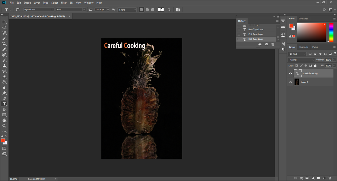
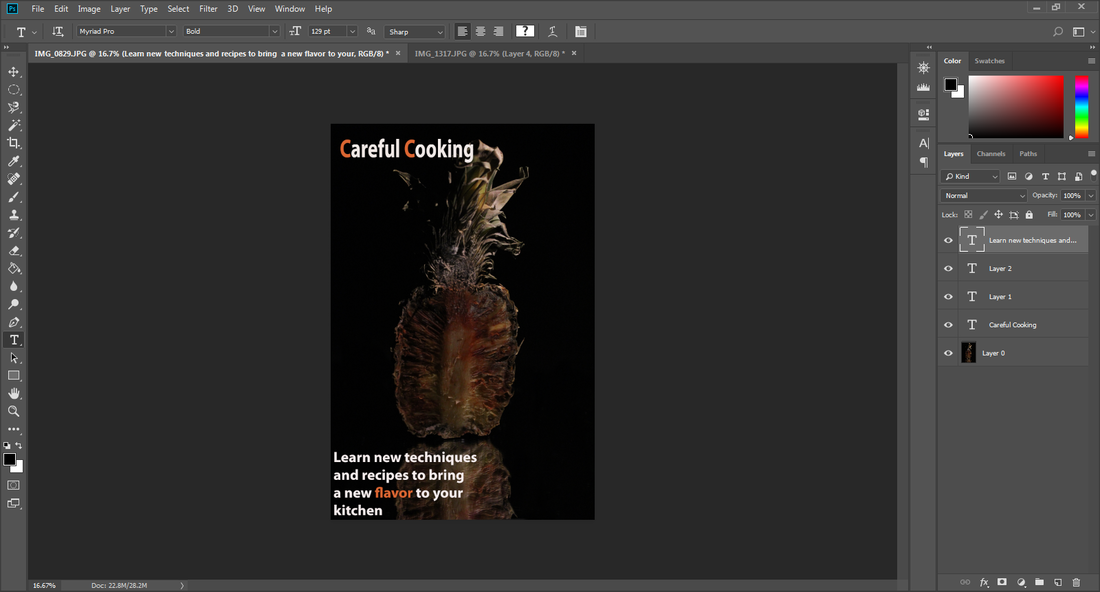
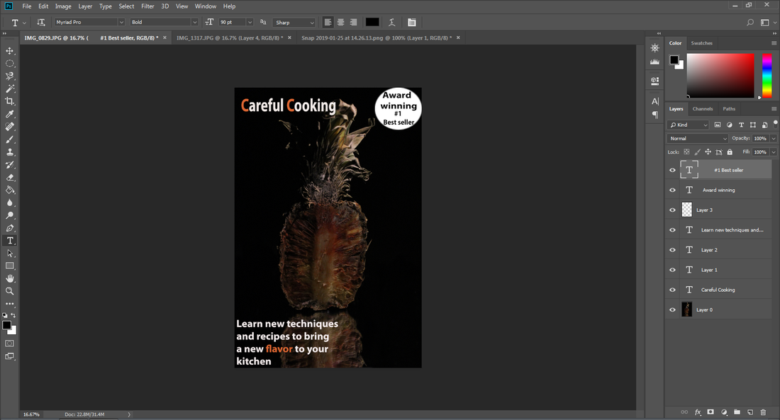
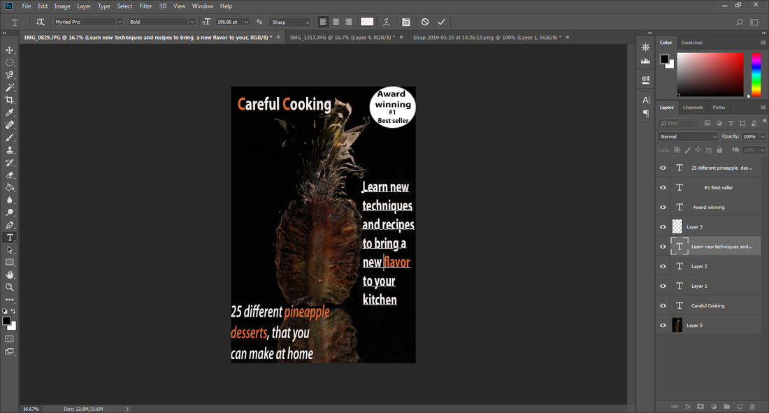
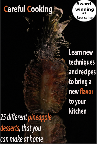
On my final outcomes I am thinking about using my photos to create cookery book pages, because I think it is a good use for my texture images and a funny contrast between something that should look delicious but when you look closely there is a shock value. I will use Photoshop to develop my outcomes and will also need to look at different fonts, layouts and text colour.
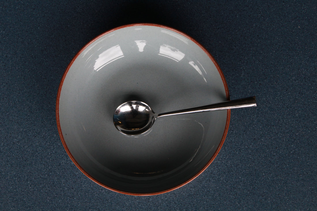
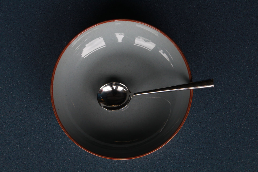
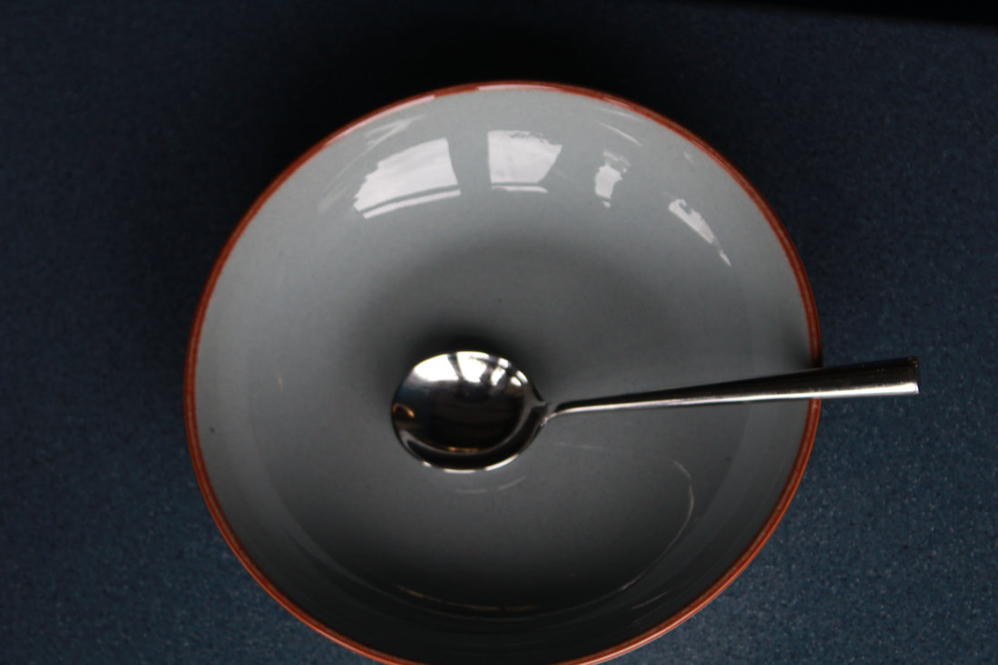
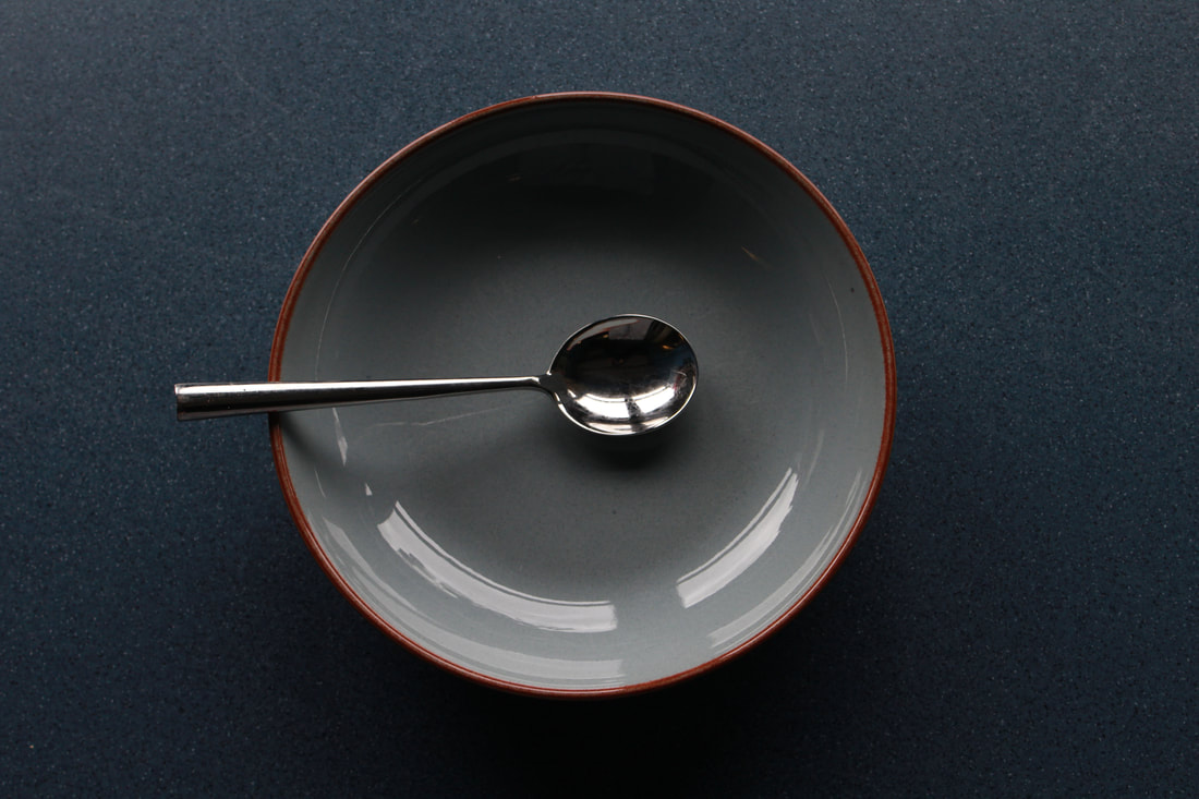
Bowels
29th of April 2019 from this point on I will not touch mt preparation work. The only work from this date will be work on my exam.

Evaluation
For my project I have made front covers of cook and recipes books. At first glance it may look like a regular cook book but in fact the fruit on the front cover is actually moldy rotten fruit. In the front cover of the cook books some of the highlighted words are actually hinting towards the fact that the food is not safe to eat and is not edible. I enjoyed using my creativity to create my own front covers and put my own spin on it and also setting up the pictures using different settings and objects.
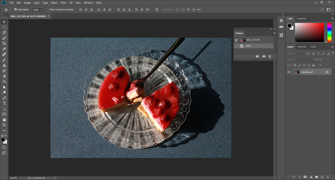
During this project the part I enjoyed the most was the process of making the fruit rot, which varied in time depending on the fruit. My particular favorite fruit was the strawberries as they went rotten quite quickly and when they went rotten they had a fur of mold which was good to photograph.
The new techniques I experienced was researching different cook books to inspire my outcomes and the different fonts I could use to make it look professional. I think the research helped me to get good outcomes which I am pleased with.
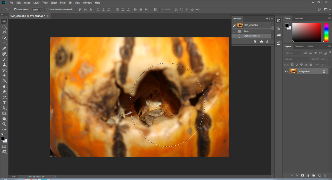
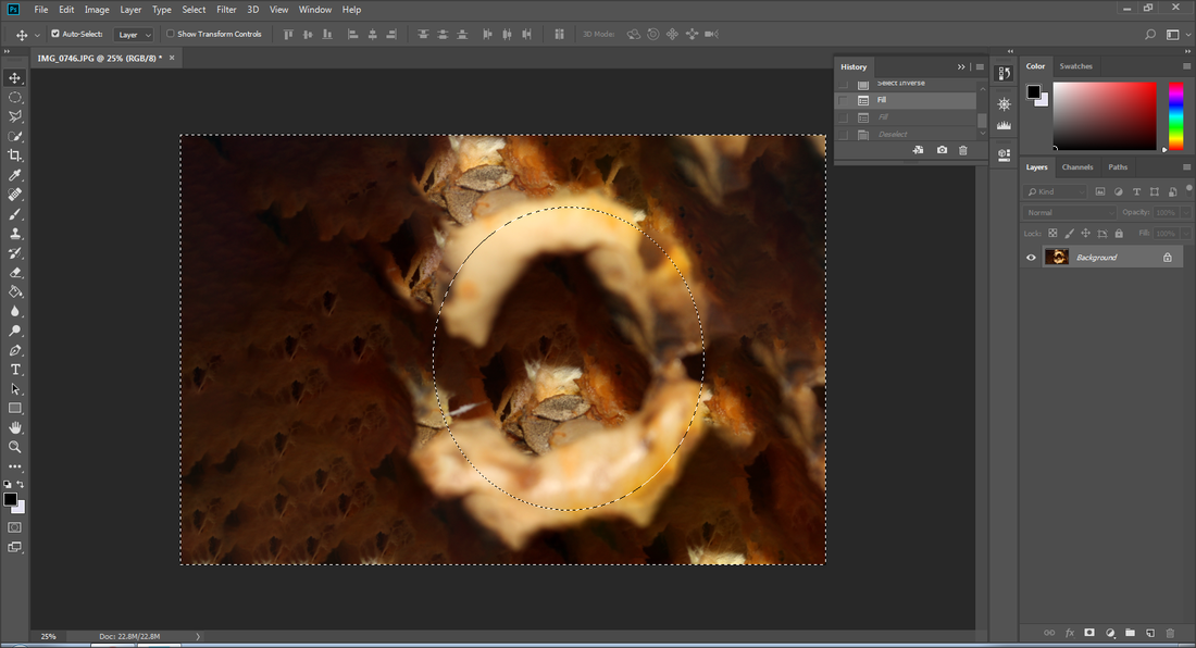
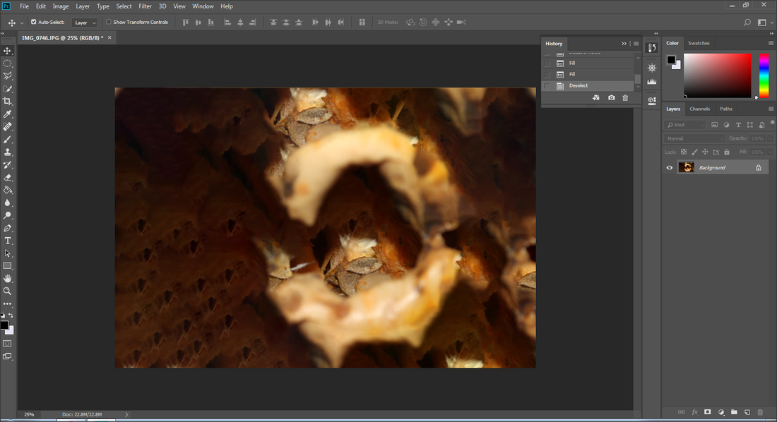
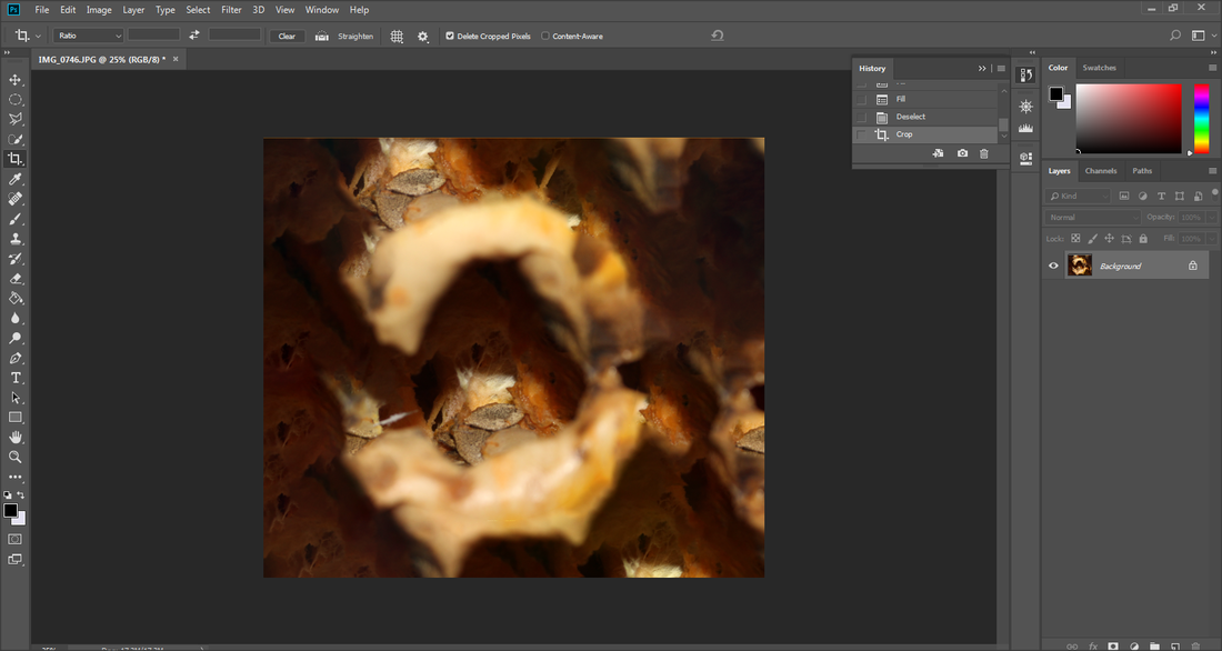
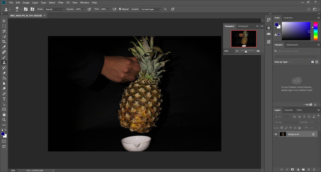
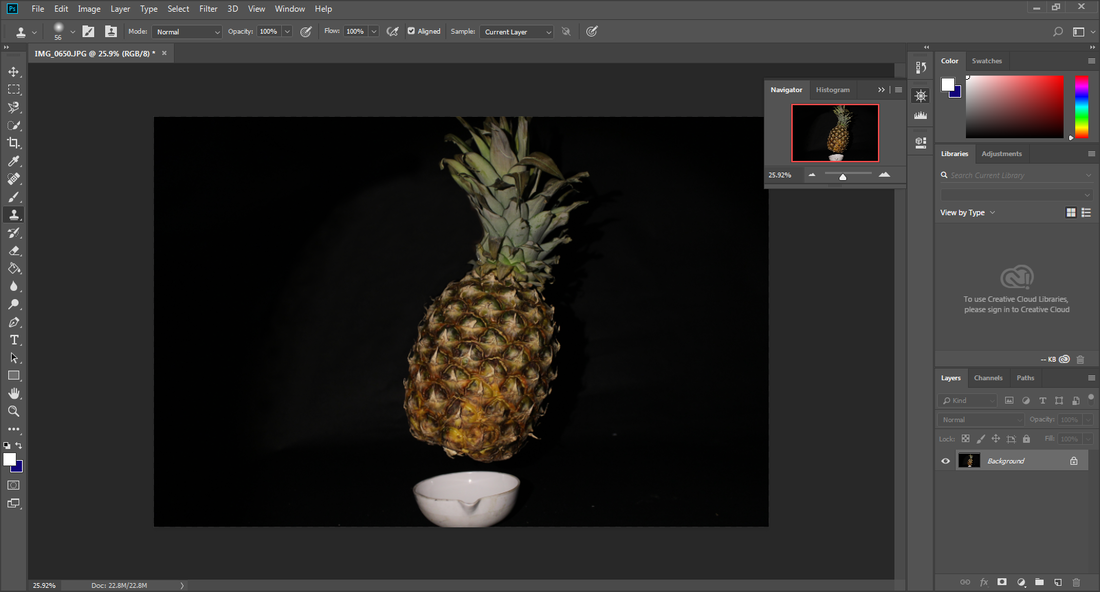
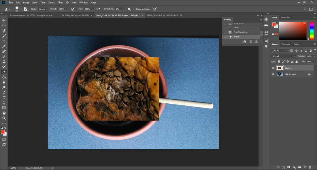
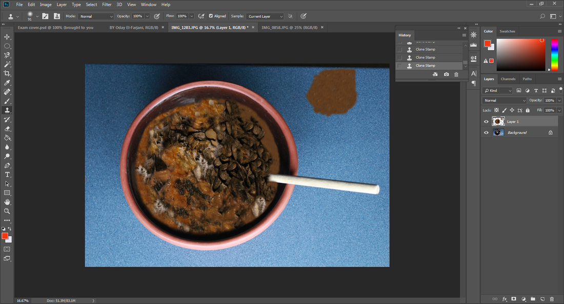
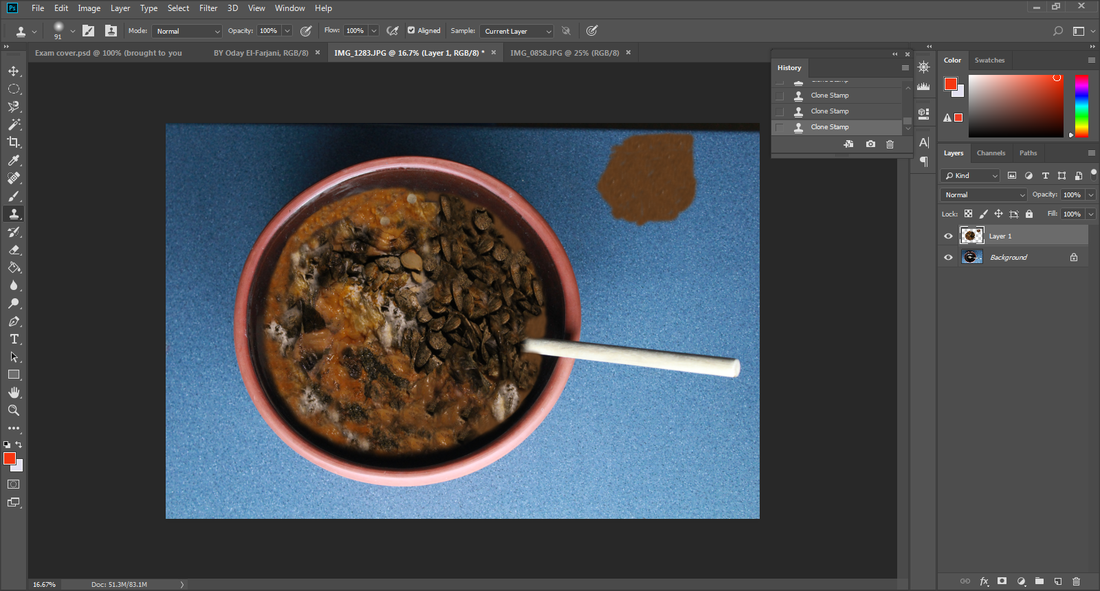
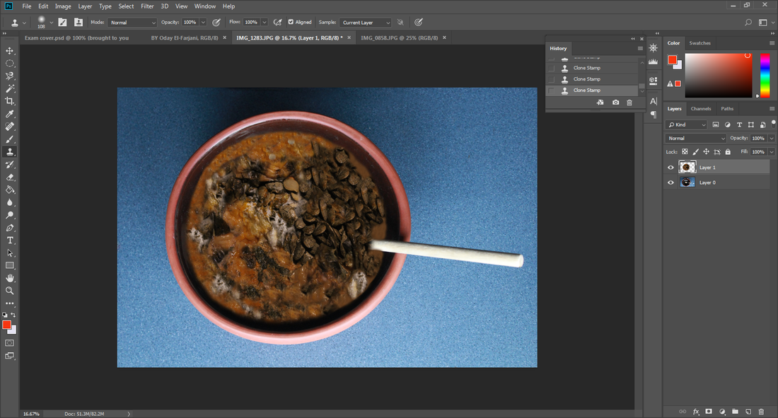
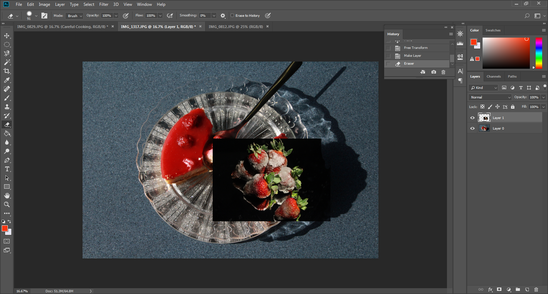
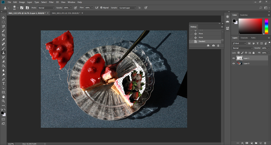
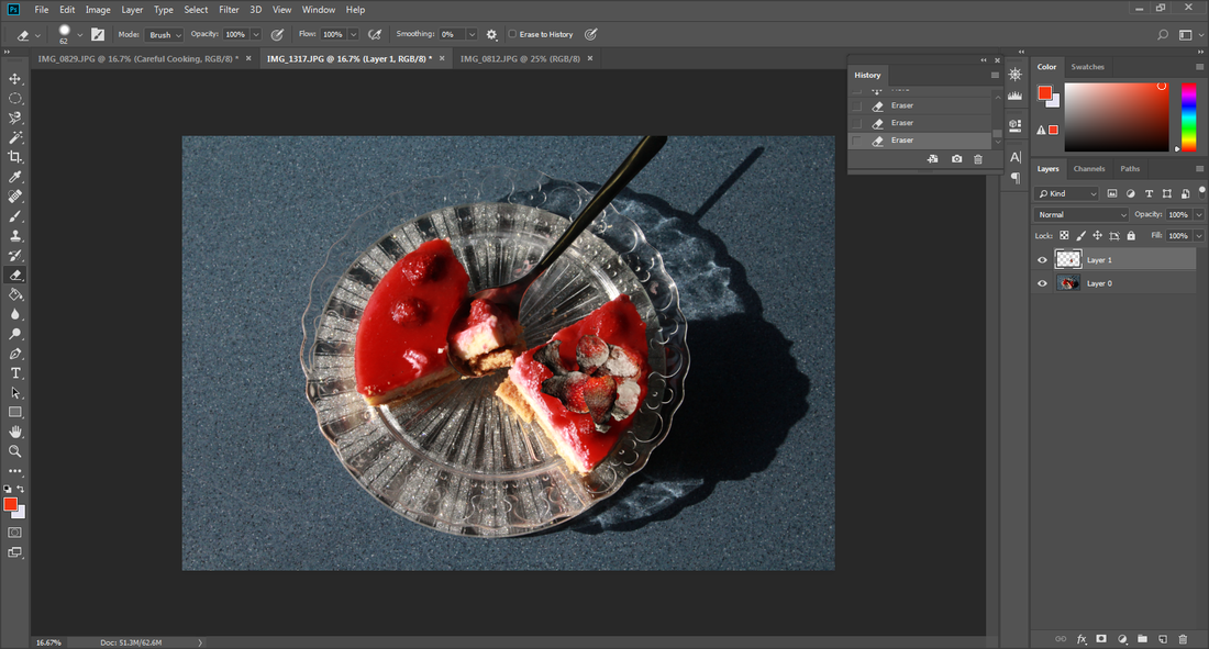
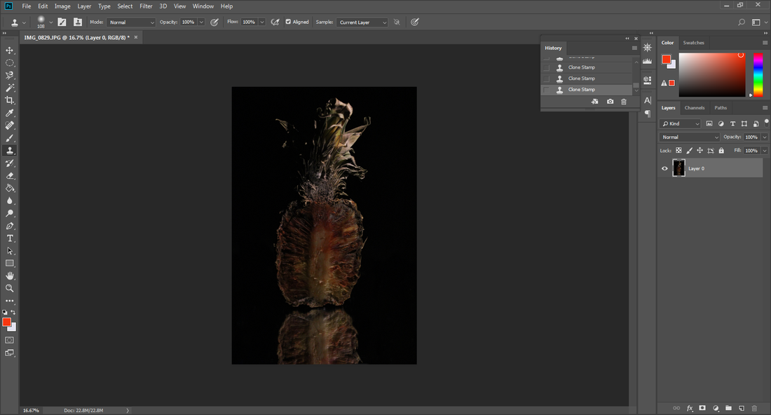
Some of the techniques I used in Photoshop were using the layer tools and the cloning tool to merge different images together. I also
developed studio shots using an infinity curve and a small spot light to get the lighting correct for my images. I used a rang of camera angles depending on the shots I needed, either birds eye view or eye level to capture the effect I was after. In my opinion the most important part of the project was the book covers, because I believe that I have made them realistic and fun and made the theme of texture my own and unique.
During this project the part I enjoyed the most was the process of making the fruit rot, which varied in time depending on the fruit. My particular favorite fruit was the strawberries as they went rotten quite quickly and when they went rotten they had a fur of mold which was good to photograph.
The new techniques I experienced was researching different cook books to inspire my outcomes and the different fonts I could use to make it look professional. I think the research helped me to get good outcomes which I am pleased with.
Some of the techniques I used in Photoshop were using the layer tools and the cloning tool to merge different images together. I also
developed studio shots using an infinity curve and a small spot light to get the lighting correct for my images. I used a rang of camera angles depending on the shots I needed, either birds eye view or eye level to capture the effect I was after. In my opinion the most important part of the project was the book covers, because I believe that I have made them realistic and fun and made the theme of texture my own and unique.
